Introduction
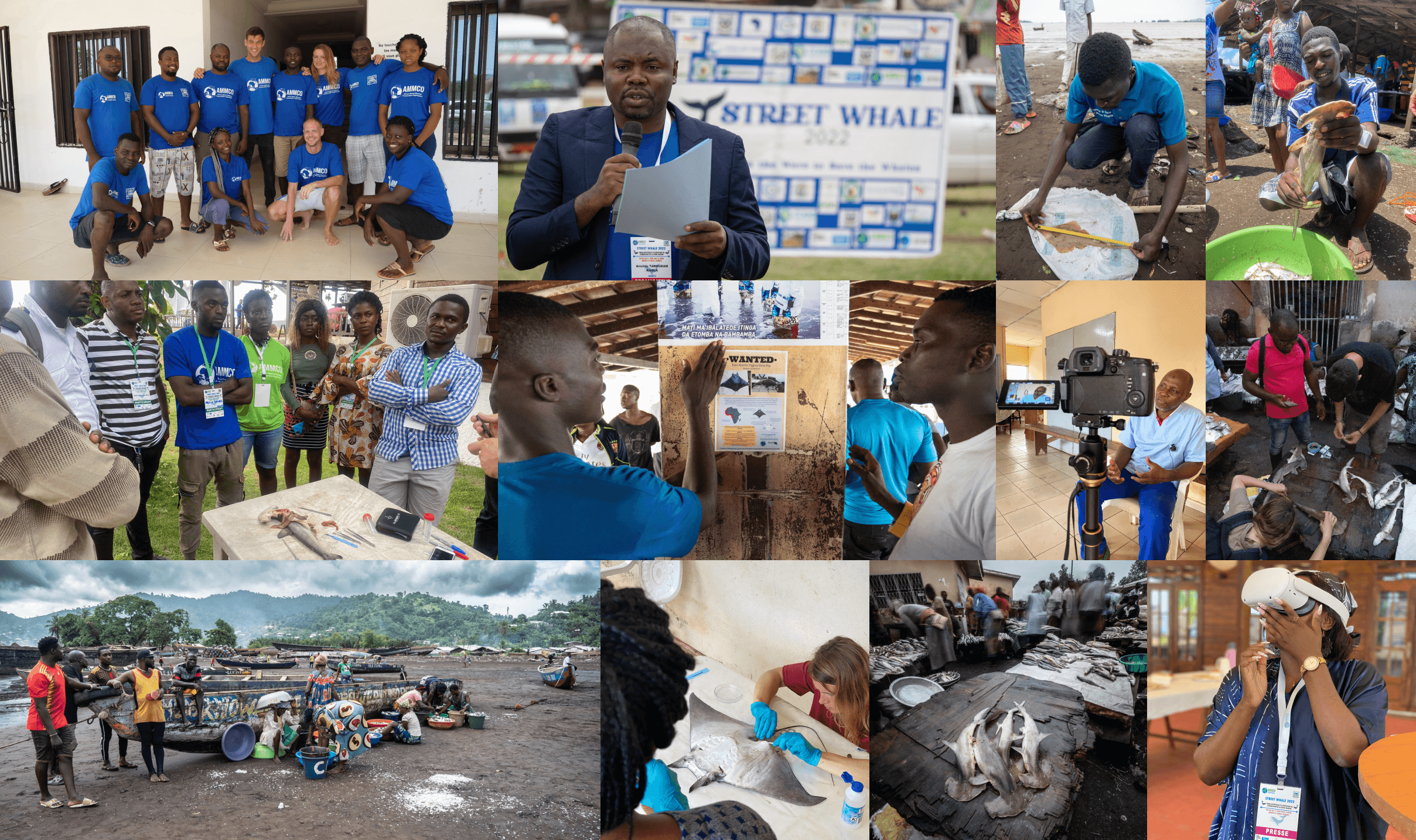
Co-designed a new experience that improved clarity and accelerated the validation of observations for two user groups. In Cameroon, megafauna such as whales and sea turtles face threats from poaching, bycatch, and habitat loss.
IMPACT
Project timeline
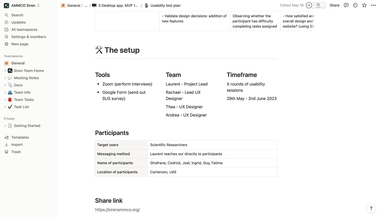
Nov 2022 - May 2023 (11 months)
my role
Mobile application and webapp
Competitive analysis
Heuristic evaluation
Redesign
Usability testing
Team
x3 UX Designers
x1 Project Lead
x5 Engineers
x1 Field Assistant
Tools
Figma
Miro
Gitlab
Slack
The challenge
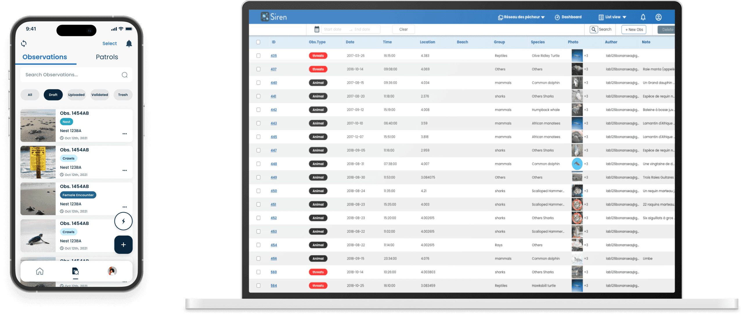
Fishermen initially recorded data manually. AMMCO built an app and web platform, but it was unintuitive and lacked key features. The goal was to create a user-friendly app for offline data capture and streamline the web app for better usability, accessibility, and data management.

the solution

PROCESS AND INSIGHTS
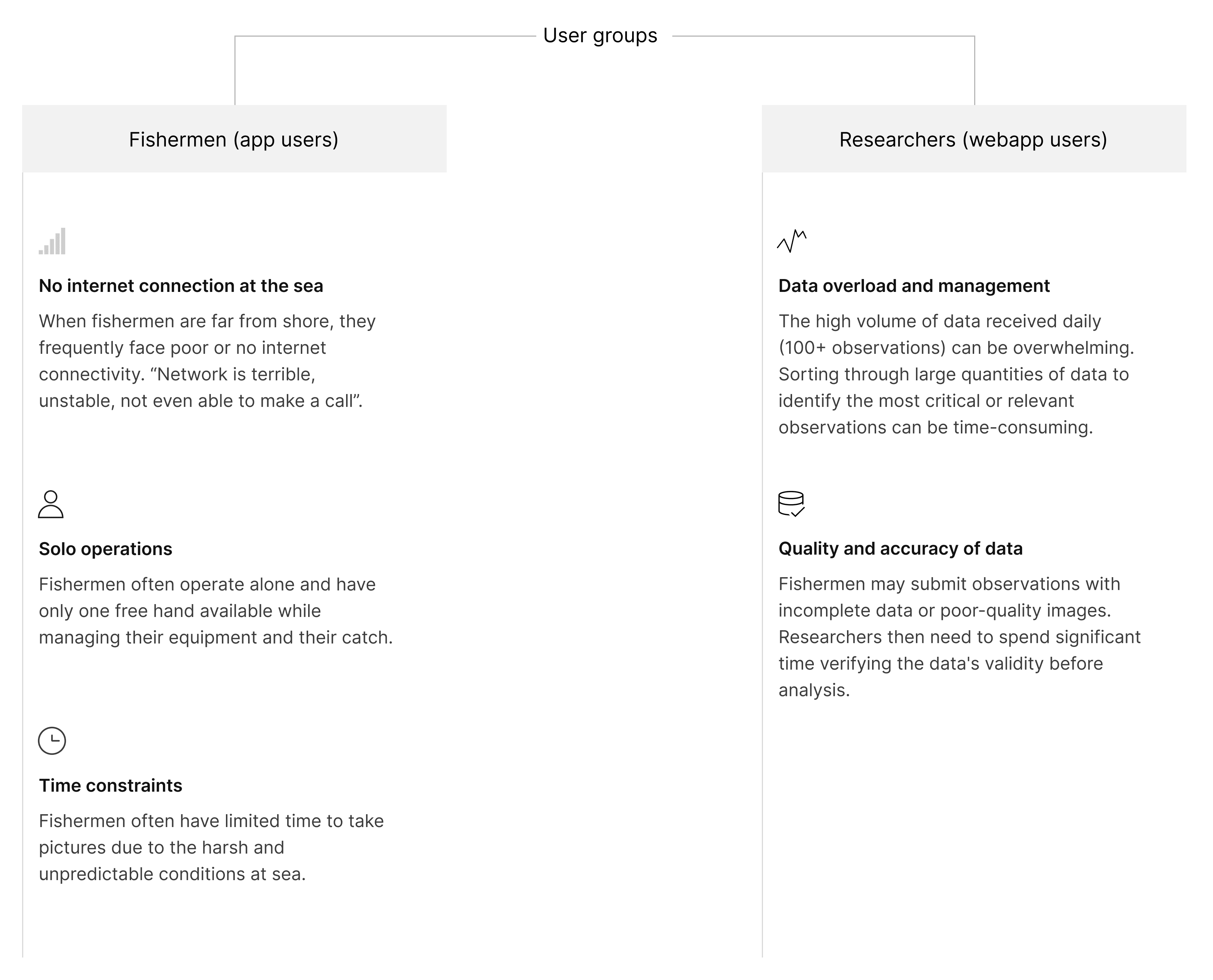
research
We conducted primary research with three of our target users - fishermen - and reviewed previous research of the interviews held with the our second target users - researchers. Here’s what we discovered:
design - mobile app
How can we ensure fishermen at sea in windy, rainy, and unfavourable conditions can upload observations as quickly as possible?
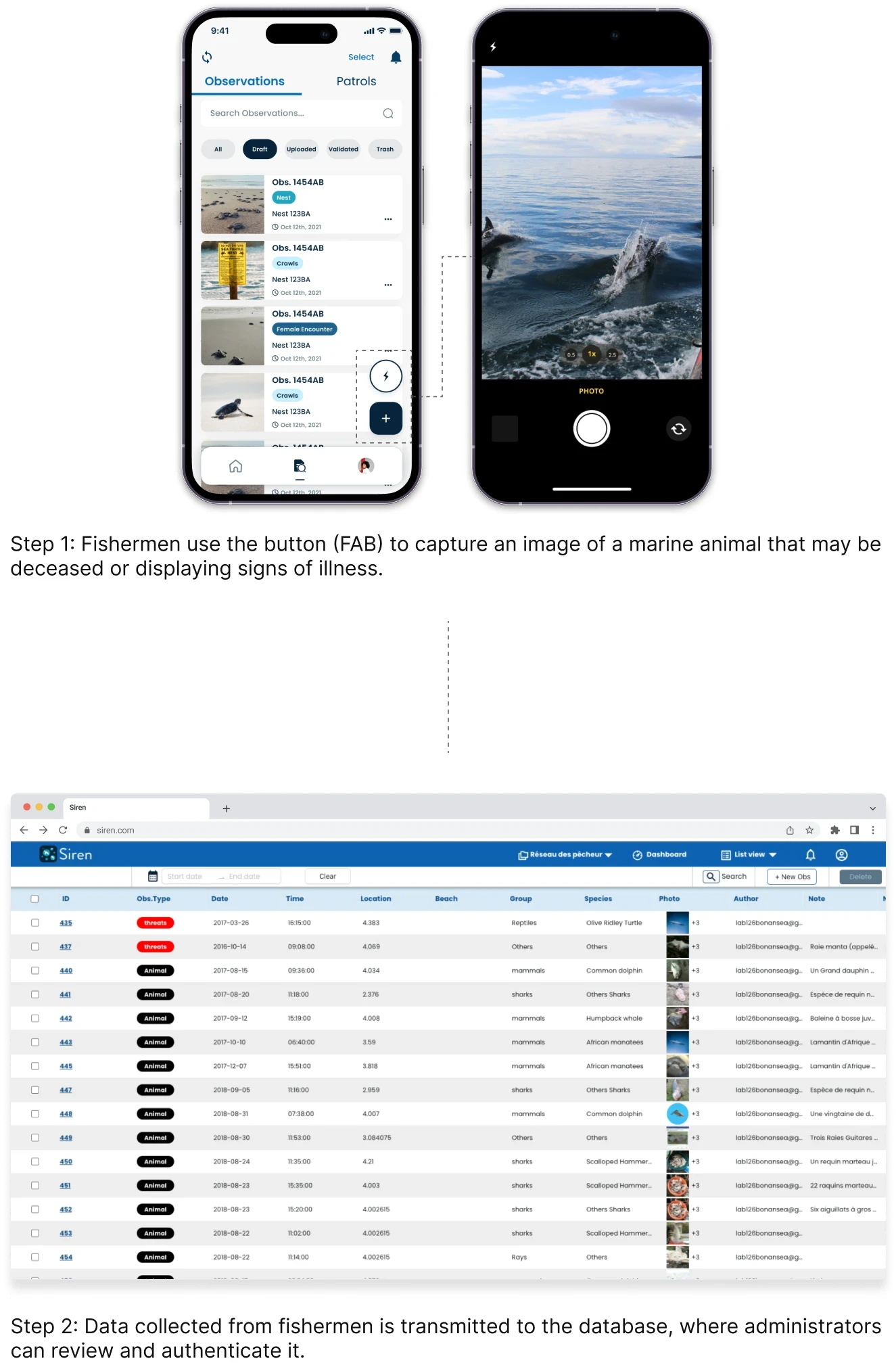
With all the necessary preparation in place, I began designing a feature to help fishermen quickly upload observations to the webapp. Previously, users could only upload one observation at a time, which was cumbersome. The new feature streamlines this by allowing multiple observations to be uploaded at once.
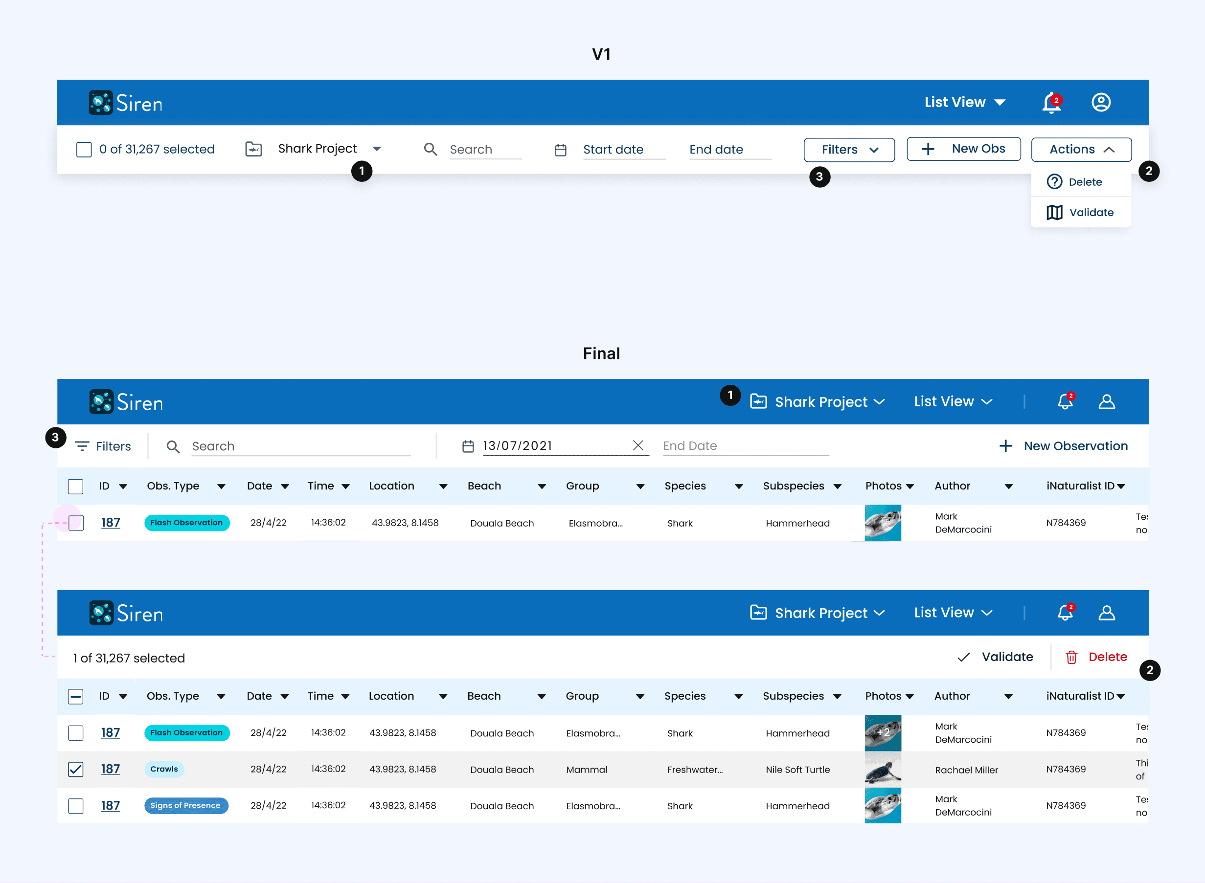
Select and upload multiple observations at once
The initial design showed actions like "Upload" and "Delete" in a top bar but lacked a "Cancel" button.
The improved version adds "Cancel" and checkboxes for bulk selection. We replaced the tertiary buttons with icons to enhance usability and quick recognition, accommodating non-native English speakers and challenging fishing conditions. This change helps capture more observations efficiently and saves fishermen time.


Monitor real-time progress
Fishermen need to track uploads, especially with limited connectivity at sea. The initial design used toast notifications, which were easily missed, obstructed the "Add Observation" button, and risked accidental cancellations.
The final design replaced them with a visible circular progress loader and a cancel option for delayed or mistaken uploads.
design - Web app
I conducted a thorough evaluation of the design using Nielsen's 10 usability heuristics, identified areas for improvement, and prioritised issues based on severity using a 0-4 scale to reflect the importance of each issue.
Heuristic analysis of the current platform using a rating scale between 0-4.
0: Not a usability problem; 1: Cosmetic problem; 2: Minor usability problem; 3: Major usability problem (important to fix); 4: Imperative usability problem (must fix)

This project was new territory for our design team, making it challenging to find direct competitors, but we succeeded. We also analysed indirect competitors like Google Maps and Airbnb for valuable insights. I've only written notes for the navigation and table sections.

Analysing the map and list views of both direct and indirect competitors, including examples like iNaturalist, Airbnb, and Global Fishing Watch shown in the picture.

Competitive analysis table. Abbr.: D - direct competitor. I - indirect competitor.
We then moved on to designing the webapp, which was a highly collaborative effort among all three designers. My contributions focused primarily on the global top navigation, as well as key features within the table and observation modals.
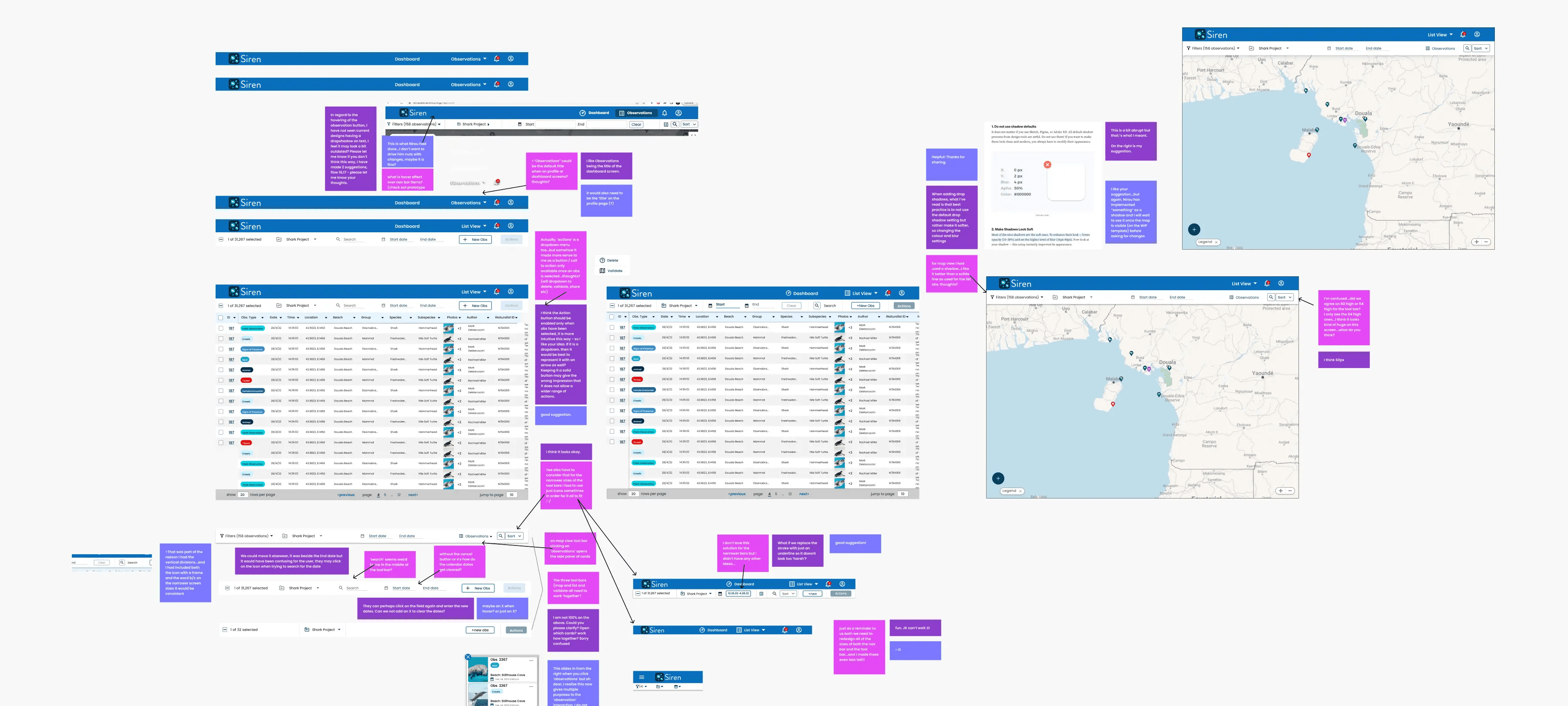
Designing the map and list view involved collaborative discussions, where we explored various options, provided reasoning for our choices, and ultimately reached a consensus.
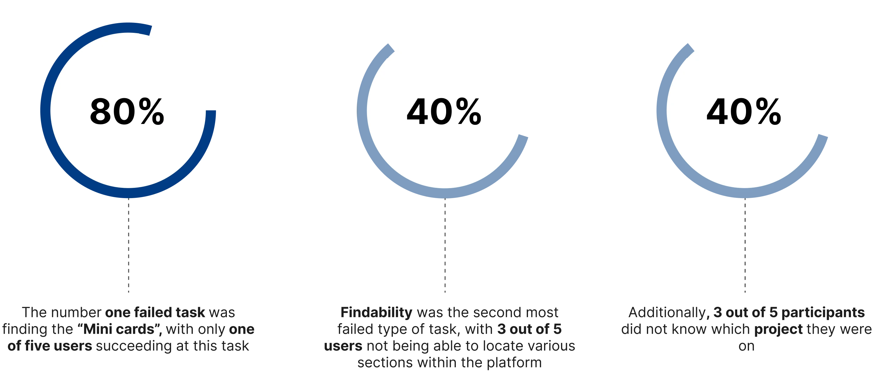
Researchers focus on observation type, species, and location first. How can we streamline the process to help them quickly locate, review, and validate the right observations while minimising time spent?
We developed the top global navigation for the web app by exploring various design options and gathering feedback from stakeholders. In the final version, we simplified the design by removing unnecessary features. This streamlined the navigation to four key features: filters, search, date, and new observation creating a more intuitive interface.
1: Grouping related elements improves discoverability and reduces cognitive load;
2: Contextualising actions within the table reduces clutter and confusion;
3: Placing Filters and Search together creates a logical flow for quicker data discovery.
DEV handoff
All our software developers were based in Cameroon, which posed challenges due to poor internet connectivity, preventing us from relying solely on Figma for behaviour and component specs. Without a dedicated business analyst, we wrote the acceptance criteria ourselves. To address these issues, we created detailed PDFs to outline the design behaviour and requirements.

usability testing
Interviews
We had six Zoom interviews with participants from Cameroon and the UAE. The UX team rotated roles as moderators, note-takers, and observers during the remotely moderated, recorded sessions. Each hour-long session was divided into eight sections, focusing on error tracking, impression tasks, and exploratory tasks. Using the "think aloud" protocol, we minimised interaction to observe participants' natural behaviour.
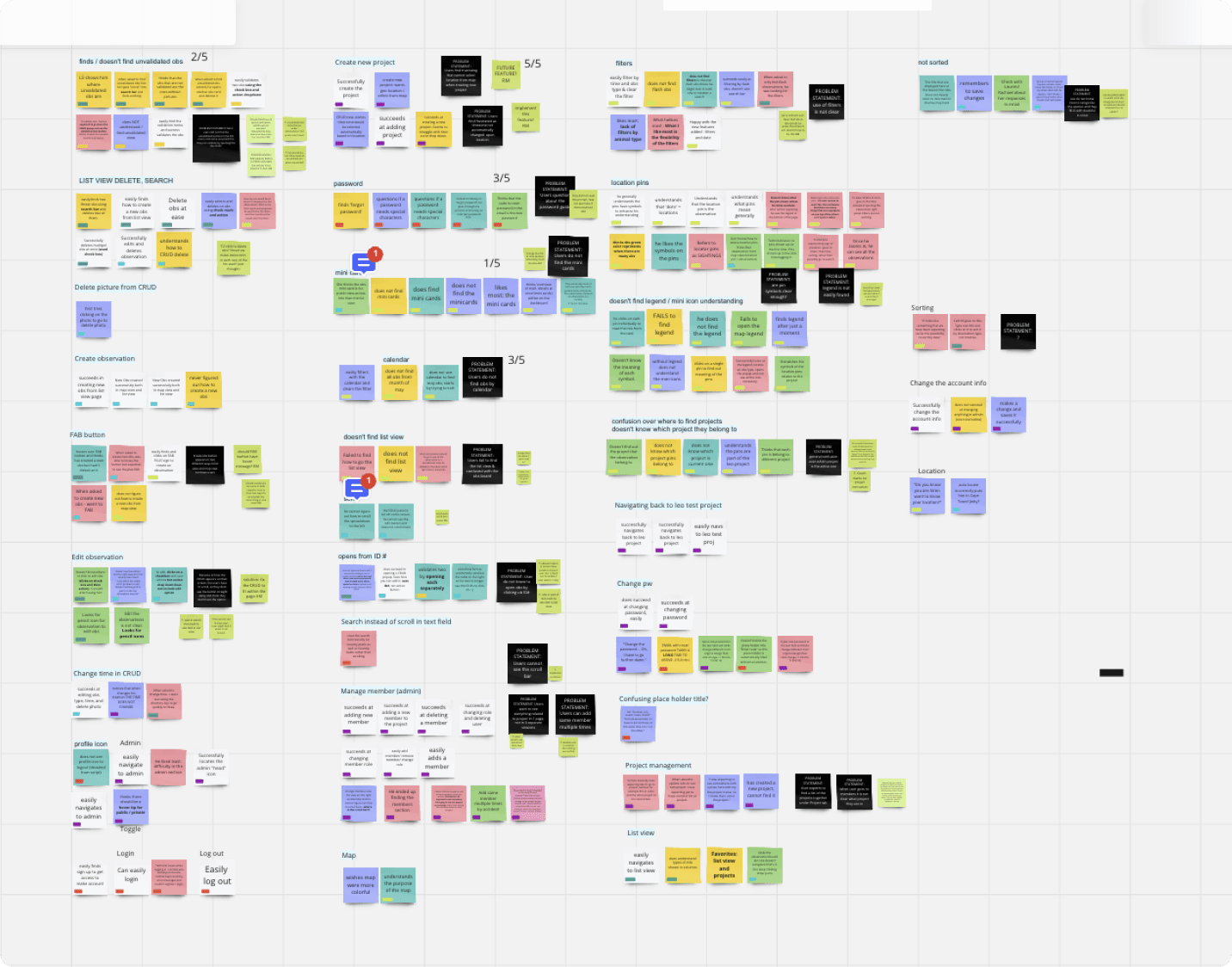
Identifying patterns and prioritising key issues from interview data
We documented interview insights as sticky notes in Miro, initially categorising them by section to capture participant experiences. Next, we rearranged the notes into non-section-specific groups and added problem statements alongside potential solutions for each.
Finally, we prioritised the most significant issues by allocating three stars each to the problems we found most critical.


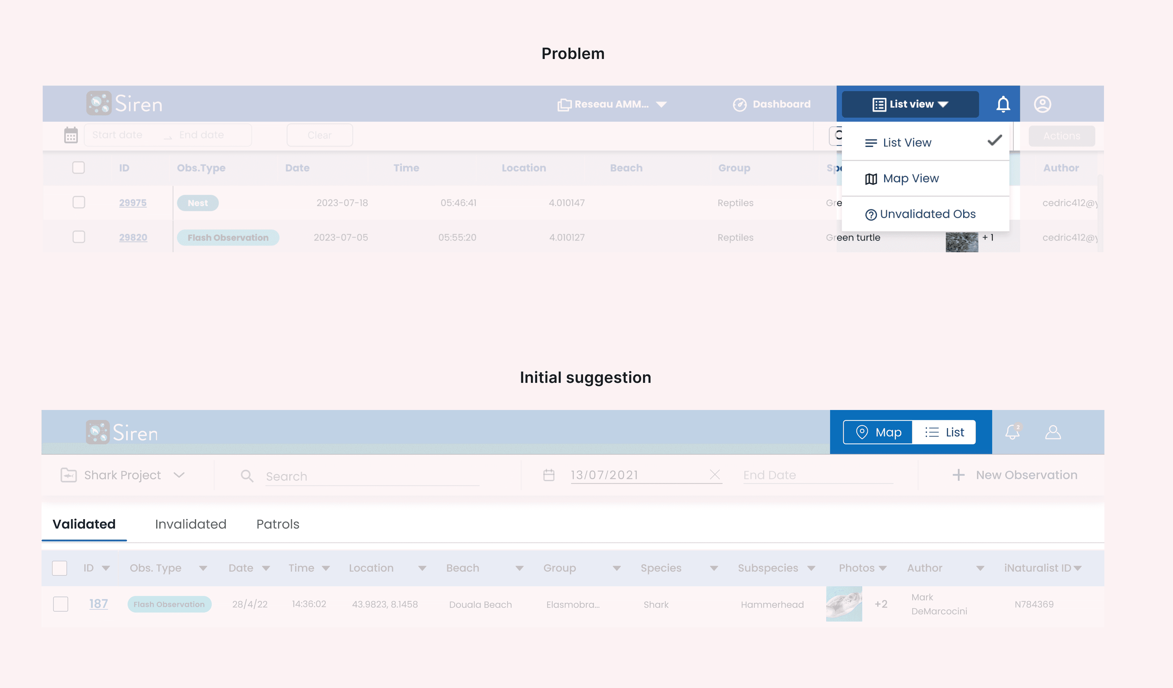
Users struggled to find how to switch between map and list view
The drop-down menu was hard to find, making it challenging for users to switch between views. Initially, we experimented with a toggle for switching between map and list views and explored using tabs to organise different observation types for easier access.
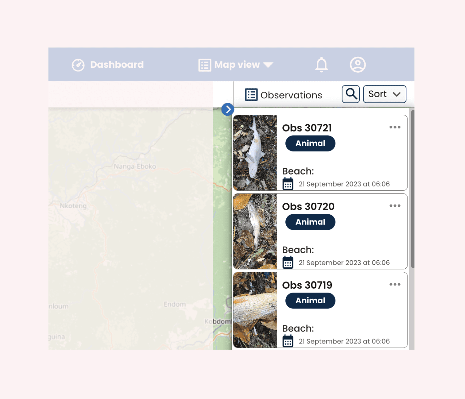
The majority of users found it difficult to locate the observation drawer
To improve the findability of mini cards, which previously required users to click the observation button in the toolbar, we implemented a simple, easy-to-develop solution: having the mini cards open by default, inspired by platforms like Airbnb.

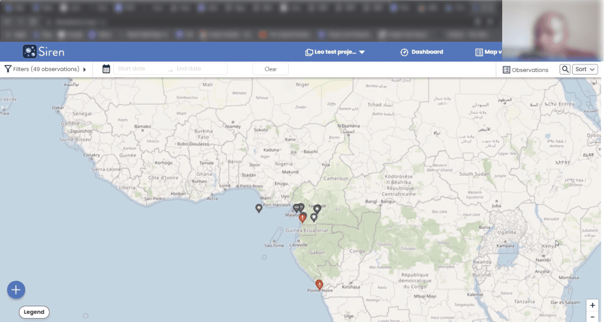
Slow loading times with large amounts of data
The map experienced slow loading times for users. To address this, we explored grouping observations into clusters instead of displaying all data simultaneously. This solution is still in progress.
We initially aimed to avoid creating a guide/user manual, relying on the web app's intuitiveness. However, we discovered that some users are not as tech-savvy and require instructions. Currently, this is a PDF guide, but in the future, we might transform it into an interactive onboarding experience.
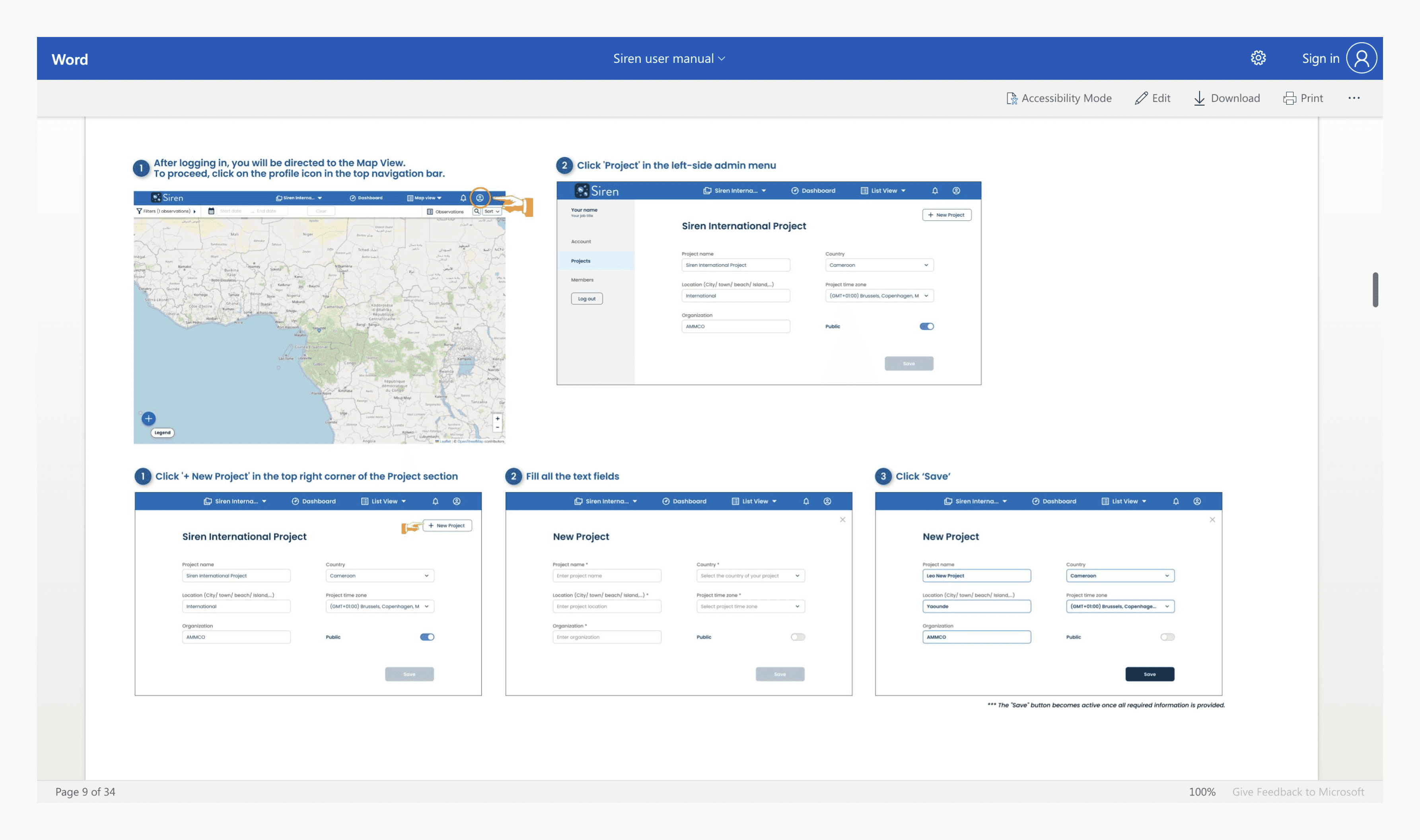
The Word document guide for new users on how to use the web app.
Fishermen may enter errors like typos, mismatched descriptions, or blurry photos, which researchers must investigate. Artificial Intelligence 🤖 could provide instant species identification and photo quality checks, prompting corrections and saving researchers time, speeding up the process for government review.
Fishermen volunteer to record observations which may affect the quantity and quality of data. To address this, we could introduce gamification strategies 🎯 like leaderboards to showcase top contributors and implement monthly challenges to foster engagement. Partnering with National Geographic could also add value by offering special badges or rewards that recognise their commitment to conservation.
Design active onboarding to replace the user manual.
This project was incredibly exciting. However, due to budget constraints as an NGO, we had limited resources, resulting in a small development team and a prolonged development process.
The language barrier between the UX team and developers hindered communication, and we primarily relied on the project link for collaboration, a practice we began to change towards the project's conclusion.
Unfortunately, we shipped the product to production without conducting usability tests beforehand. This decision had significant repercussions, as certain elements, such as the toolbar in the map and list view, require a complete redesign.