mobile · B2c / d2c · Med-tech


introduction
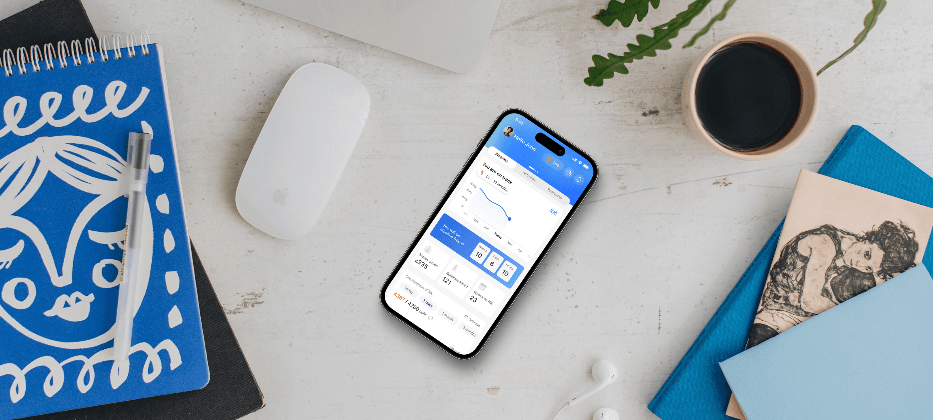
NX Labs is a proof of concept presented to angel investors for funding. I designed the app that connects to the device, helping users reduce nicotine intake through personalised plans.
IMPACT
The project successfully secured distribution and supply contracts, leading to product sales.
Project timeline
May 2024 - August 2024 (4 months)
my role
Mobile application
Primary and secondary research
Competitive analysis
Team
x1 Product Designer
x1 Software Engineer
x1 Industrial Engineer
Tools
Figma
Chat GPT + Gemini
the challenge
Millions of nicotine users attempt to quit but fail, WHY?
Most quit attempts fail due to withdrawal, habits, and lack of personalised support. Traditional methods overlook individual behaviours, leading to relapse. Breaking routines and managing triggers are key to successful cessation.

Personal observations highlighted the true severity of the problem
I noticed the widespread issue when I saw many vapes purchased from a single store, noticed discarded vapes on the ground, and observed how much my partner was consuming.

the solution
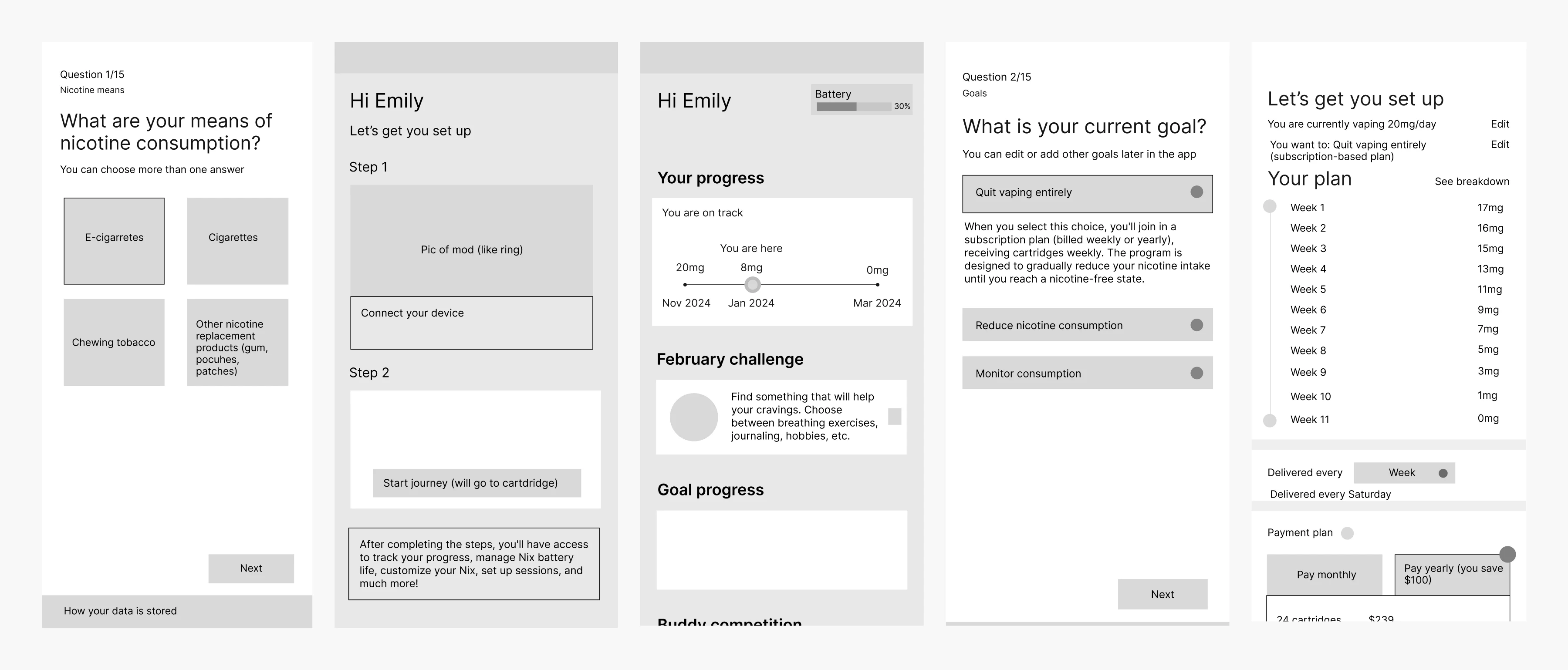
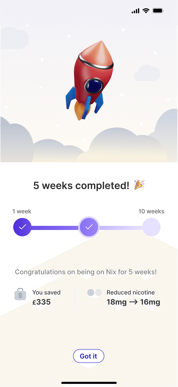
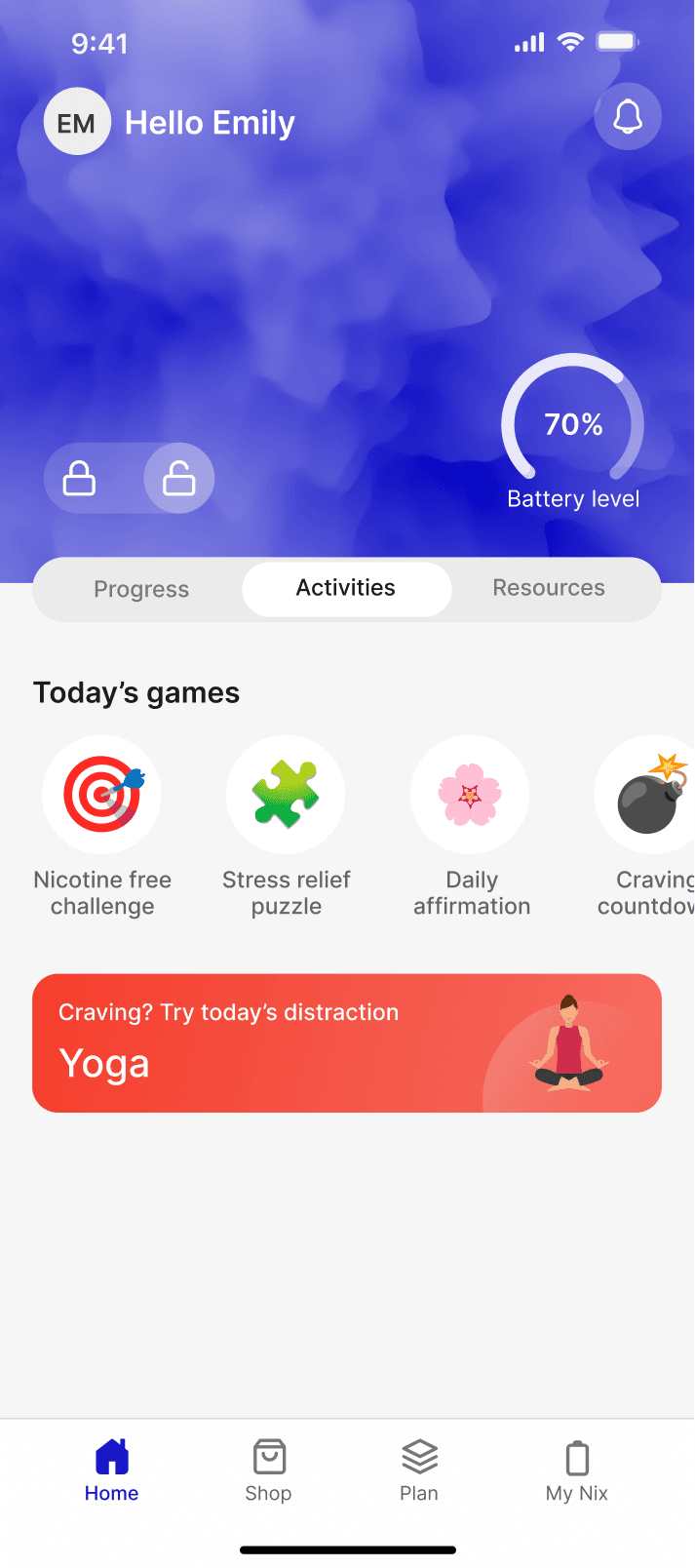
The app helps users quit vaping with a personalised approach. After onboarding, it collects behavioural data to create a nicotine reduction plan. In the first week, the NX device tracks baseline data to refine the plan. Users then gradually reduce intake with support, progress tracking, and motivation through reminders, gamification, and social comparisons.

PROCESS AND INSIGHTS
research

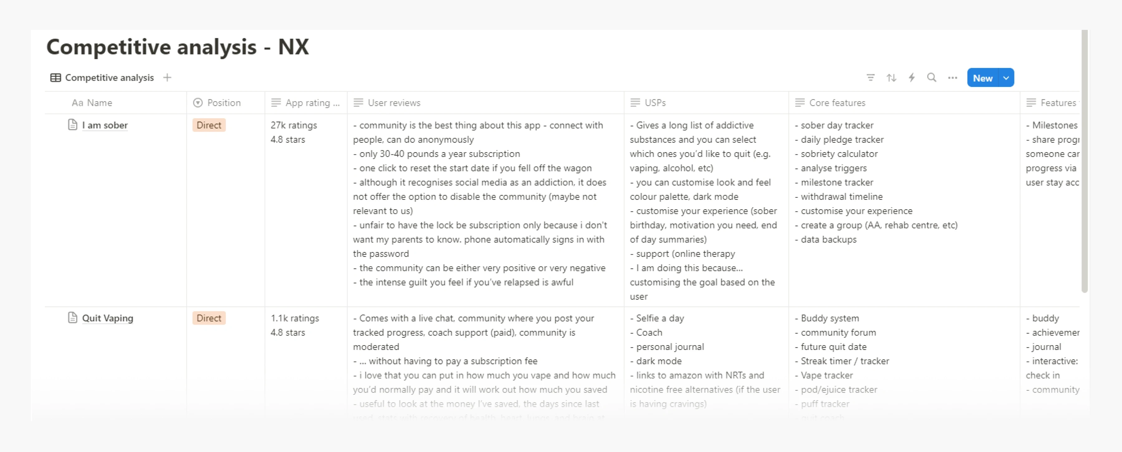
I explored the App Store with the goal of finding apps aligned with helping users quit nicotine. I identified a few relevant ones and documented key details in Notion, including their core features, user reviews from the App Store, and unique selling points (USPs).
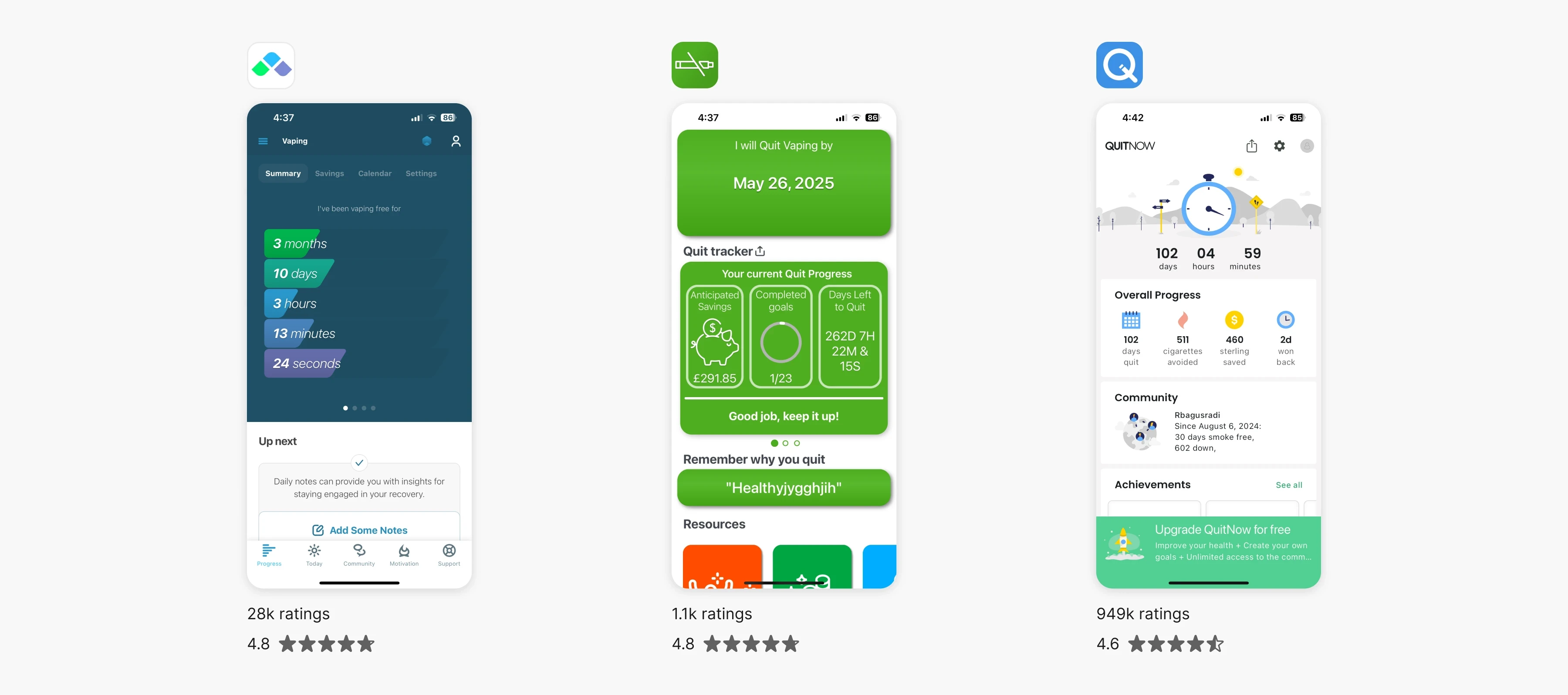
A graphic showing the three biggest competitors: I Am Sober, Quit Vaping, and Quit Now. They are ranked by the number of ratings, from highest to lowest, along with their respective star ratings.
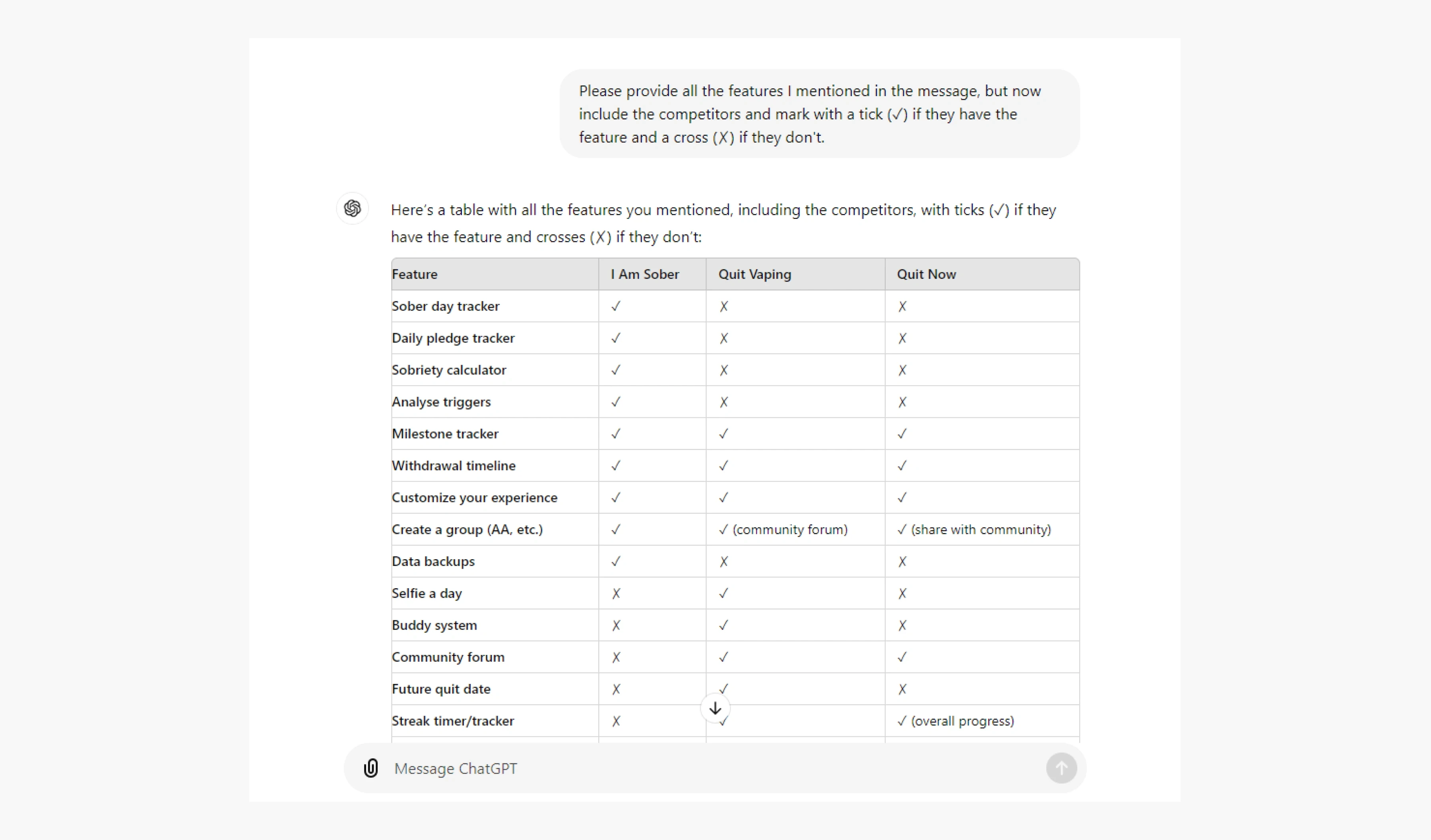
As we move further into the era of AI, I used ChatGPT to efficiently organise the data I gathered. In my Notion, I listed the features and unique selling points of competing apps, and then asked ChatGPT to create a table showing which competitors have those features and which don't. This streamlined the process and gave me a clear comparison of the apps.
design
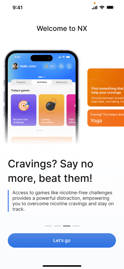
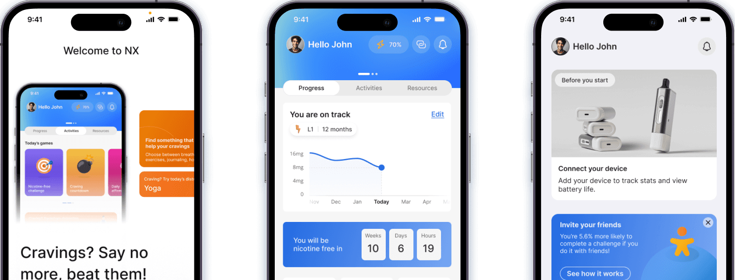
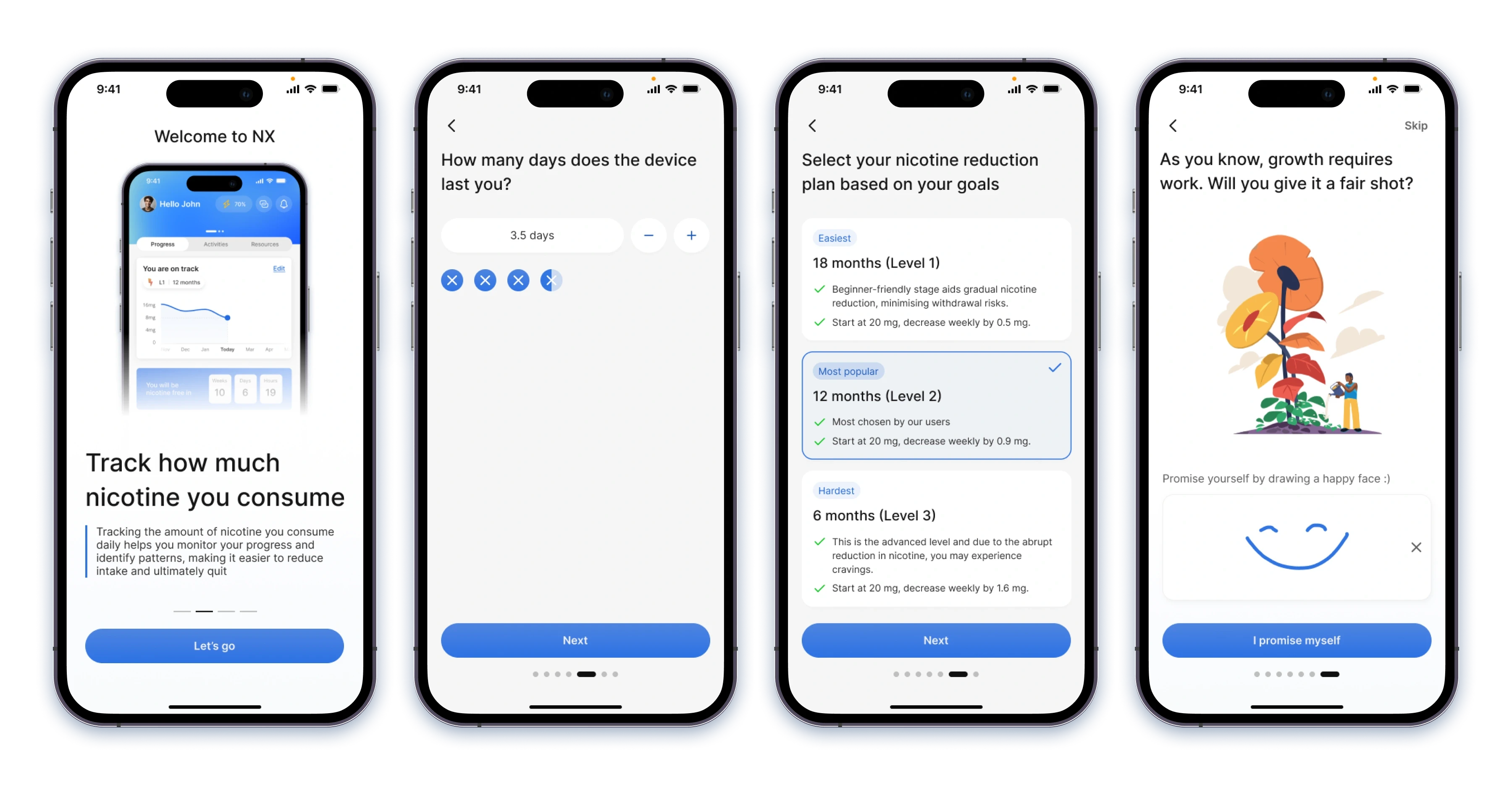
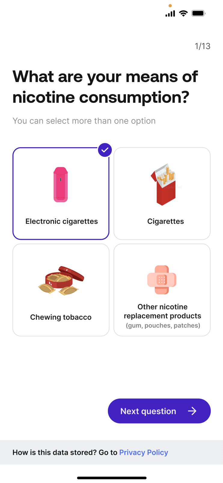
Onboarding is a great way to get to know your user while giving them a sense of purpose. I used positive reinforcement (the "happy face" commitment at the end) which can make the experience feel rewarding. Ending on a positive note can really shape how they feel about the product overall.
Frameworks like the Hook Model help apps like NX drive habit formation. The cue (daily reminder/challenge) taps into the Zeigarnik Effect, making users want to “finish the job”. The action (relaxation exercise) is quick and simple which acts as a gateway to building a habit. The reward (points or streak) satisfies users while motivating them to keep going. The investment (goal setting/progress tracking) activates the Endowment Effect, making users value their progress and return to maintain it.

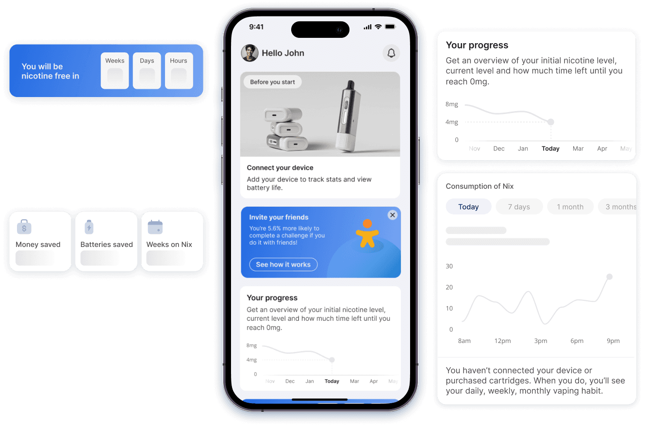
After onboarding, users receive deliverables that highlight the product's value before any payment is requested. This approach removes barriers, encourages exploration of app features, and fosters commitment by introducing key concepts before a decision is required.

We then moved on to designing the webapp, which was a highly collaborative effort among all three designers. My contributions focused primarily on the global top navigation, as well as key features within the table and observation modals.


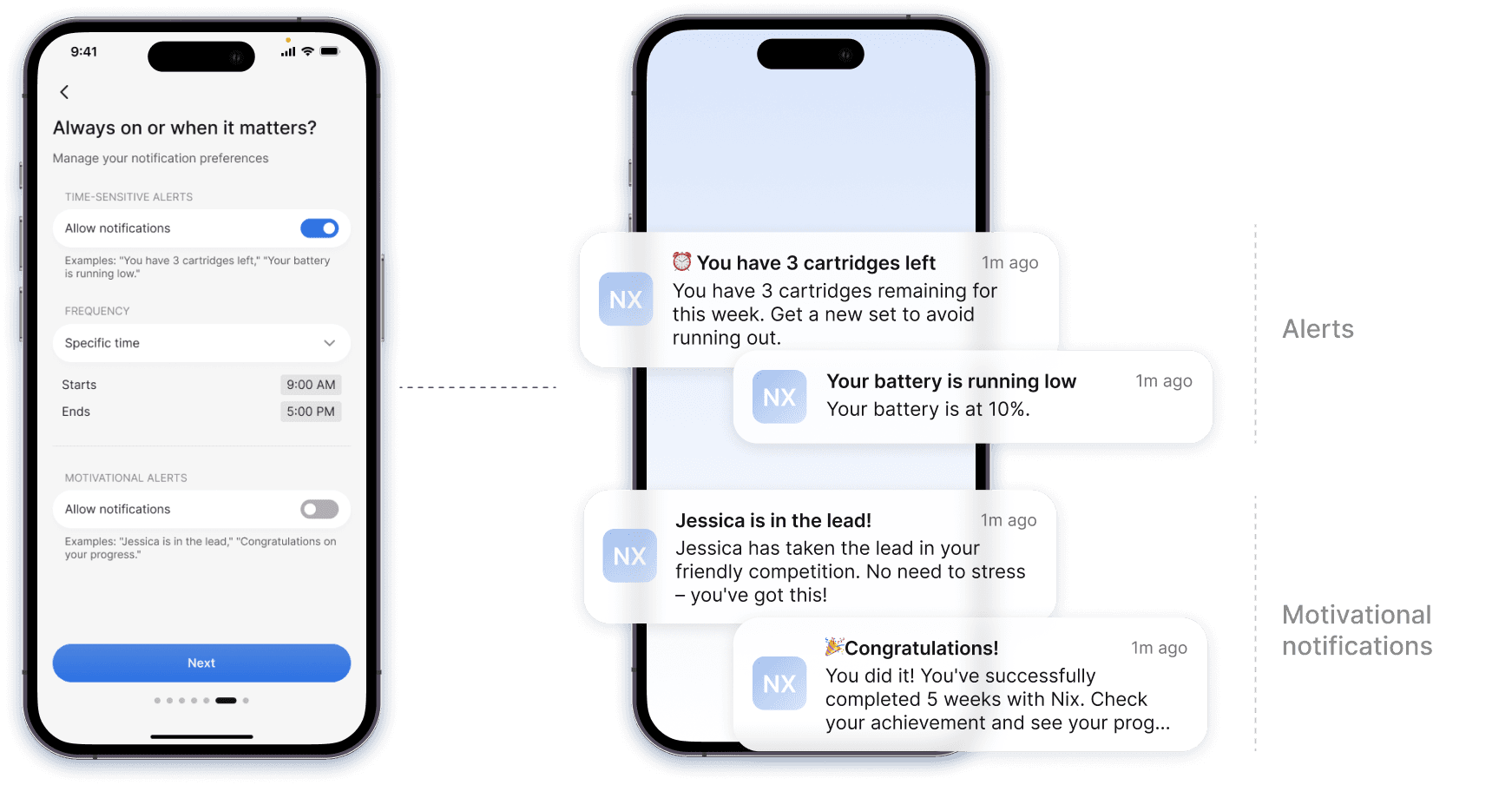
How can we make data visualisations clear, informative, and engaging for non-technical audiences while ensuring accessibility and the ability to convey complex insights effectively and intuitively?
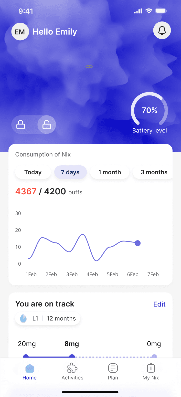
Replacing a sliding control with a line chart
Users on this journey of change need continuous, clear, and encouraging feedback. However, many are unfamiliar with technical data and complex graphs. The comparison visualisation went through two iterations: the first used a sliding control, which was less intuitive, so I replaced it with a line chart showing both data sets and added a bed icon to mark the start of usage.


Simplifying the colour scheme and adding explanatory text for clearer data presentation
The consumption bar chart also underwent 2 iterations. Initially, it had too many colours and a hard-to-read tooltip. I simplified it with one primary colour and added text to explain the data and highlight usage spikes.
From a progress bar to a line chart for better user clarity and interaction
I aimed to show progress toward a goal using a progress bar, but found that data point spacing worked well for users starting at lower nicotine levels but caused overlap for those just starting out. The final version included a line chart which allows users to scroll left or right to view their progress.

Low-fidelity wireframes
Iterations
I went through many iterations before reaching a final result I was satisfied with.


Behind the scenes 👀
Present the MVP to investors to secure funding.
After obtaining funding, develop version 2 of the app, incorporating new features such as LED light customisation, hit level tracking, haptic feedback, wearable integration, and more.
Engaged in extensive research on nicotine cessation, a completely new field, which was both challenging and exciting.
Discovered the high prevalence of vaping, which opened my eyes for the urgent need for effective cessation tools.
The need for a rapid presentation of designs in the pitch deck limited the depth of exploration.
Gained significant experience in data visualisation, contributing to a deeper understanding of user behaviour.
The project emphasised the importance of innovative solutions for public health challenges and provided a solid foundation for future work.