design systems

introduction
We launched this project to unify our design system and prevent duplication. Previously, I unknowingly designed a component that already existed, creating redundancy. Developers also struggled to identify reusable components, leading to inefficiencies.
Project timeline
Aug 2023 - present
my role
18/23 components created
Plan and roadmap
Accessibility
Team
x3 Product Designers
x1 Senior Delivery Manager
Tools
Figma
Zeplin
SharePoint
the challenge
Without a design system, inconsistent terminology caused misalignment, the brand identity became fragmented, and developers faced confusion over components. Teams wasted time searching, relied on ad-hoc designs, and repeatedly redesigned components for consistency.
85%
design process improvement
2
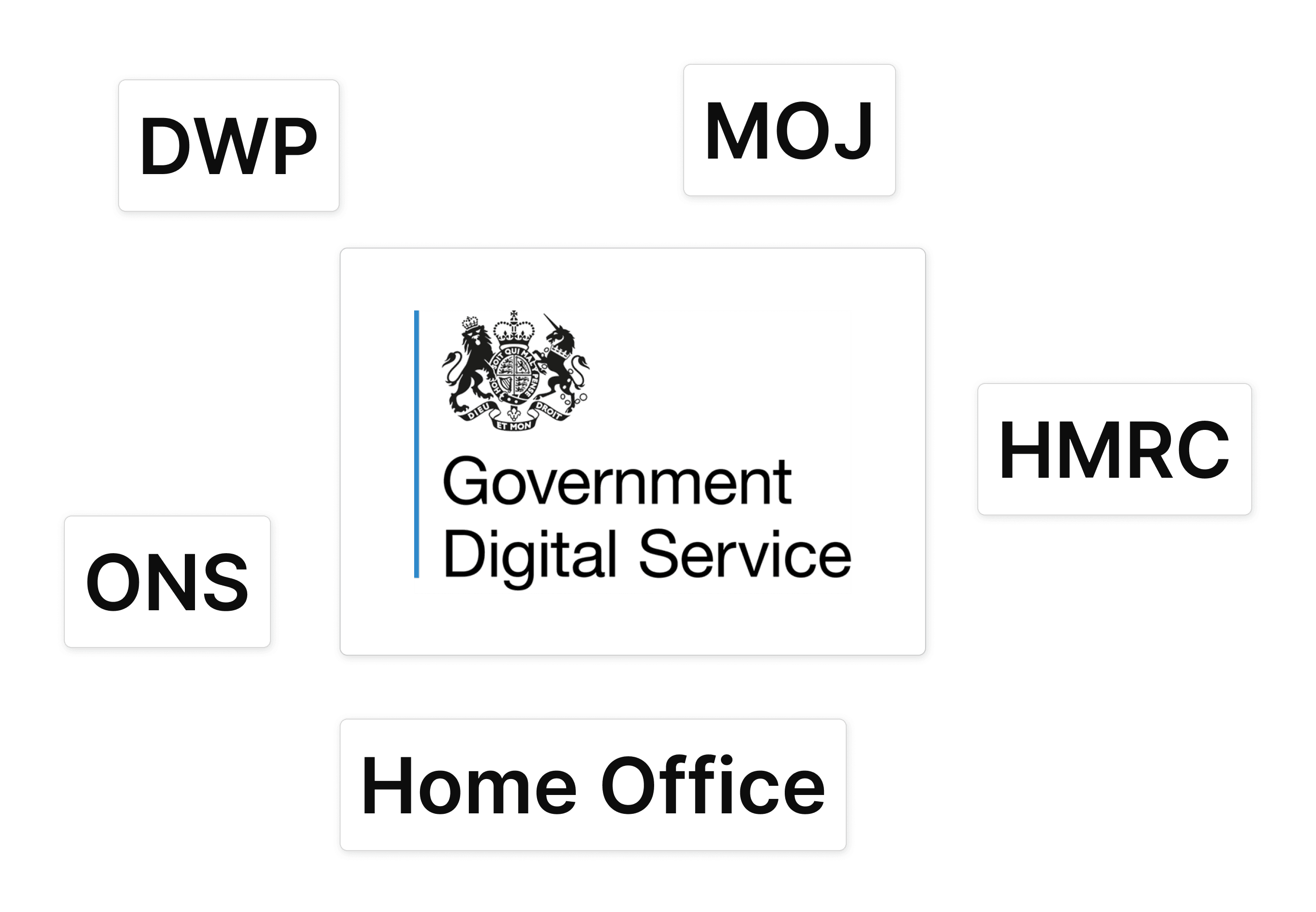
departments using our components
91.3%
improvement per process
PROCESS AND INSIGHTS
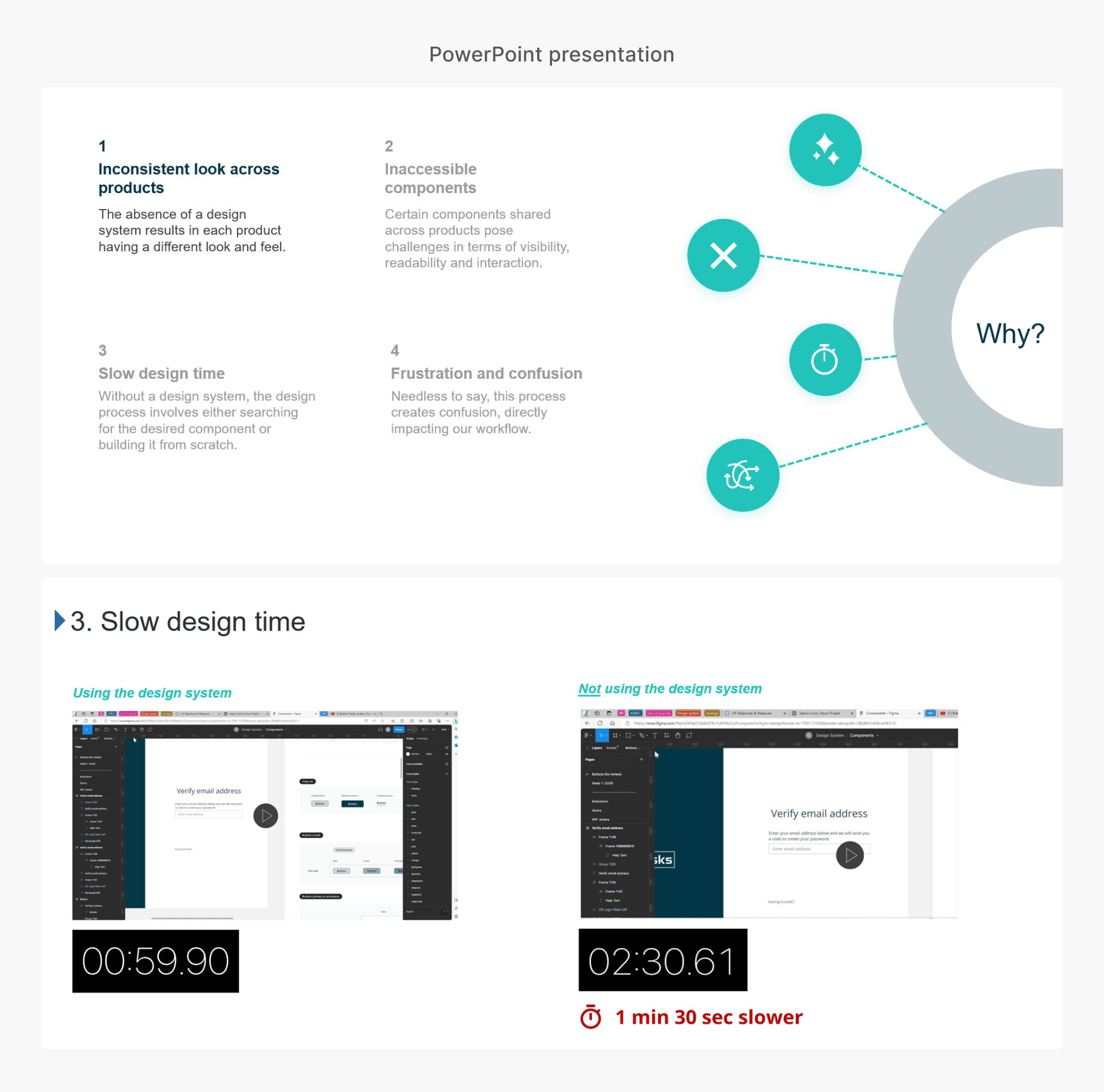
the problem
Joining a team with just one UX designer in a low-UX-maturity company meant the design system lacked necessary components, forcing us to copy-paste from other projects, spend excessive time searching, repeatedly develop the same components, and overlook accessibility.
Our initial component library
The initial component library included colours, icons, the logo, buttons, fields, checkboxes, and radio buttons, but we needed more to ensure faster work delivery.


Screenshots from two of our products revealed the use of inaccessible components with insufficient contrast, lack of responsiveness, and other issues.
Most of our components were not accessible
Many components, such as pagination, footer links, and buttons, lacked accessibility, posing challenges for users with visual difficulties and even average users. Additionally, some products were not responsive on smaller screens, leading to cluttered information and inaccessible interactive components.
the process
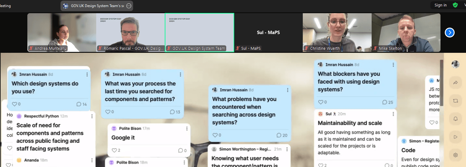
Attending events like the GOV.UK Hackathon 2024 offers valuable insights from leading design systems.
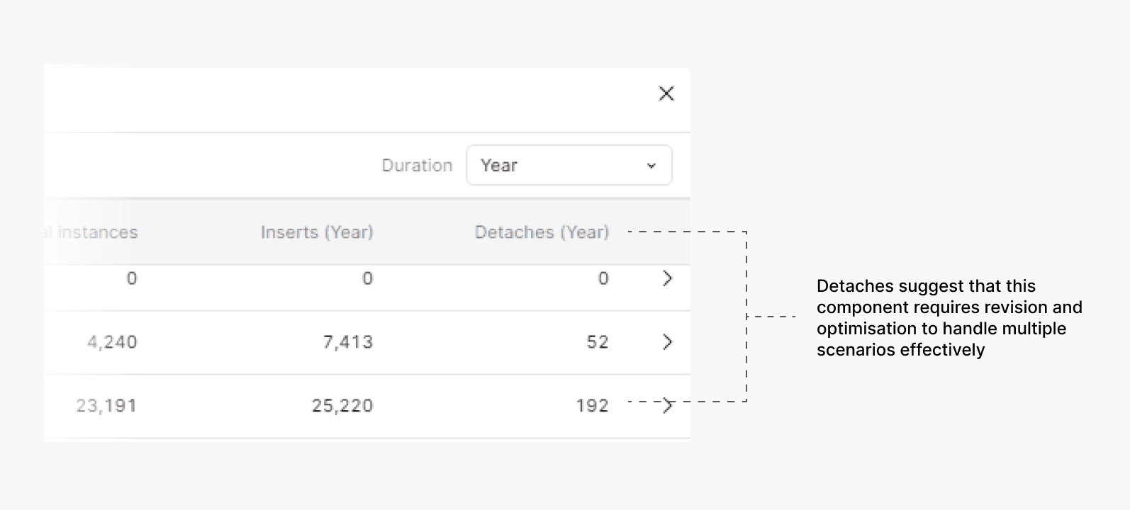
Merging the old design system with the new one was a gradual process. Initially, we continued using components from the old system, but as we progressed, we added more components to the new system until we no longer needed to rely on the old one. At one point, we reached an impressive 6,000 to 8,000 component insertions!

While reviewing current scenarios, unforeseen situations may arise as projects progress. As the components are used more, we'll gain valuable insights into their application across different products.
A component starts as a proposed pattern, created to address a specific need. As it’s used in more products, we refine it based on feedback and real-world use, turning it into an exposed pattern. Once it’s stable and doesn’t need further tweaks, it becomes a mature pattern ready for widespread use.

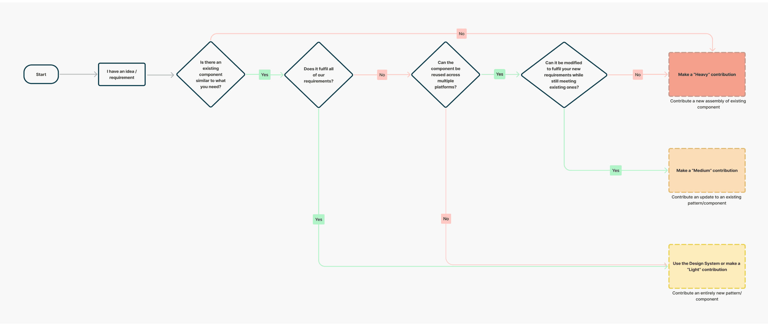
Our governance model follows a cyclical approach, where decision-making is led solely by our design team, while other teams contribute insights and ensure alignment. When designing new features, we check if the needed component exists in the design system. If not, we first make minimal tweaks (light contribution). If that’s not possible, we create a new component (heavy contribution), ensuring the system remains adaptable without unnecessary changes.
"Medium" contribution example (upload component)
The upload component adapts based on space: in a modal, it has a compact design, while in a larger desktop layout, we made moderate adjustments like enlarging the drop area, adding an icon, and including a label.

We reached a point where we had developed a robust component library. To ensure its effectiveness, we held monthly calls with developers to present the components and validate their viability using the hot potato approach. Before deploying the components to production, we thoroughly tested them across multiple projects to confirm their maturity and reliability. Additionally, we conducted internal usability testing with a minimum of three people to ensure that each component or pattern was intuitive for users.


“What’s the point of our design system? Surely, if we are disciplined and everyone is doing what they need to do, it’s all there, organised and labelled. The number of new projects in our horizon are either fewer or standardised to look the same.”
Member of the senior leadership team
Communicating the value of the design system to stakeholders and the senior leadership team helped drive adoption and demonstrated its impact
When we first introduced the design system, we faced resistance due to the extensive collaboration required with developers and the significant effort needed to build the components. As a result, the senior leadership team initially questioned its value.
However, I presented the importance of the design system, and my presentation was well received.
I showcased the design system's efficiency and importance to the senior leadership team using examples and real-life scenarios.
impact
We never imagined that our design system could benefit so many teams and even be used across departments.
Reusing components instead of building them from scratch saves the team an average of 150 hours of work
Previously, developers built each component from scratch, with no reusable components available across products or teams. Now, they have a shared library of over 50 components, enabling reuse and collaboration across teams, saving approximately 150 hours of work.

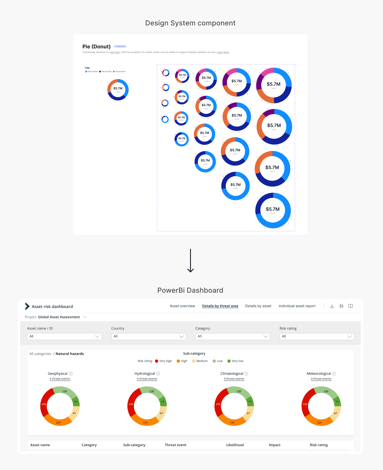
The data analysis teams are using our components to build dashboards in Power BI
We worked extensively on Power BI dashboards and eventually built our own data visualization library, which kept growing. Since we had to test whether these visualizations were possible in Power BI, we ended up with a library that was well-suited for data analysis teams when they needed to create custom dashboards.
Implementing our design system within the marketing department for use on our public website
Our public website, built 7 years ago, was inconsistent with our current client-facing product, creating a disjointed look and feel. The marketing team decided to reuse our components and implement them on the public website, achieving a consistent look.

The design system has been a great initiative, and I'm proud to have contributed so much to it and seen it come to life. Despite facing resistance, we powered through and managed to improve not only our workflow when designing components but also the workflows of developers and business analysts.
Continue building and promoting the design system, with the hopes of other departments adopting it.
Improve and expand the documentation, making it clearer and more detailed, with examples, use cases, and guidelines to ensure ease of adoption by teams.
Collect ongoing feedback from teams using the system and iterate to improve the components and guidelines.
Continue improving the design system's accessibility features to ensure all components meet WCAG guidelines and are usable by diverse users.