Unified, Accessible Dashboard for Store Managers to Easily Review Security Profiles
One of the top technology giants works with our Crisis and Security department and they approached us to enhance the usability of their existing Tableau dashboards. The project aims to make data accessible to store managers across multiple retail locations, allowing them to view the security profile for their specific stores. We leveraged our Crisis and Security department’s analytics methodology to develop a new set of dashboards.
The business lead shared their feedback: "The designs your team came up with are just freaking awesome. It's exactly what we envisioned when we started this. They killed it!" - Jason, Business Lead
Project timeline
March 2024 - August 2024 (5 months)
Team / organizational lines
Product Designers (x2)
Business Lead
Areas
Redesign
Stakeholder interviews
Heuristic analysis
the challenge
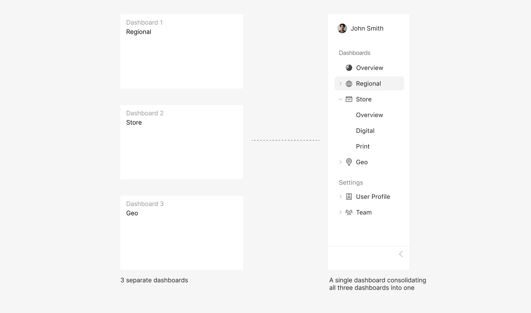
The challenges the client faced with were both visual and usability-related. They presented us with 3 separate dashboards which had limitations due to the use of Tableau, making them neither accessible nor easy to understand. Much of the data lacked context or explanation, making it difficult for novice users to interpret without additional guidance.
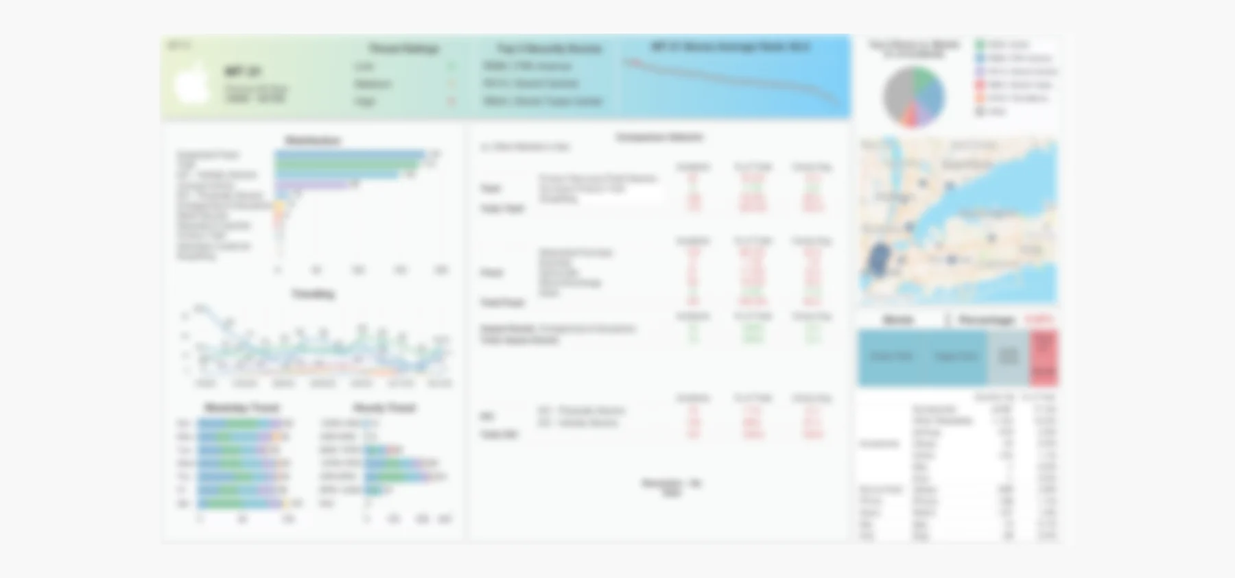
The client supplied three dashboards—regional, geo, and store. The image is blurred to protect sensitive data.
the solution
We developed a unified dashboard that allows store managers to easily review the security profile for their locations. In addition to enhancing the visuals, we significantly improved the dashboard's usability and accessibility.
ideation
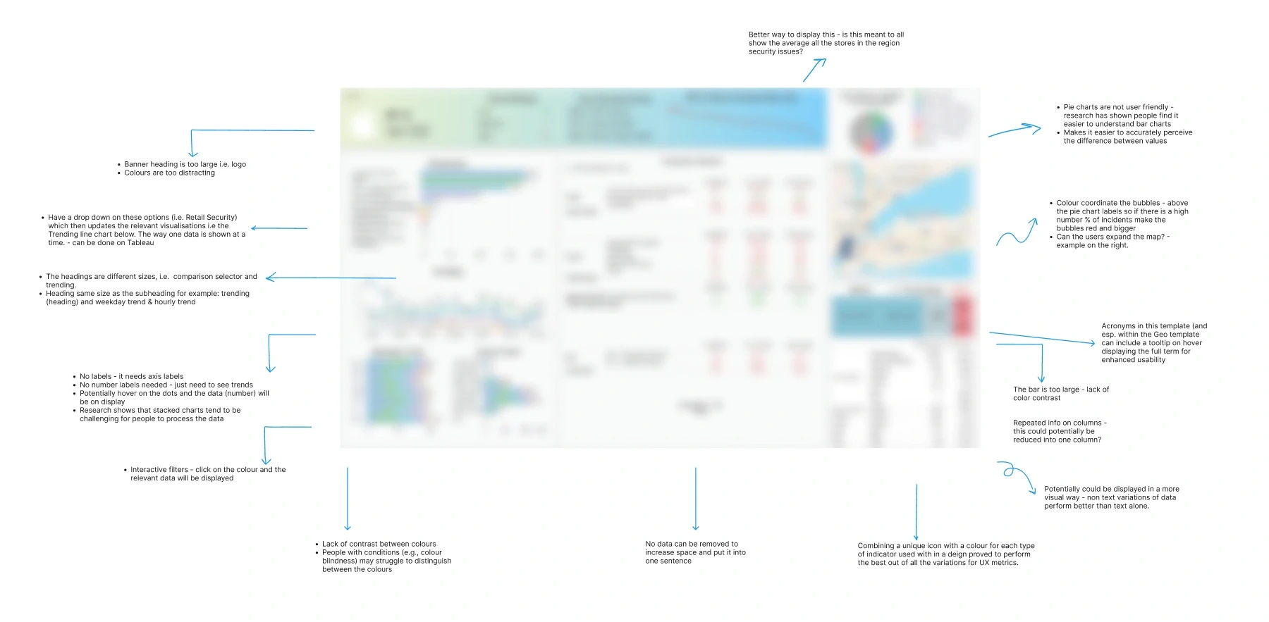
The first step we took was to hold a call and conduct a thorough analysis of the existing dashboard, using both our expertise and the WCAG guidelines. Together, we added comments directly on the dashboard for easy reference.
3.1 Competitive analysis
Working in a B2B environment can be challenging because most of the insights come directly from stakeholders, rather than being readily available online. To enhance our approach, we researched various online dashboards, particularly in the risk management space. We then combined elements from the client’s existing dashboard with ideas from our research, helping us shape a more effective way to visualize the data.

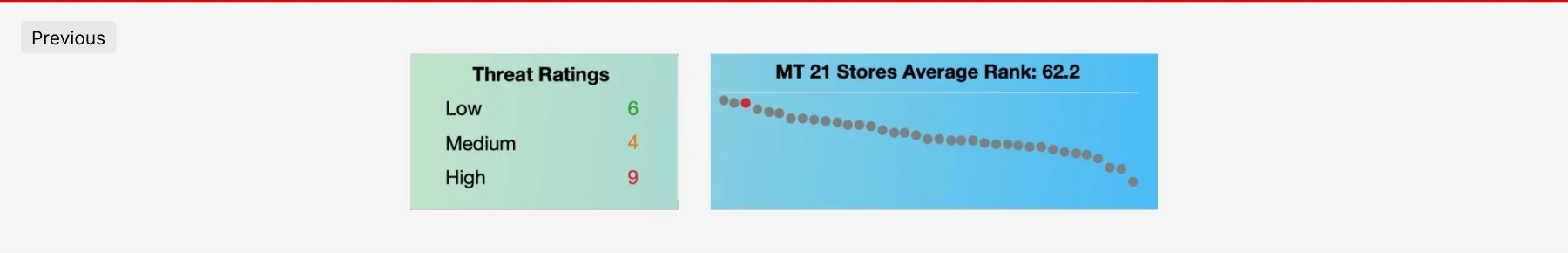
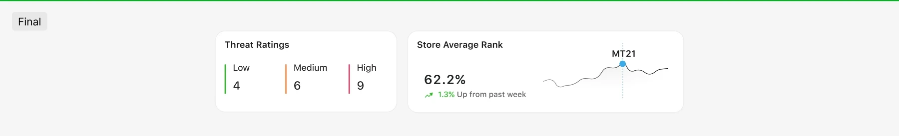
4.4 We organised the layout and provided actionable insights (1.3% up from past week) that guide users toward making informed decisions
4.1 Initial iterations
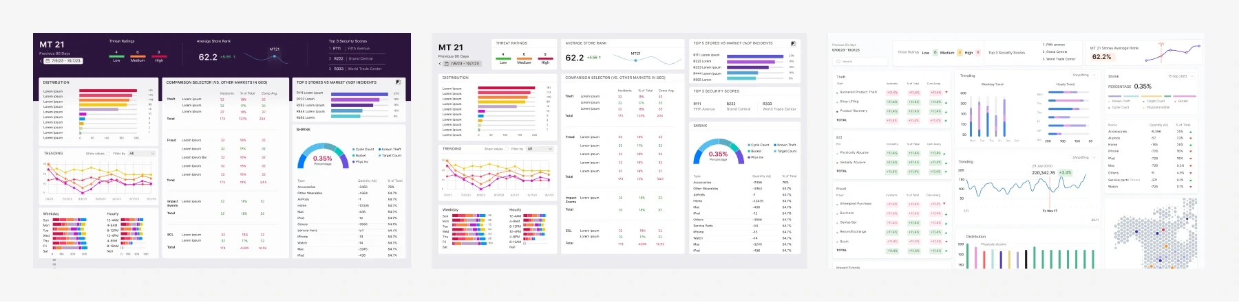
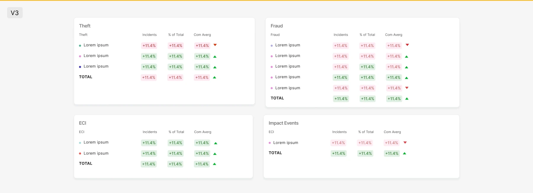
We began by creating several iterations that followed the client's existing layout in Tableau. However, we quickly found it challenging to fit all the necessary information into the limited space available.

We also printed the dashboards to ensure the text was legible and that the colours didn’t blend into each other. The grey had to be adjusted to a darker shade, as the original was too light and lacked accessibility.
4.5 We decided to integrate legends directly within the data visualization to optimise space
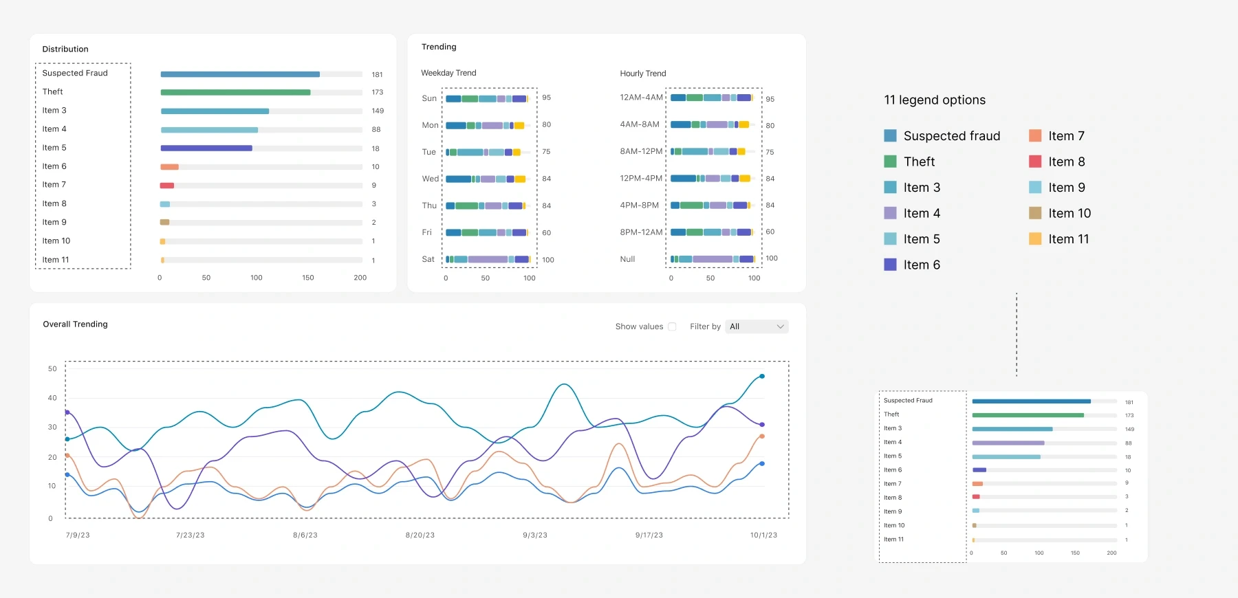
We debated whether to place the legend in a separate section or integrate it into the first data visualization. Since it's the first element, users' attention would naturally be drawn there, and over time, they'd recognize it as the legend. Additionally, selecting an item in the legend would highlight related elements within the visualization, making it more intuitive. User testing is needed to confirm this approach.
design
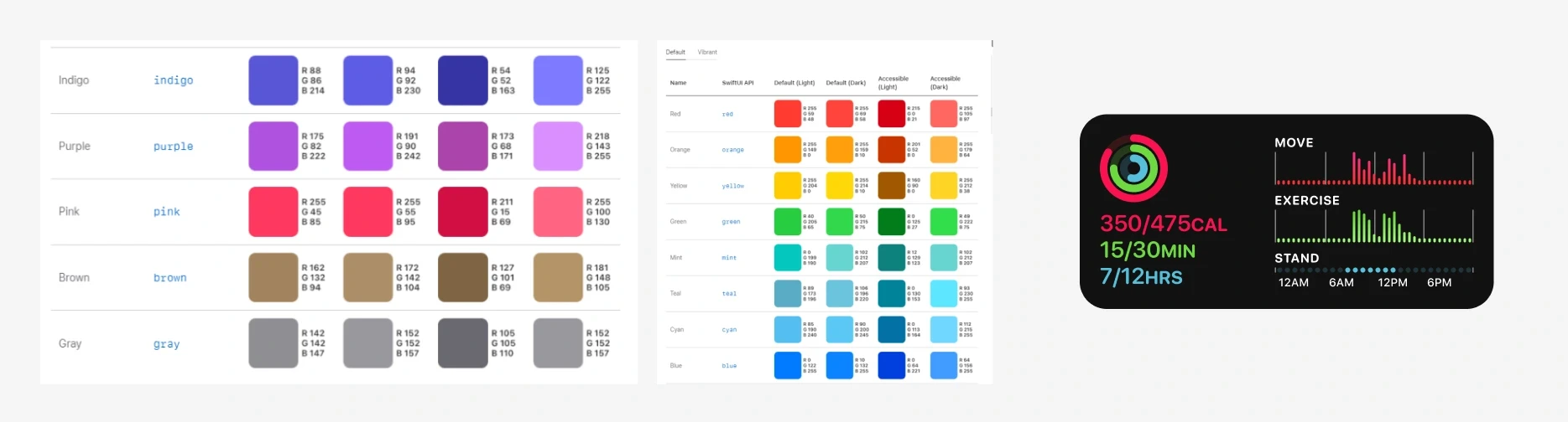
One of the first things we focused on was analysing the client’s colour palette and how they typically combine colours, especially since the dashboard relies heavily on colour-based visualizations.
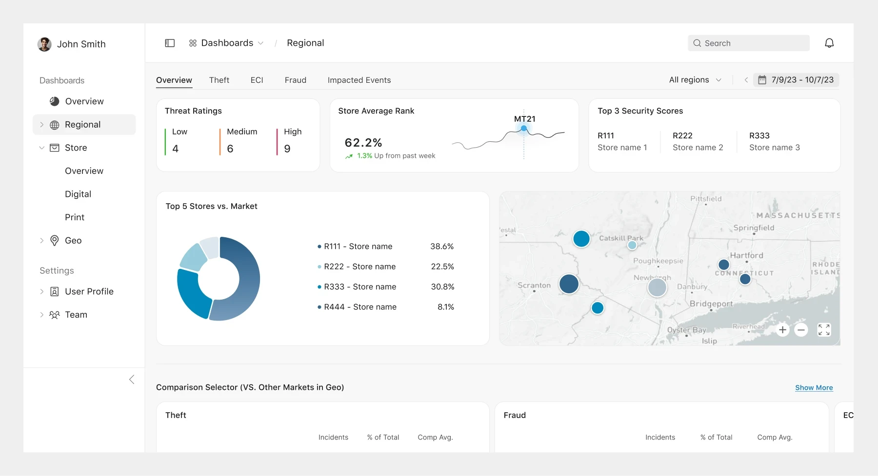
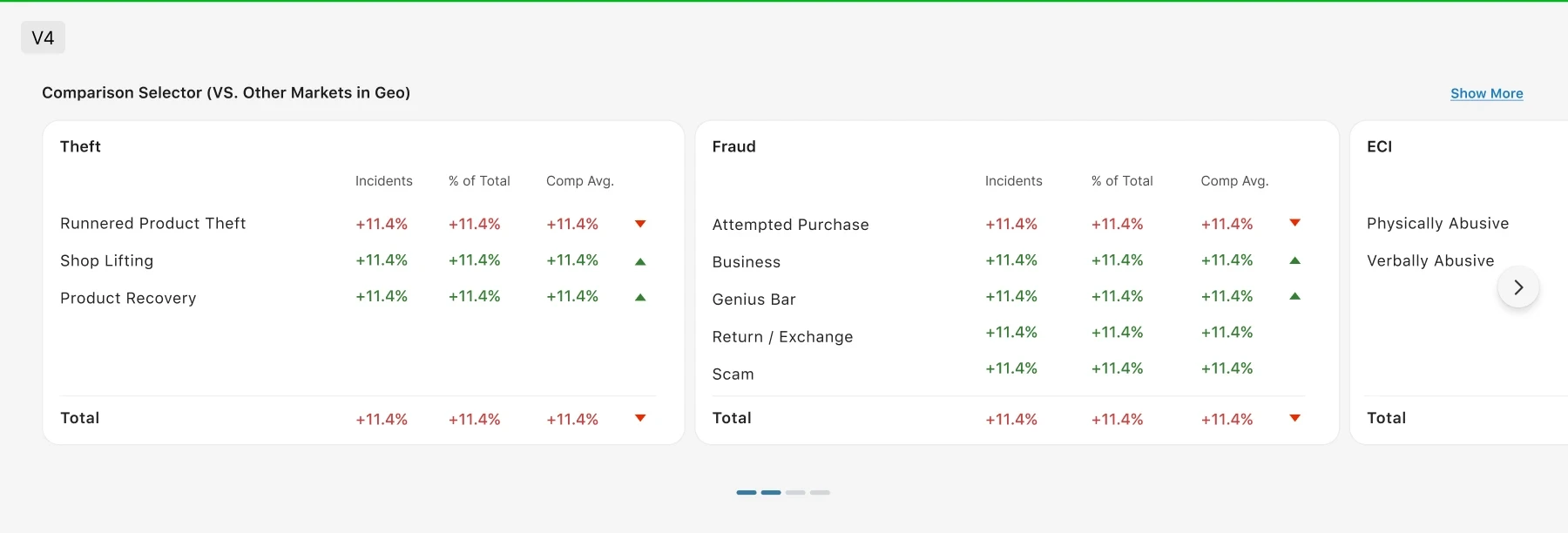
4.2 We proposed moving beyond the limitations of Tableau by developing a custom platform tailored to their specific needs
Since the client liked the idea of creating a custom platform instead of using Tableau, despite the higher investment, we gained the flexibility to redesign the navigation. This allowed us to consolidate the three separate dashboards into one, with a global navigation system for seamless access.
4.3 Although we had more flexibility with space, we aimed to consolidate content as much as possible. For example, we used a carousel to organise the tables efficiently
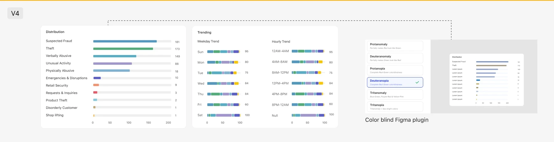
Each legend item represents a distinct, non-sequential category, necessitating the use of clearly differentiated colours. With 11 legend options, we faced the challenge of selecting a colour set that was distinct enough. We used the colours shown above, but with a large volume of data, we needed an extensive colour palette. Additionally, some colours appeared identical to individuals with deuteranopia.
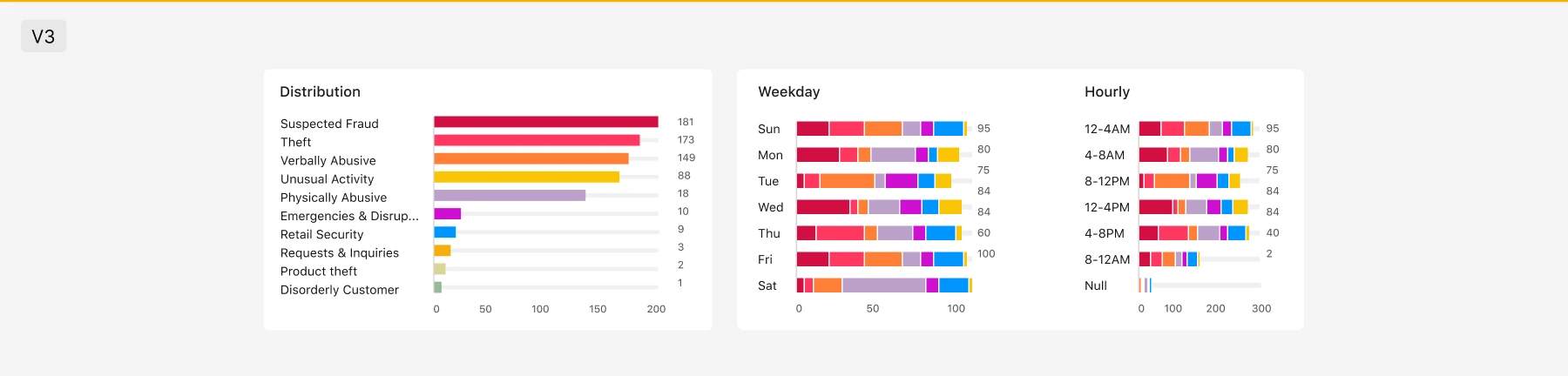
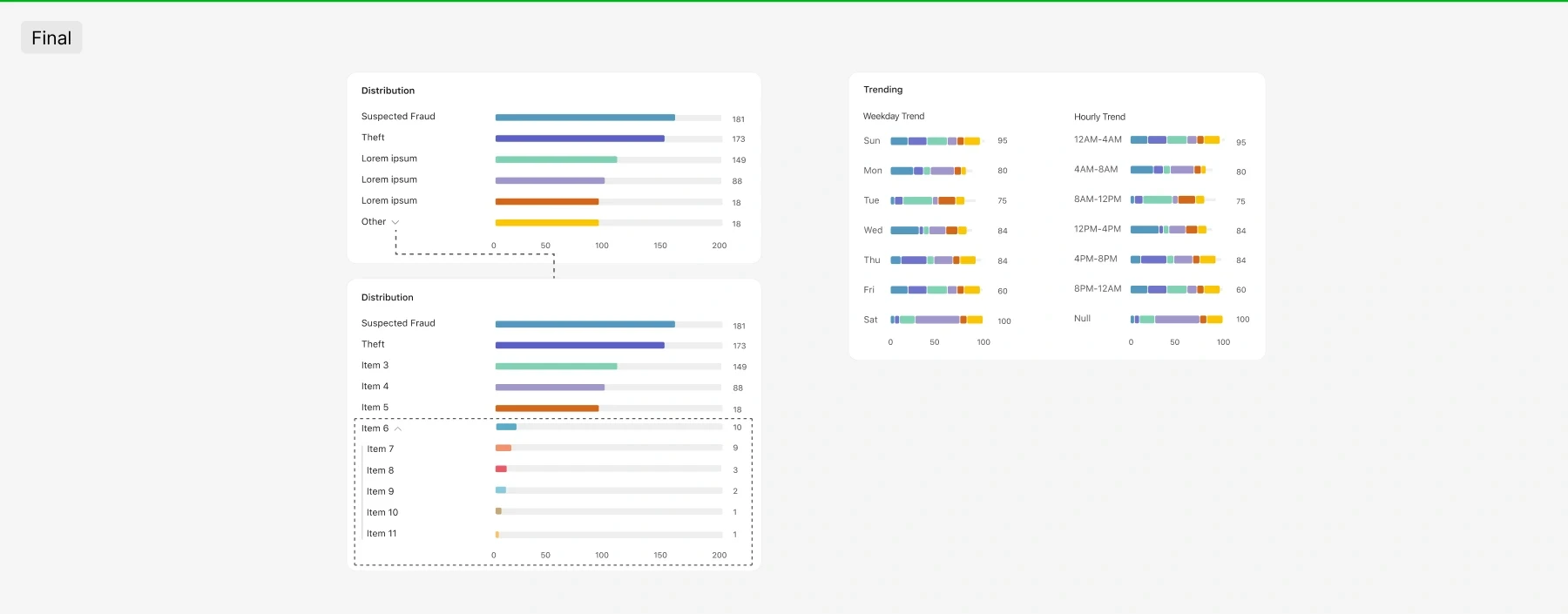
We decided to group items with the least data into a category labelled 'Other.' Research suggests that using fewer than 6 colours in a categorical colour palette is most effective, as comprehension of categorical colours becomes challenging with 6 colours and extremely difficult with 12.
By interacting with any section of a data visualization, such as a bar chart, users can easily see the filter's effect on adjacent visualizations, making it simpler to view related information.

4.6 Final design
Next steps
This project was exploratory, and the client requested improvements to the dashboards both visually and in terms of usability. However, due to an extended security contractual process, the project remains in development. Our goal is to secure funding to begin full-scale development, engage more with stakeholders, and conduct usability testing.
Unified, Accessible Dashboard for Store Managers to Easily Review Security Profiles
One of the top technology giants works with our Crisis and Security department and they approached us to enhance the usability of their existing Tableau dashboards. The project aims to make data accessible to store managers across multiple retail locations, allowing them to view the security profile for their specific stores. We leveraged our Crisis and Security department’s analytics methodology to develop a new set of dashboards.
The business lead shared their feedback: "The designs your team came up with are just freaking awesome. It's exactly what we envisioned when we started this. They killed it!" - Jason, Business Lead
Project timeline
March 2024 - August 2024 (5 months)
Team / organizational lines
Product Designers (x2)
Business Lead
Areas
Redesign
Stakeholder interviews
Heuristic analysis
the challenge
The challenges the client faced with were both visual and usability-related. They presented us with 3 separate dashboards which had limitations due to the use of Tableau, making them neither accessible nor easy to understand. Much of the data lacked context or explanation, making it difficult for novice users to interpret without additional guidance.
The client supplied three dashboards—regional, geo, and store. The image is blurred to protect sensitive data.
the solution
We developed a unified dashboard that allows store managers to easily review the security profile for their locations. In addition to enhancing the visuals, we significantly improved the dashboard's usability and accessibility.
ideation
The first step we took was to hold a call and conduct a thorough analysis of the existing dashboard, using both our expertise and the WCAG guidelines. Together, we added comments directly on the dashboard for easy reference.
3.1 Competitive analysis
Working in a B2B environment can be challenging because most of the insights come directly from stakeholders, rather than being readily available online. To enhance our approach, we researched various online dashboards, particularly in the risk management space. We then combined elements from the client’s existing dashboard with ideas from our research, helping us shape a more effective way to visualize the data.
4.4 We organised the layout and provided actionable insights (1.3% up from past week) that guide users toward making informed decisions
4.1 Initial iterations
We began by creating several iterations that followed the client's existing layout in Tableau. However, we quickly found it challenging to fit all the necessary information into the limited space available.
We also printed the dashboards to ensure the text was legible and that the colours didn’t blend into each other. The grey had to be adjusted to a darker shade, as the original was too light and lacked accessibility.
4.5 We decided to integrate legends directly within the data visualization to optimise space
We debated whether to place the legend in a separate section or integrate it into the first data visualization. Since it's the first element, users' attention would naturally be drawn there, and over time, they'd recognize it as the legend. Additionally, selecting an item in the legend would highlight related elements within the visualization, making it more intuitive. User testing is needed to confirm this approach.
design
One of the first things we focused on was analysing the client’s colour palette and how they typically combine colours, especially since the dashboard relies heavily on colour-based visualizations.
4.2 We proposed moving beyond the limitations of Tableau by developing a custom platform tailored to their specific needs
Since the client liked the idea of creating a custom platform instead of using Tableau, despite the higher investment, we gained the flexibility to redesign the navigation. This allowed us to consolidate the three separate dashboards into one, with a global navigation system for seamless access.
4.3 Although we had more flexibility with space, we aimed to consolidate content as much as possible. For example, we used a carousel to organise the tables efficiently
Each legend item represents a distinct, non-sequential category, necessitating the use of clearly differentiated colours. With 11 legend options, we faced the challenge of selecting a colour set that was distinct enough. We used the colours shown above, but with a large volume of data, we needed an extensive colour palette. Additionally, some colours appeared identical to individuals with deuteranopia.
We decided to group items with the least data into a category labelled 'Other.' Research suggests that using fewer than 6 colours in a categorical colour palette is most effective, as comprehension of categorical colours becomes challenging with 6 colours and extremely difficult with 12.
By interacting with any section of a data visualization, such as a bar chart, users can easily see the filter's effect on adjacent visualizations, making it simpler to view related information.
4.6 Final design
Next steps
This project was exploratory, and the client requested improvements to the dashboards both visually and in terms of usability. However, due to an extended security contractual process, the project remains in development. Our goal is to secure funding to begin full-scale development, engage more with stakeholders, and conduct usability testing.