Saving consultants time and cleansing CRM data simultaneously with a user management platform
I worked on designing an internal user management platform that integrates with our central CRM, which serves as our main source of truth. This platform is the second iteration of an earlier version created by developers, and it required a complete redesign from both a UX perspective to better meet the needs of our internal users and from an architectural perspective to support additional features.
Project timeline
Nov 2023 - May 2023 (11 months)
Team / organizational lines
Solo Product Designer
Business Analyst
Product Manager (x2)
Solution Architect
Engineering Team (x8)
Areas
Redesign
Stakeholder interviews
User journey
Usability testing
the challenge
We needed to rebuild the user management system because the original version was designed as a temporary solution for inviting users to our platforms. This system was standalone and not integrated with our CRM, which is the platform where we manage client information and access important information such as client details.
the solution
The user management platform, on the other hand, is focused primarily on controlling access to our platforms, not as the core of our operations. Now, with our new approach, we’re connecting all our platforms to ensure seamless communication and data sharing between them. We're also implementing architectural changes to improve the user experience across the board.
Discovery
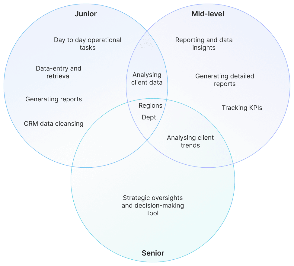
I conducted exploratory interviews with stakeholders and discovered that the platform’s primary users span various hierarchical levels, from junior staff to mid-level managers and senior executives. They represent multiple departments, such as Crisis and Consulting, and Digital Risk, among others. These users are geographically dispersed across global regions, including EMEA, LATAM, North America, and APAC. Each user group has different needs and workflows, depending on their role, department, and location, influencing how they interact with the platform.
We then outlined the user journey, detailing all the actions users would take on the platform, before moving into the ideation phase.
ideation
I presented low-fidelity wireframes to stakeholders, including Project Managers, Solutions Architects, and Delivery Managers, to establish an initial understanding of the user flow without spending too much time on detailed design. The first flow I proposed didn’t fully address all the necessary functionalities, so I revised it to better meet their needs.
design
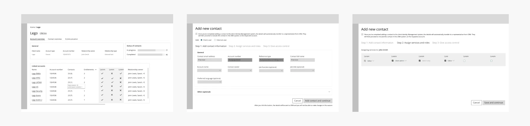
The finalised flow is made up of 8 distinct screens, including the homepage, client account page, client contact overview page, manual and bulk upload screens, error screens, contact page, and preferences page.
5.1 Homepage - How to effectively present six hierarchy levels in a clear and intuitive manner from both a UX and development standpoint
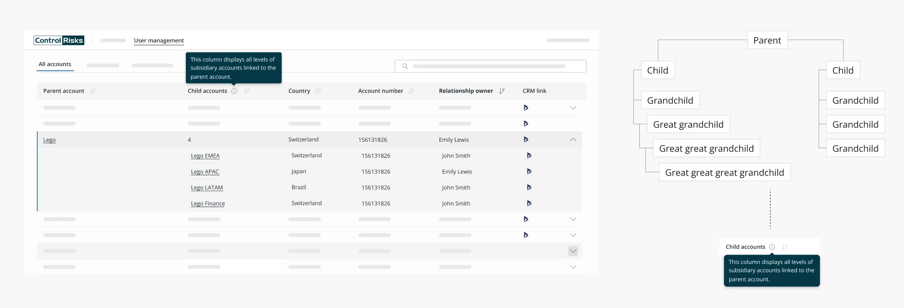
Due to the complexity and neglected state of the CRM data, we ended up with six hierarchy levels, which were nearly impossible to visualize in a table format without using a tree map. I decided the best approach was to display all levels under a single child level, with a tooltip indicating that the column may contain additional levels below the child level.
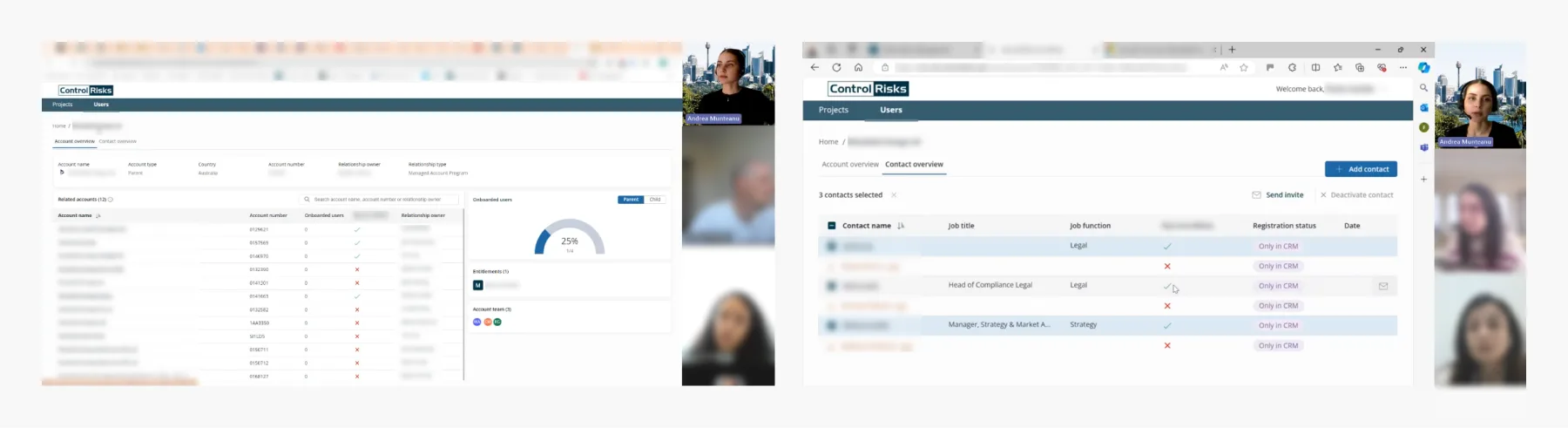
5.2 Client account overview page
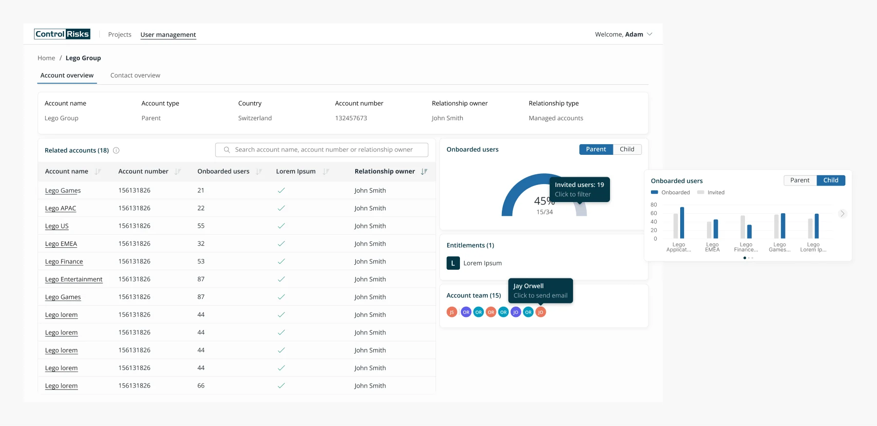
On the client account page, I’ve incorporated data visualizations to enable users to quickly view the number of onboarded users versus those who haven’t been onboarded yet. Users can also filter this visualization to see the onboarding status for each child account, showing a comparison between onboarded and invited users.
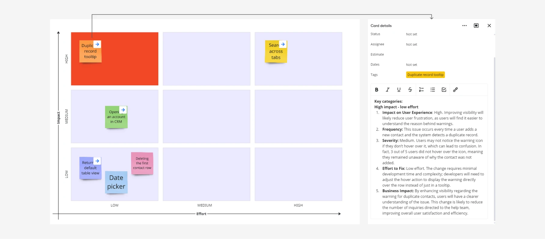
5.3 Displaying duplicate records while disabling actions on them to encourage users to clean and update the CRM data for accuracy
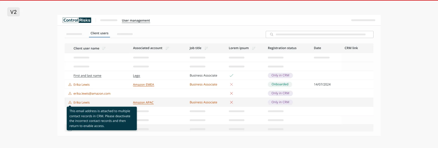
Because the CRM data contained multiple records for the same client user, we needed a way to present it clearly to the admin user. Initially, I considered grouping all duplicate records together, but this approach would be challenging to implement, could clutter the table, and some duplicates only had email addresses without names.
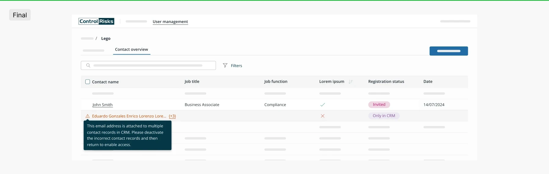
I decided the best approach would be to group the duplicates and display the number of duplicate records in parentheses next to the user’s name. The user can hover over the entire row to see why the name is marked and can also access the CRM page to manage the user (remove any duplicate contacts) before taking any actions like inviting, deactivating, etc. on the user management platform as they are stopped from doing so on this platform. This helps enormously in the data cleansing process.
5.4 Single vs. multi-select actions

I was inspired by Gmail’s feature of displaying individual actions at the end of a row when the user hovers over it. When the user selects at least one row using the checkbox, the top container with search and filters is replaced by the number of selected contacts and available bulk actions (such as sending invites or deactivating users). If an action isn’t allowed (e.g., deactivating a user), a tooltip appears to explain the restriction to the user. This way we are reusing the available space that we have and prioritising the data in the table.
Dev handoff
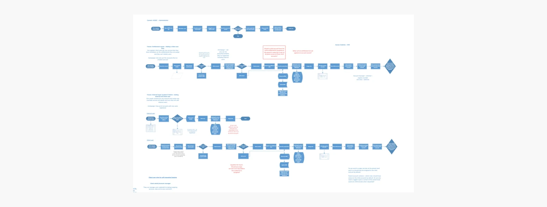
When I began working on this project, we had just started using Zeplin for developer handoff, primarily for version control. Since it was new to all of us, I received a lot of constructive feedback during our sprint retrospectives. Developers requested that I provide documentation for each component on every screen and attach the Zeplin link to each story. I also received plenty of positive feedback as we adjusted to the new process. The mistake I made during this process was assuming certain behaviours were obvious, which led to additional questions and extra time spent clarifying them.
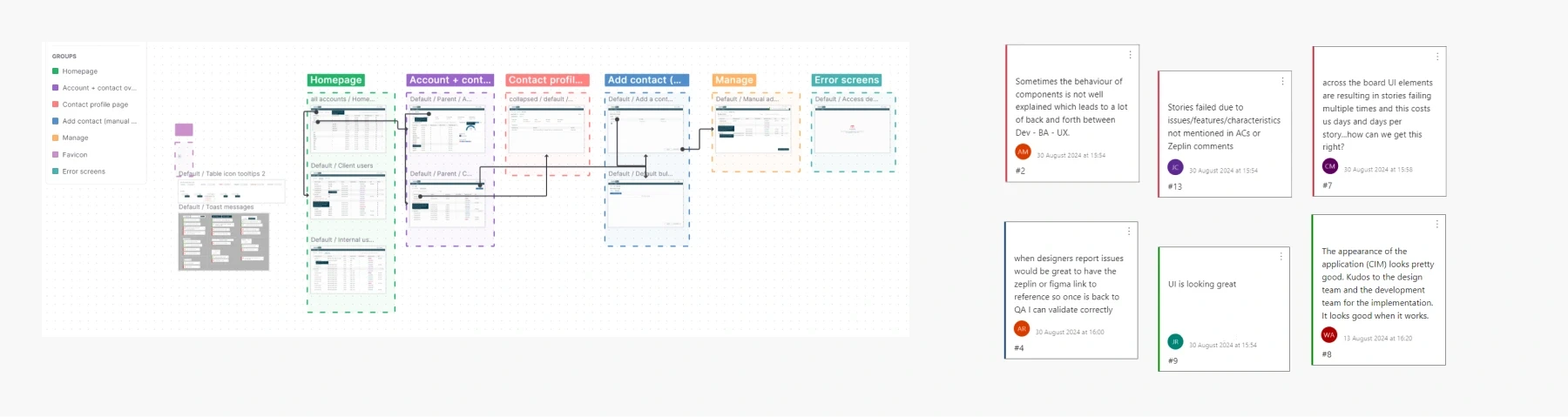
On the left side is Zeplin, where I've organized similar screens into groups, each tied to individual user stories. On the right side, I've included feedback from sprint retrospectives, capturing insights on how easy / difficult it was for the team to find specifications and other relevant information.
USability testing
Usability testing happened post-production this time, which wasn’t ideal. Conducting it earlier would have saved us from spending additional development time. Unfortunately, due to a limited scope and low product maturity, testing wasn't originally part of the roadmap. However, I was able to convince stakeholders of its importance, which ultimately allowed me to carry it out.
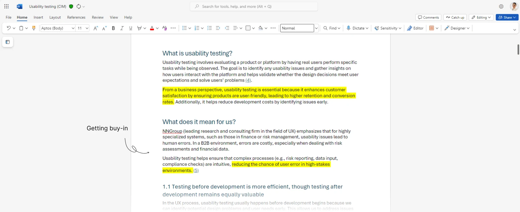
We conducted remote moderated usability testing. The participants we chose had no prior experience with the platform and included junior, mid-level, and senior roles from five distinct departments. All were familiar with CRM systems and had some exposure to project management. We selected 7 participants (including 1 pilot) through direct outreach via Outlook, meeting with 5 of them. To evaluate localization, we ensured representation from each region (EMEA, LATAM, APAC, and America)
Following the usability tests, I had to use LLMs to quickly rewrite the information gathered due to time constraints.
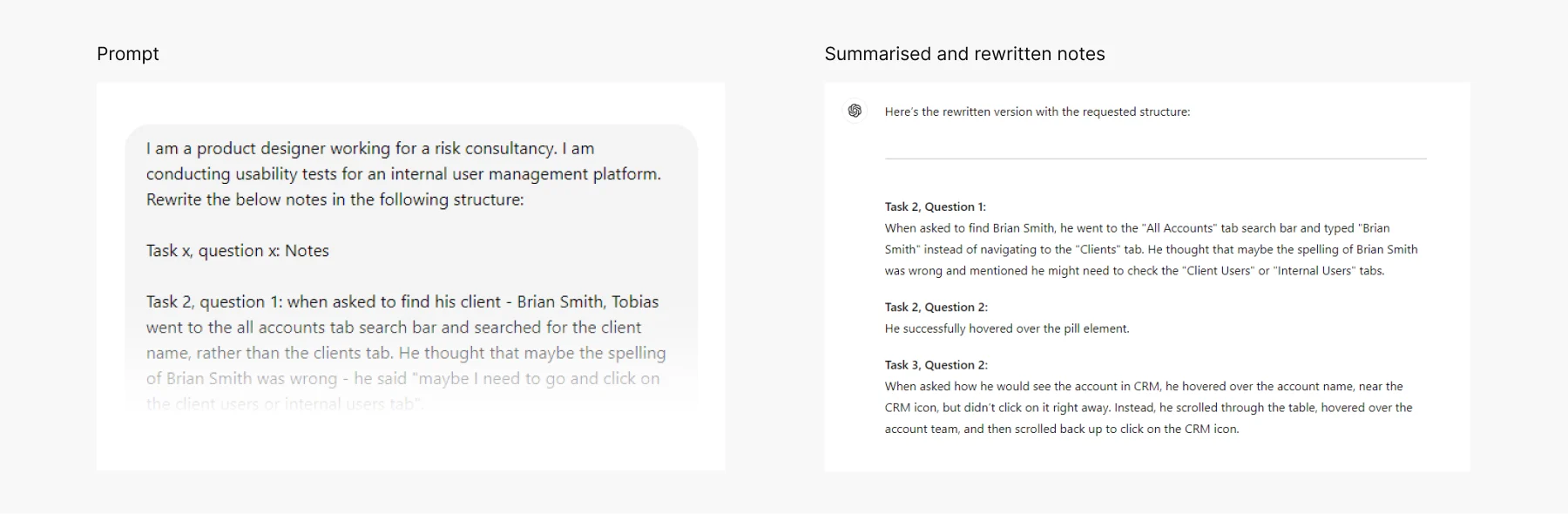
After tracking metrics such as error rates and time on task, I used Miro to organize all the participant notes, categorizing them by task. I then analysed the metrics, including the error rates for each task, which allowed me to identify the tasks that users struggled with the most.
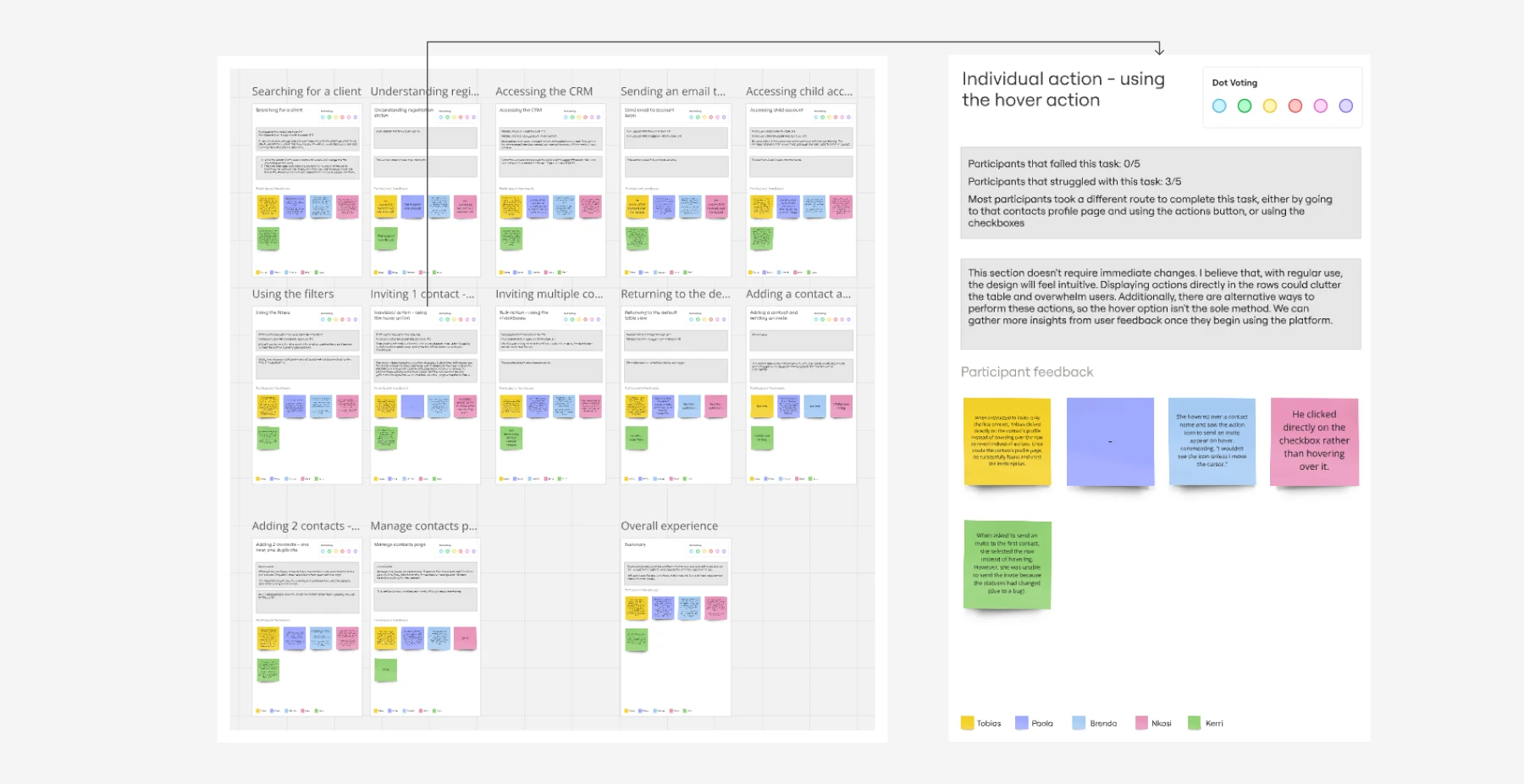
The tasks that users struggled with the most were added to a prioritization matrix based on an impact versus effort axis. This helped me determine which tasks should be addressed first and which ones could be revisited later when there is capacity in future sprints.
Findings + improvements
The participants rated their overall experience as 3.9, indicating that several areas needed improvement.
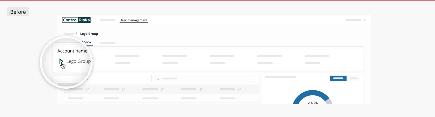
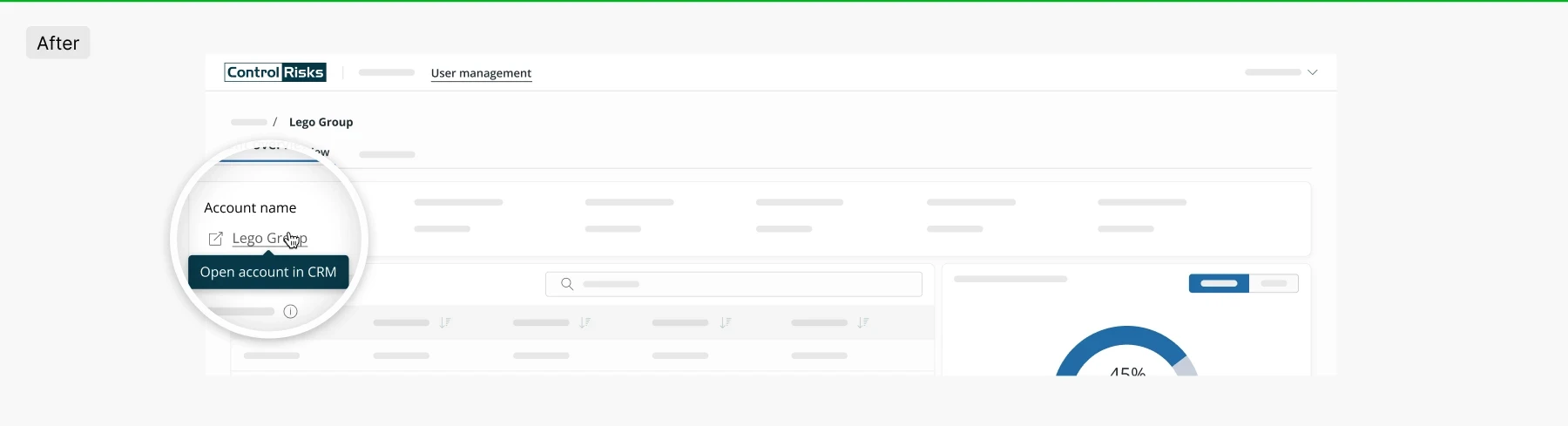
5/5 participants struggled with opening an account in the CRM, with 1 participant failing to complete the task
The icon was not intuitive enough for users to identify it as the CRM access point, leading them to spend a considerable amount of time before realizing its purpose. To address this, I changed the icon to a more generic one, made the account name hyperlinked, and added a tooltip for better clarity.
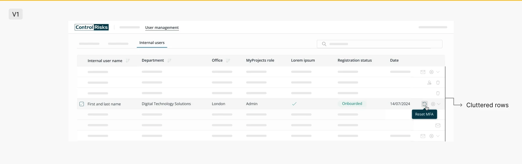
3/5 participants struggled to locate how to perform an individual action, i.e. hover over the row and click on the icon
I based the design of this functionality on models from major companies, allowing users to perform individual actions on hover. However, some participants struggled to locate these actions, with one remarking, “I wouldn’t see the icon unless I move the cursor.”
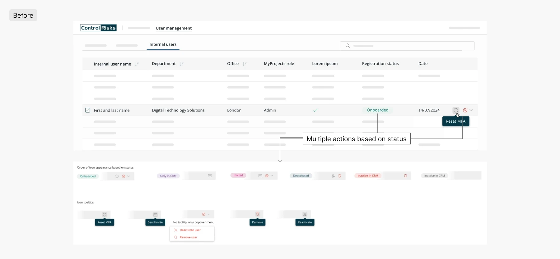
I experimented with a few variations, adding the action icons to the display with lower opacity to avoid cluttering the table. However, since there are different actions based on status, the table still appeared cluttered.
I also tried placing the actions behind a static ellipsis button, but this approach would require users to perform an extra click. This is undesirable, especially since they would perform these tasks on a daily basis.
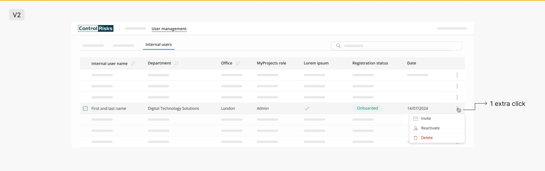
I ultimately decided to keep the designs as they were because I reviewed my recordings and noticed that users were able to locate the icons as the test progressed. This suggests that the issue may not be related to usability, but rather a learning curve. However, we should continue to monitor this during the User Acceptance Testing (UAT) phase.
Impact and reflections
Promoting usability testing across various platforms has significantly resonated with stakeholders, including partners and directors, resulting in strong positive feedback. This has raised the importance of user experience, prompting stakeholders to prioritize usability testing and enforce it on future projects.
Through usability testing, I discovered that the majority of our users were accessing the platform via laptops. This led me to request access to Google Analytics to analyse the primary screen resolutions used by our audience. Surprisingly, I found that the resolution we had been designing for (1440 x 900px) was not the most common. Instead, most users were working with a screen resolution of 1280 x 720px, particularly due to the popularity of Dell laptops with smaller screens among our audience. As a result, we had to adjust our design strategy, shifting focus to this resolution and offering designs for three different screen sizes during handoff. This change ensured that our designs were optimized for the actual devices being used. Find out more here
This project gave me the chance to follow the entire UX process—from research and ideation to design, handoff, and usability testing. It was a fantastic experience for me as a designer, allowing me to see how all the pieces fit together and how each phase influences the final outcome.