Enhancing Decision-Making with Granular, Multi-Facility Threat Insights using an Asset Risk Dashboard
Current market solutions only partially meet client needs, as there is no integrated system to combine multiple data streams and accurately assess true asset risks. We created a dashboard with four sections to provide clients with a comprehensive risk overview of their assets, including detailed threat information. Initially, the plan was to build the dashboard in-house as a standalone platform, but due to budget and time constraints, we opted to develop an MVP using platforms like Power BI, which also presented some limitations.
Project timeline
June 2024 - November 2024 (6 months)
Team / organizational lines
Solo Product Designer
Data Engineers (x3)
Solution Architect
Intelligence Collection Analyst
Areas
Dashboard design
Data visualisations
PowerBi
the challenge
For clients with facilities spread across different regions, executives want to see a comprehensive risk overview that spans multiple facilities, not just their local region or individual site. Existing tools use vague, inconsistent scoring mechanisms, lack granularity for location-specific assessments, and are time-consuming to onboard, often failing to deliver full value to teams.
the solution
Designing four distinct dashboards that allow clients to assess their facility's risk and make informed decisions.
Discovery
I held several discovery sessions with the stakeholders and identified two key user groups. Due to time constraints, we couldn’t conduct direct interviews with users, so I gathered insights through calls with the stakeholders instead.
1. Security Managers: These users oversee entire sites or multiple locations. They will primarily use the first three dashboards to analyse key risk drivers and make comparisons across different sites. Their focus is on identifying what’s contributing to high risk scores and advising clients accordingly.
2. Site-Specific Users: The fourth dashboard is designed for site managers and is either printed or downloaded and shared with individual sites. It provides an asset-specific view tailored to their location, offering a summary and action items relevant to that particular site. This dashboard consolidates information from the first three dashboards.
ideation
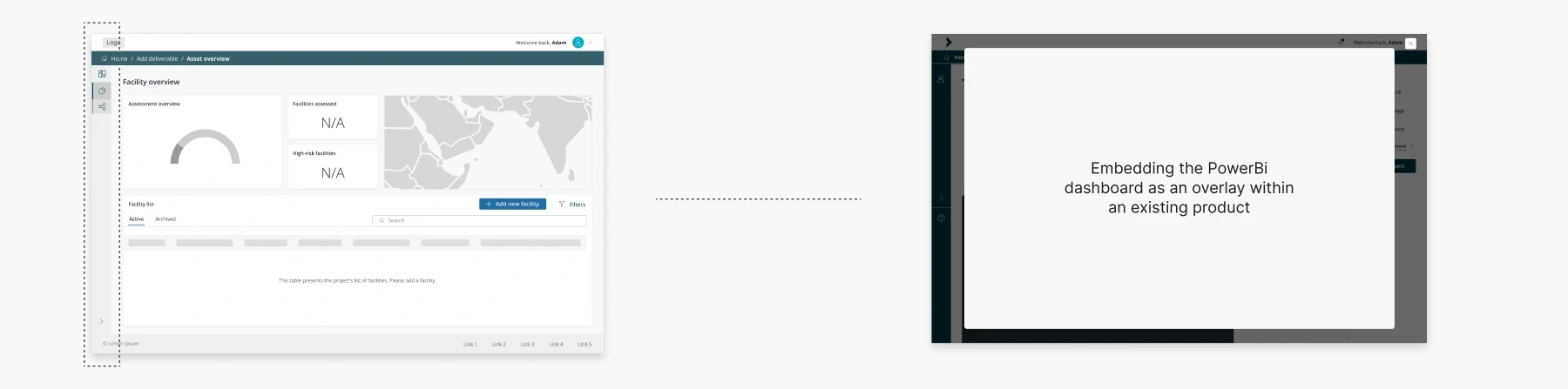
The stakeholders provided us with a mockup of how they envisioned the product, as their initial plan was to build it in-house. These mockups were valuable, especially since the information was complex, helping us better understand the layout and structure they had in mind for the product.

design
With all the information gathered, I began designing the platform. However, after a few screens were completed, due to budget and time constraints, we decided to use Power BI to deliver the solution instead of building the product in-house, allowing us to meet their immediate needs more efficiently.
5.1 Global navigation - A/B testing
Since the dashboard would be embedded within another product, deciding on a navigation style was challenging. To address this, I collaborated with data analysts and reviewed other Power BI dashboards for inspiration. I then created a few variations and gathered feedback via email from several people within the company to better understand their preferences and overall thoughts on the designs.
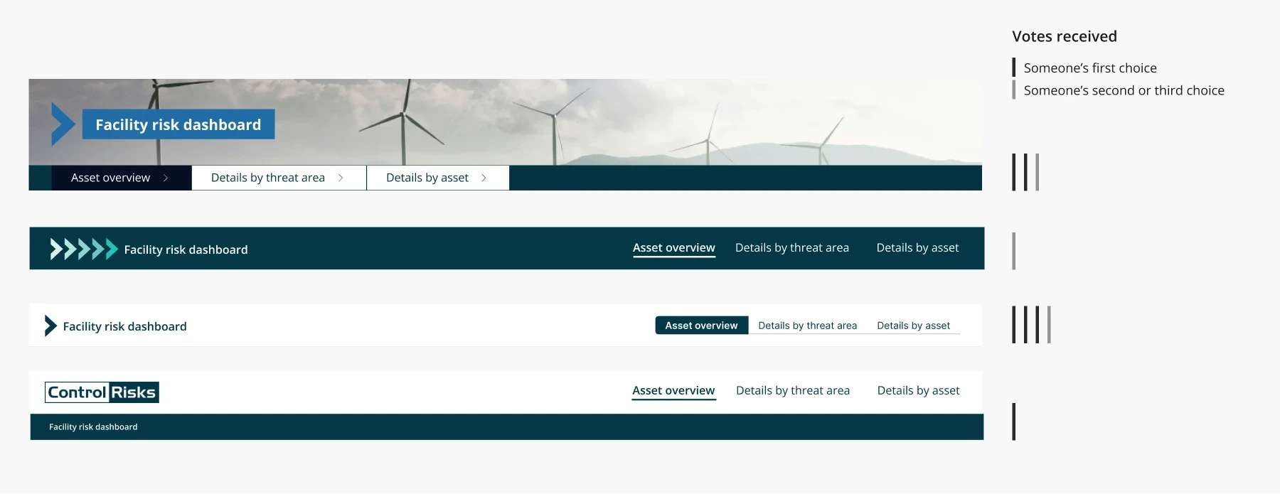
I ultimately decided to go with a minimalist navigation style that doesn't draw too much attention. This approach ensures that it blends well when the dashboard is open and still looks clean and unobtrusive when the dashboard is closed, allowing the other product's navigation to take focus.

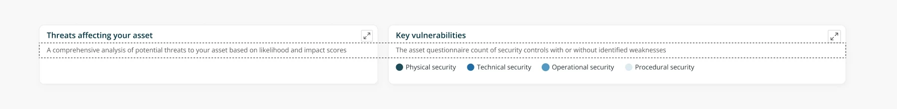
5.2 Details by threat area visualizations - determining the best way to present the key drivers of a specific category
I was tasked with creating one of the first data visualizations. Initially, I interpreted the requirements as the user needing a high-level overview of categories, sub-categories, and threat events impacting their facilities. To address this, I created three separate bar graphs.
The high-level categories provide an overview of broad risk areas (e.g., civil unrest, natural hazards), but the facilities experience varying levels of risk within each category. The layout presents each category, sub-category, and threat event as individual bar charts. However, this approach doesn't allow users to explore the specific sub-categories or threat events directly tied to each category, as they are displayed as distinct data points without any clear hierarchical connection.

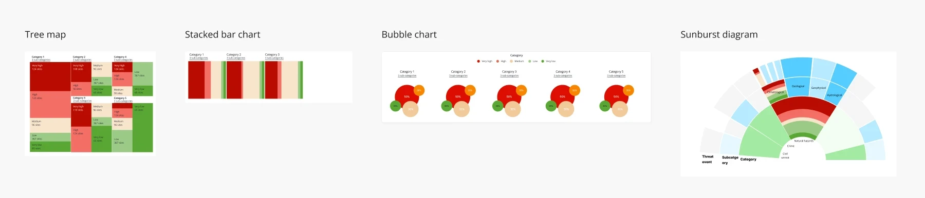
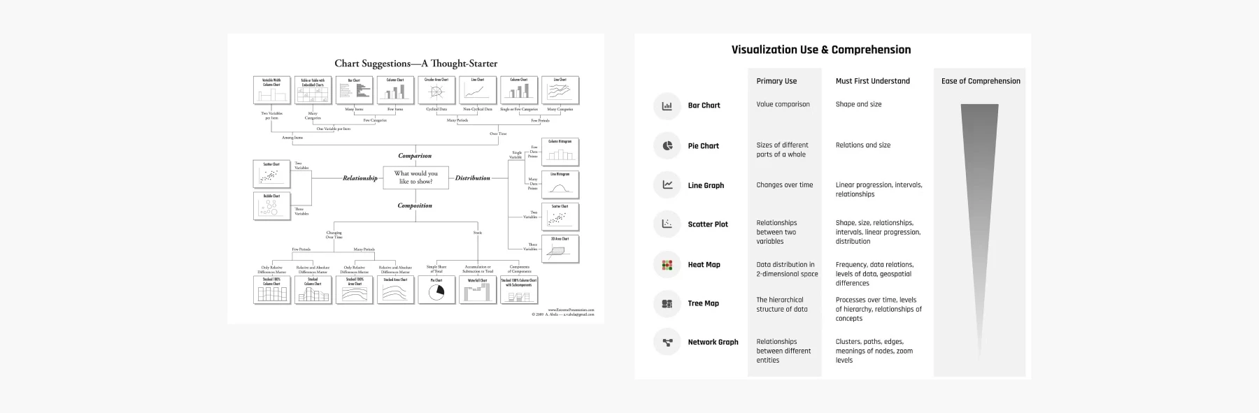
I was unsure how to best represent the hierarchy between categories, sub-categories, and threat events. I explored various visualizations, including tree maps, bubble charts, stacked bar charts, and sunburst diagrams, but each option felt too complex and didn’t clearly convey the data. They lacked the simplicity needed for users to easily grasp the relationships between these hierarchical levels.

I explored using a tree map with sub-categories placed above, allowing users to drill down into specific categories and see what's driving a high-risk area. This setup would help users easily identify the key contributors to elevated risks.
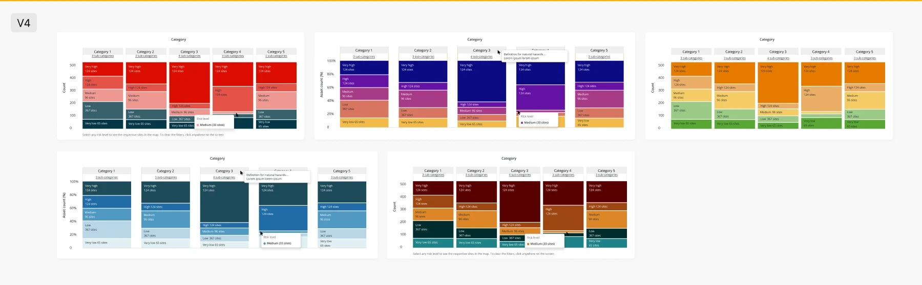
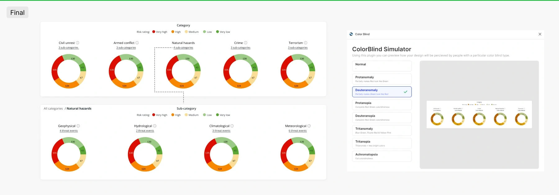
However, I wasn’t entirely confident in this approach, and I didn't like how the colours looked together—they seemed too dramatic. While I knew I had to use a traffic light colour system, since users typically refer to it when discussing high and low risk, the combination felt off. It didn’t occur to me that the issue might be the type of data visualization I was using. I experimented with different colours, but none worked because I needed a divergent colour palette while still adhering to the traffic light system (as it is the most common way risk levels are presented).
I researched various data visualizations and created a resource on my Notion page. I decided to use pie or donut charts instead of stacked bar charts, which can be cluttered and harder to compare proportions, especially with multiple risk levels. Donut charts offer a cleaner, more intuitive view, simplifying the comparison of relative proportions.
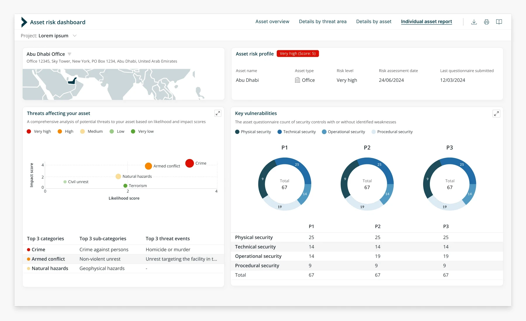
5.3 Fourth dashboard - individual asset report
I went through several iterations of the dashboard. The key change was shifting from just presenting insights to making the dashboard actionable. Initially, it simply displayed data for the manager, but a more effective approach was to highlight the areas that required immediate attention (see picture 2).
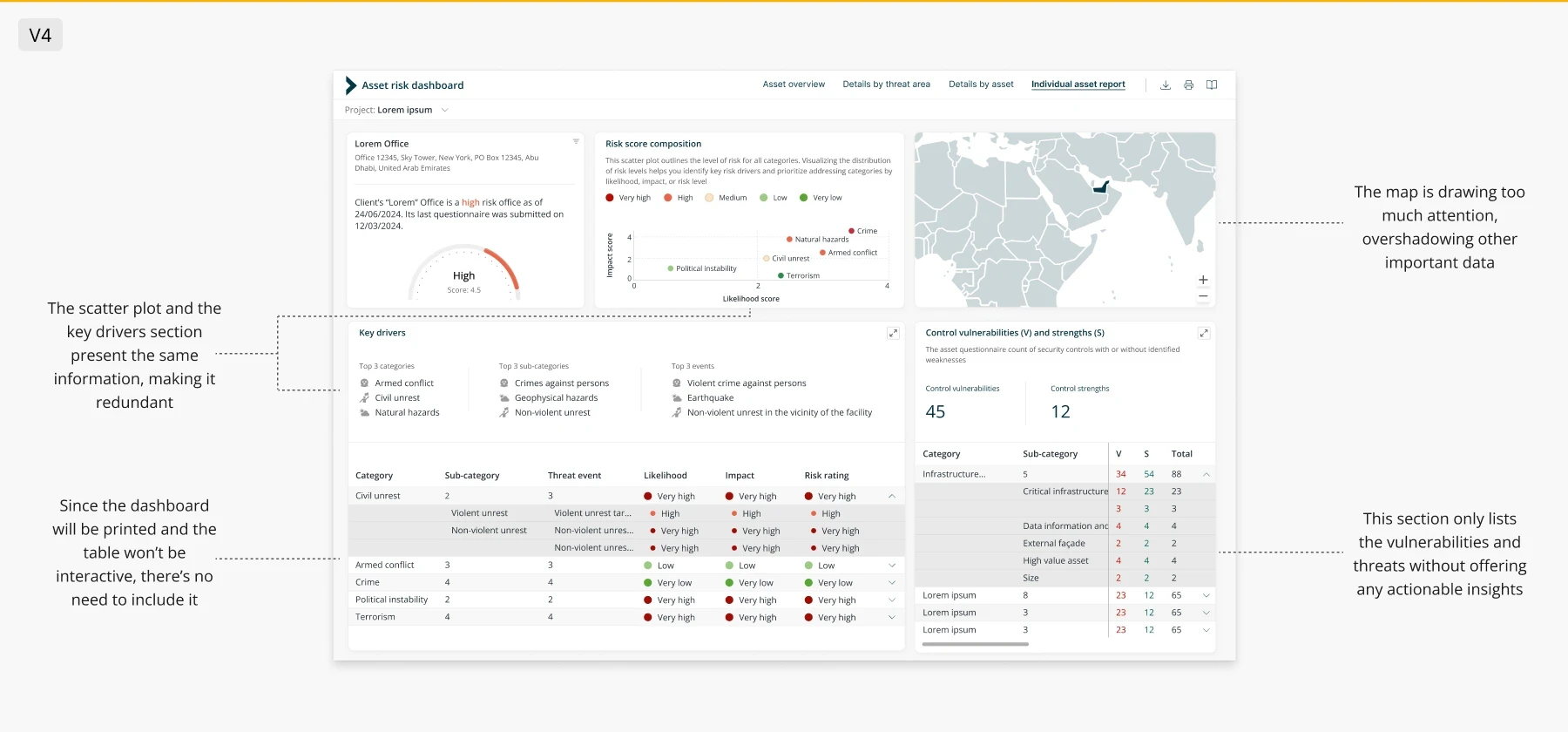
I added labels above the bars in our charts to improve clarity. This way, users understand the information without guessing, making the data easier to understand at a glance and enhancing the overall user experience.
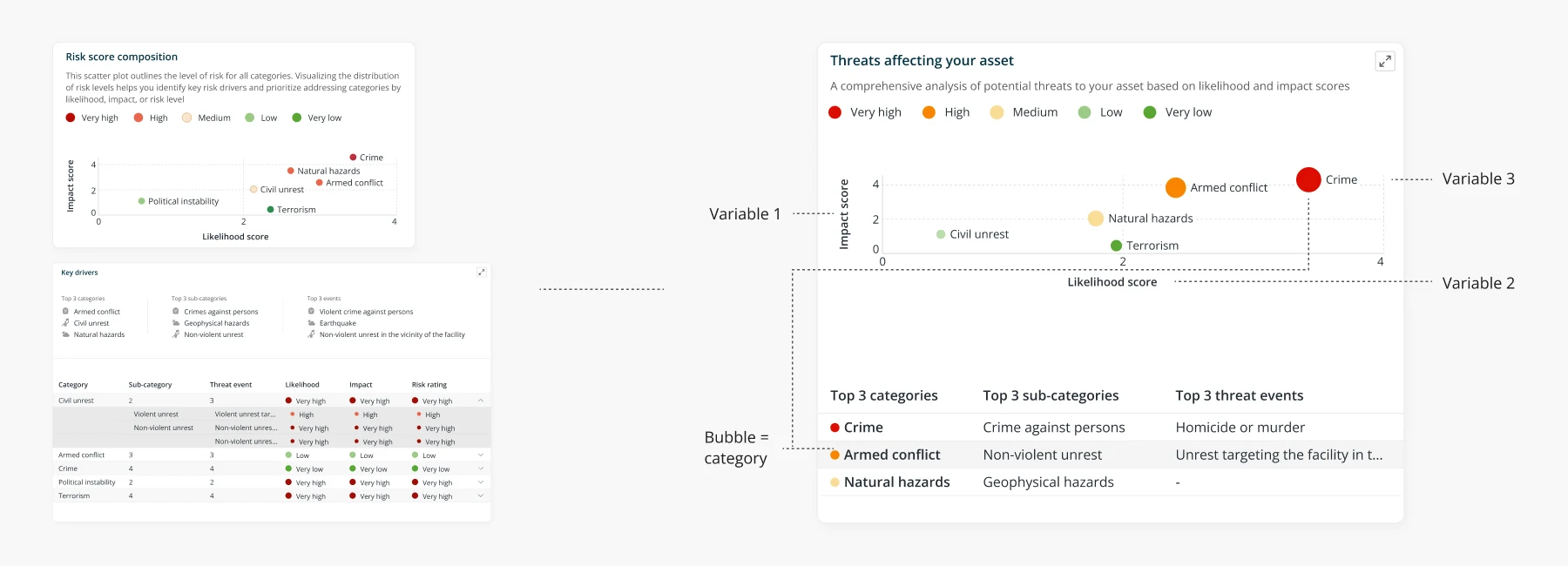
I merged the scatter plot with the key drivers section to present more meaningful data and save space, as both reflected the same information. A bubble chart is better for this data, representing likelihood (x-axis), impact (y-axis), and threat categories through bubble size and colour. This allows for easy comparison of multiple threats, making the chart ideal for prioritizing risks.
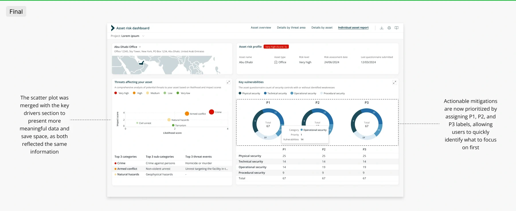
I introduced Priority 1, Priority 2, and Priority 3 data visualizations to help the user easily identify and prioritize what to focus on first based on urgency.
final thoughts
Working closely with data analysts, I ensured all design decisions were compatible with Power BI, which was a new tool for me. This collaboration helped me gain a deeper understanding of which visualizations work best for different data sets, though the complexity of the data presented challenges. I also faced difficulties with the color scheme and experimented with various options, including a diverging palette, while ensuring accessibility by passing color blindness tests.