

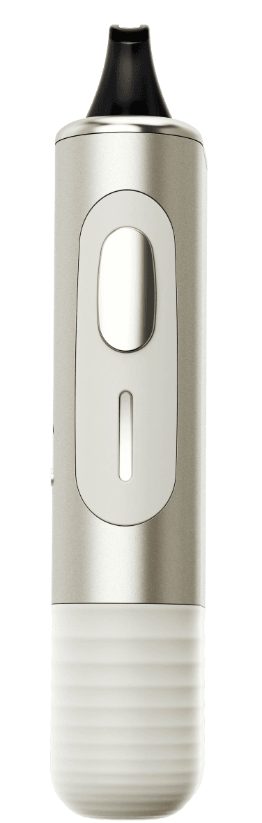
NX Quit is an exploratory project and proof of concept, showcased to angel investors with the goal of securing funding for further development. My role was to design the app, which will connect with the device and support users in reducing or quitting their nicotine intake. The app is central to the project, demonstrating seamless integration with the device while assessing user data to provide personalized nicotine reduction plans.
Project timeline
May 2024 - August 2024
Role
Product Designer - mobile application
Team
1 Software Engineer
1 Industrial Engineer
1 Product Designer
Tools
Figma
Chat GPT + Gemini
The challenge
1.1 Millions of nicotine users attempt to quit but fail, WHY?
The problem is that despite many attempting to quit nicotine, most fail due to withdrawal symptoms, ingrained habits, and a lack of personalized support. Current cessation products often take a one-size-fits-all approach, neglecting behavioural aspects of addiction and individual needs, which leads to high relapse rates. Nicotine use becomes tied to daily routines, social triggers, and emotional coping mechanisms, making it harder to quit. The repetitive hand-to-mouth action and the association of nicotine with stress relief and pleasure further reinforce the habit. Even after quitting, cues like seeing others smoke can trigger cravings, often resulting in relapse. Addressing these behaviors is essential for effective cessation.

In Great Britain, while 45% of smokers want to quit smoking, 30% will actually try to quit (make a serious attempt to quit); sadly, a mere 5% of these attempts will be successful. More than a third of quit attempts involve the use of an e-cigarette, making them the most popular choice to quit smoking. Nonetheless, only 18% of quit attempts using e-cigarettes are successful.
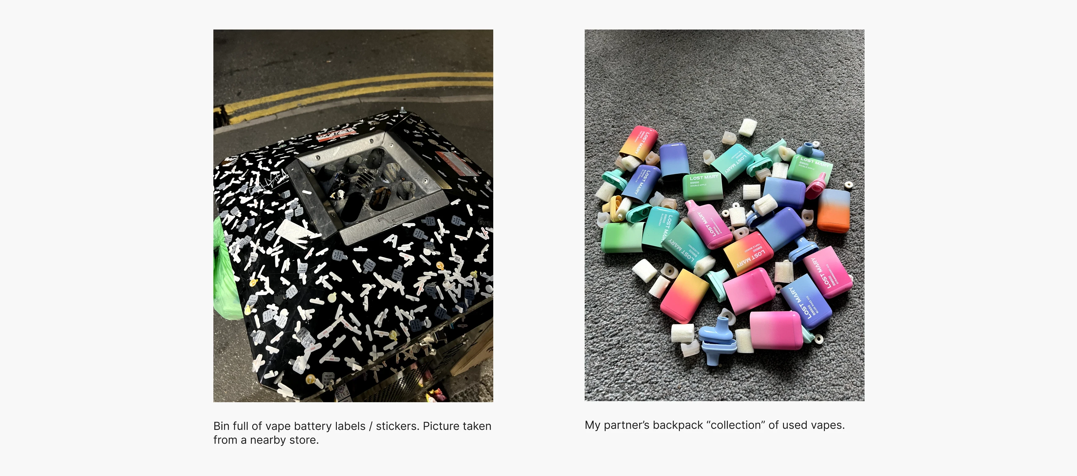
1.2 Personal observations
I noticed the widespread issue when I saw many vapes purchased from a single store, noticed discarded vapes on the ground, and observed how much my partner was consuming.
The solution
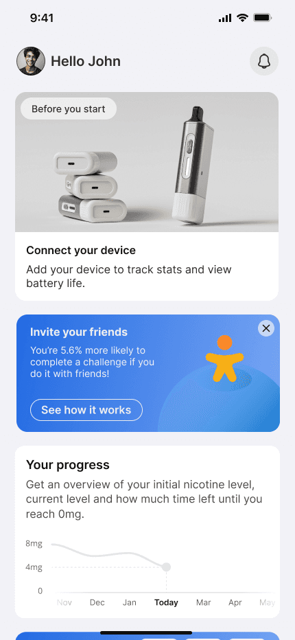
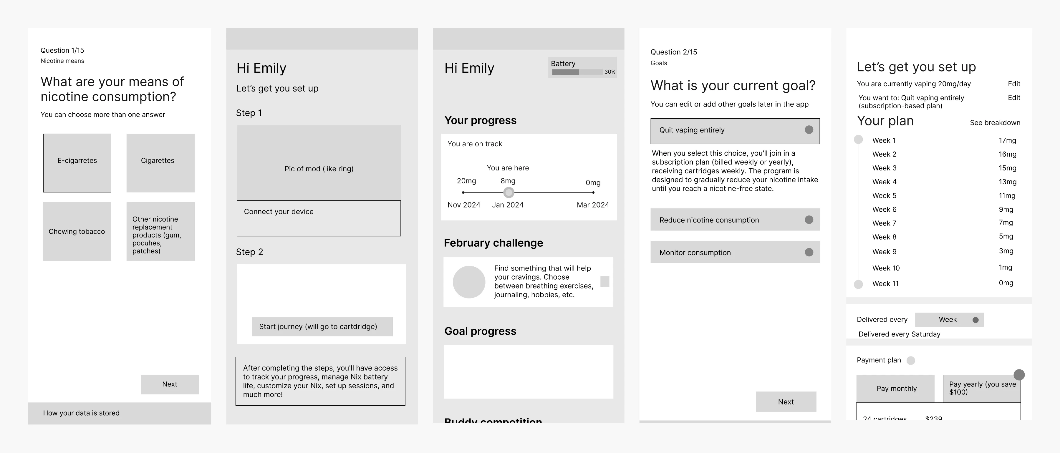
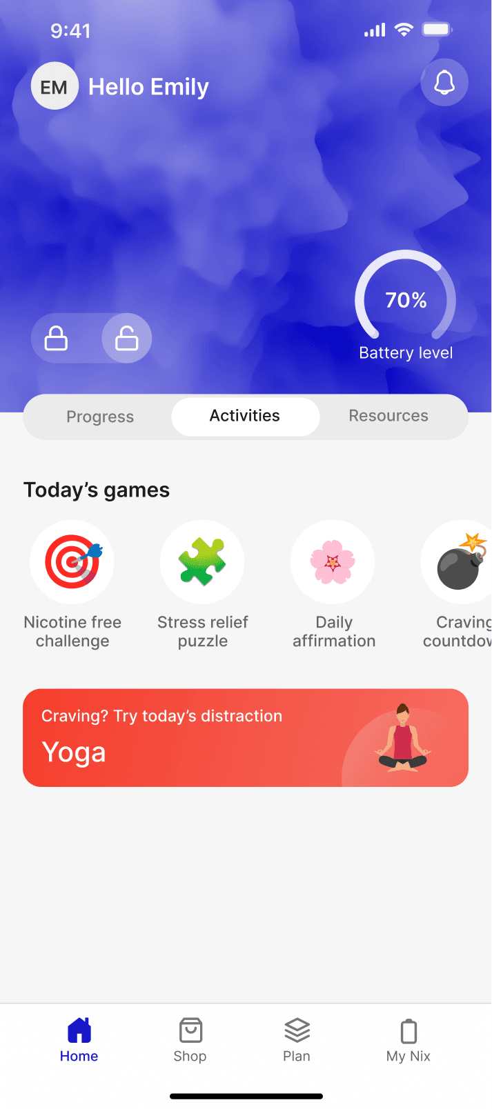
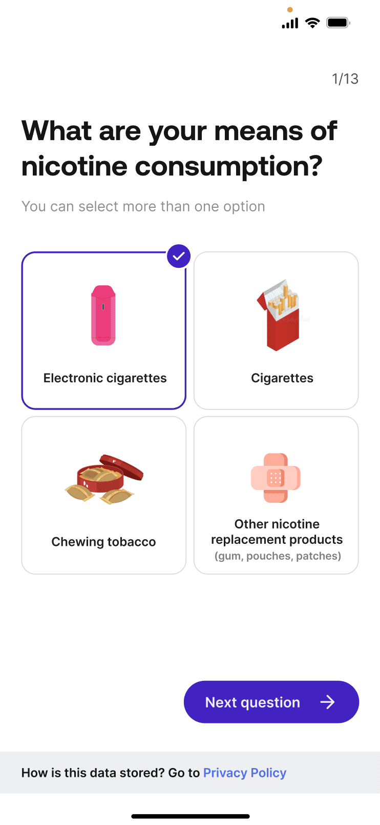
To help users quit vaping, a comprehensive solution is offered that addresses all aspects of addiction. After completing onboarding, the app uses behavioural data to create a personalized nicotine reduction plan. During the first week with the NX device, baseline data is collected and integrated with onboarding info to refine the plan. Users then gradually reduce nicotine intake, with the app providing support, progress tracking, and motivation through reminders, gamification, and social comparisons.


Discovery
3.1 Checking out what Reddit users are discussing
Reddit is often a reliable source for honest user feedback, and with over 47k members in the #quitvape forum, it's clear how challenging quitting can be. Many users share that transitioning from smoking to vaping has made quitting even harder for them, highlighting the complexity of their struggle

3.2 Competitive analysis
I explored the App Store with the goal of finding apps aligned with helping users quit nicotine. I identified a few relevant ones and documented key details in Notion, including their core features, user reviews from the App Store, and unique selling points (USPs).
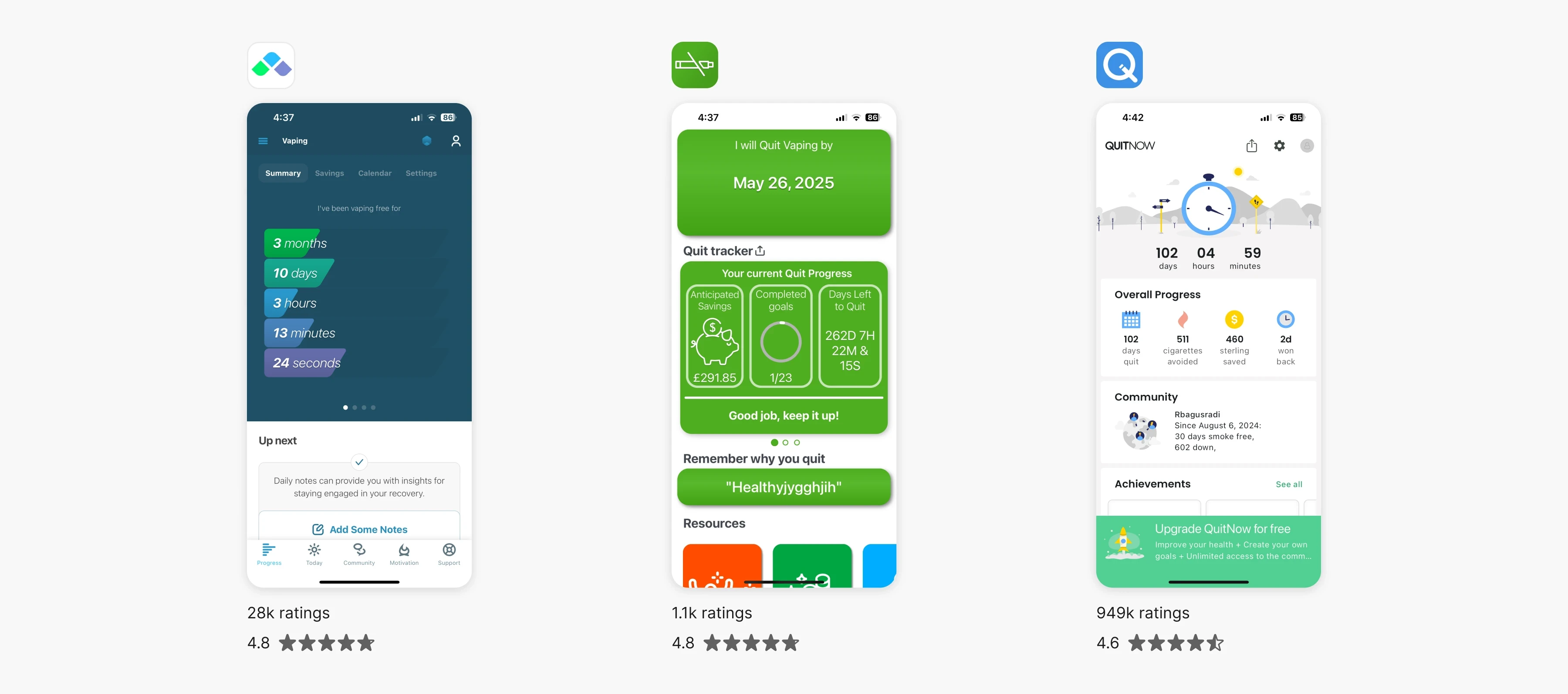
A graphic showing the three biggest competitors: I Am Sober, Quit Vaping, and Quit Now. They are ranked by the number of ratings, from highest to lowest, along with their respective star ratings.
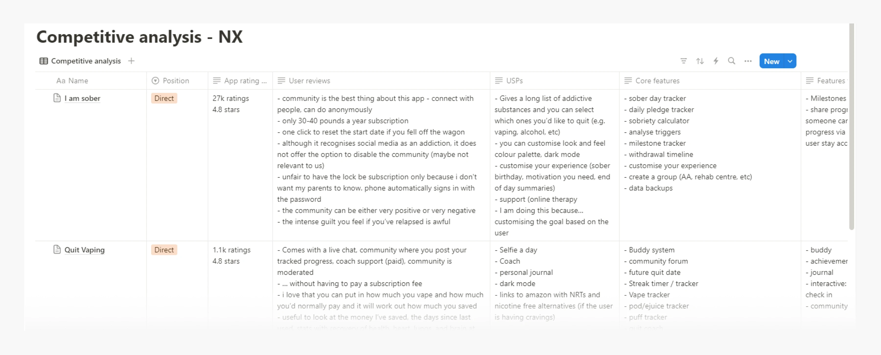
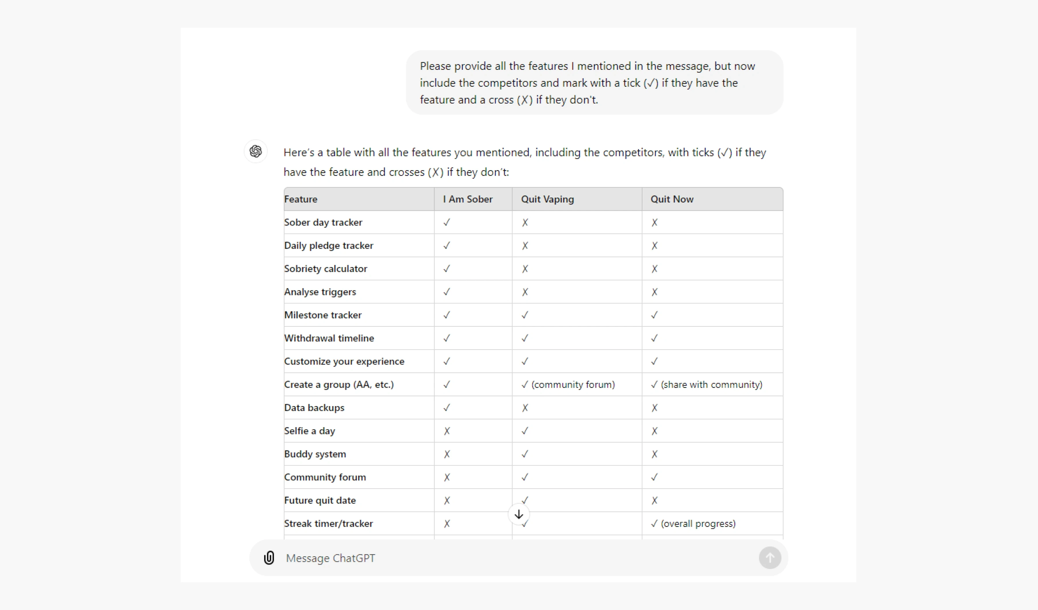
As we move further into the era of AI, I used ChatGPT to efficiently organize the data I gathered. In my Notion, I listed the features and unique selling points of competing apps, and then asked ChatGPT to create a table showing which competitors have those features and which don't. This streamlined the process and gave me a clear comparison of the apps.
4.1 Addiction is a challenge. How do we keep users motivated to quit vaping / reduce nicotine intake?
Habits are actions performed without conscious thought — like grabbing your morning cup of coffee or going to the gym every day after work.
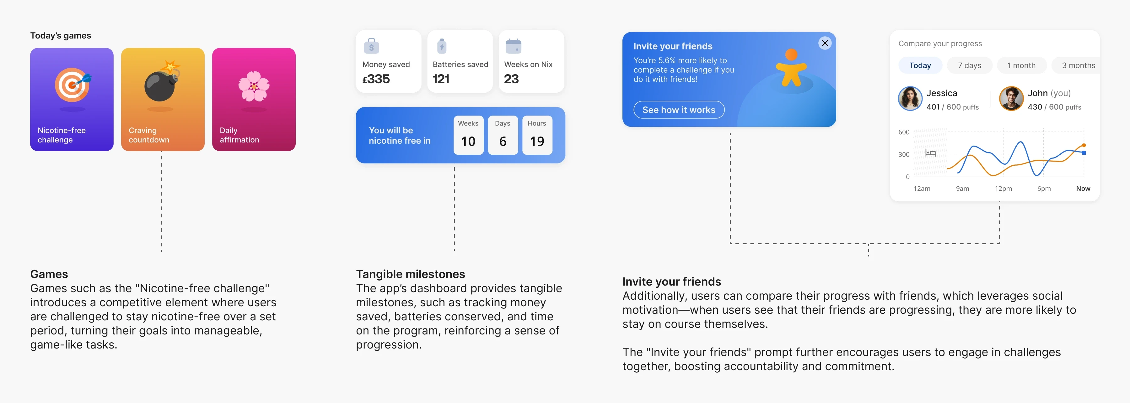
That’s why turning an app into a habit is the holy grail for every product — and Duolingo has managed to do for millions of users. I decided to get some inspiration from their strategies.
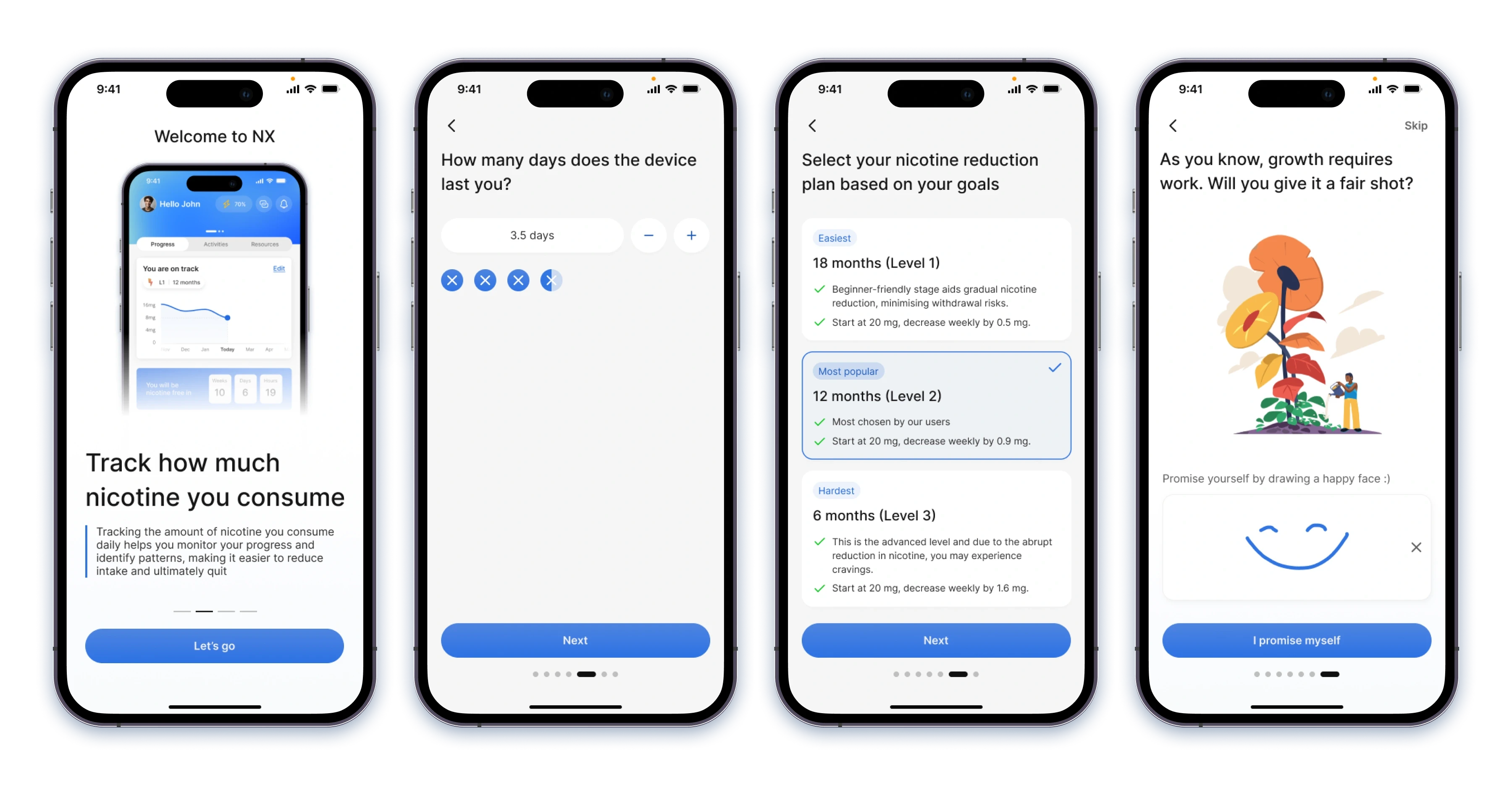
4.2 Avoiding paywalls and prompting users to pay without experiencing any value (leveraging priming)
After completing the onboarding process, users are presented with several deliverables aimed at showcasing the product's value before requesting any credit card information or payments. This approach is designed to prevent barriers for users interested in trying out the product before making a purchase, while also guiding them to link their devices and explore the app's functionalities. This method subtly exposes users to concepts or ideas before asking them to make a decision, which makes them more inclined to commit to this journey.

4.3 During the first week, the app collects baseline live data while the user gets used to the device
We then moved on to designing the webapp, which was a highly collaborative effort among all three designers. My contributions focused primarily on the global top navigation, as well as key features within the table and observation modals.


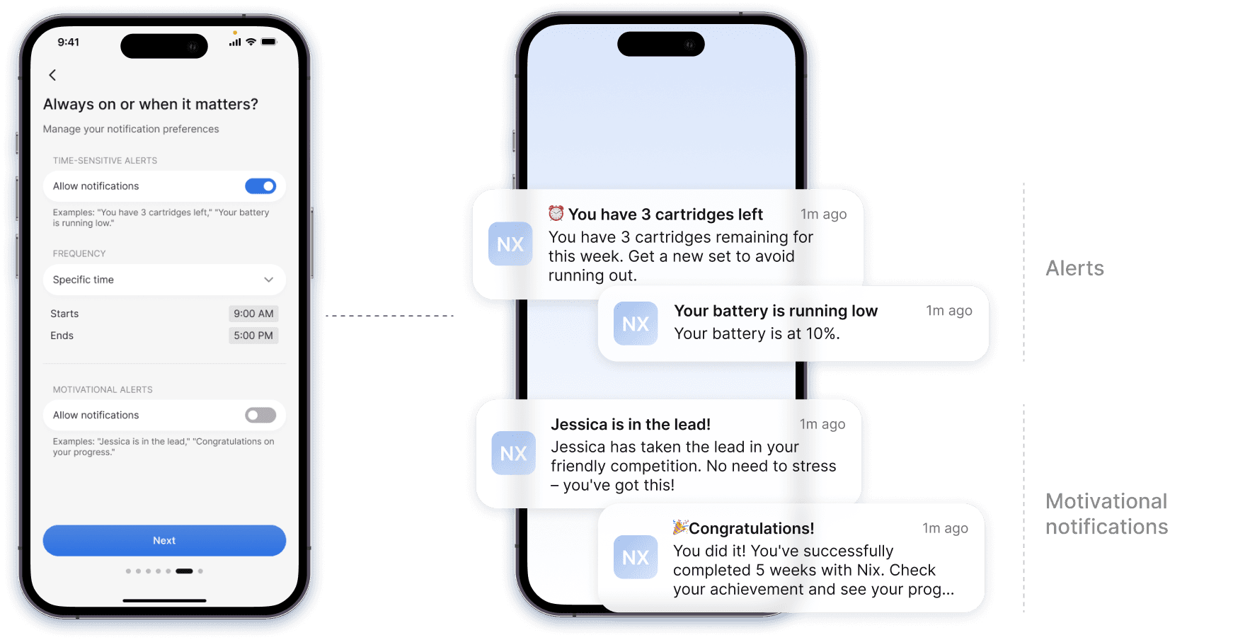
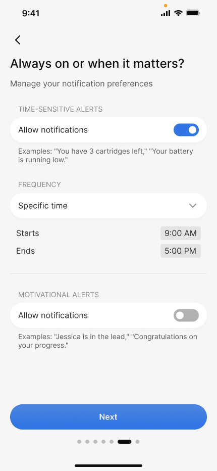
4.4 Push notifications are used to trigger habits and alert the user
A Facebook study found that fewer notifications boost user satisfaction and retention. Slack adjusts notification frequency over time, which we could mirror by reducing and grouping notifications as activity increases. Including frequency options in our onboarding could also help (see pic 1). Another important factor is that frequent notifications could expose a user's quit journey, especially in shared or public spaces, making them uncomfortable.
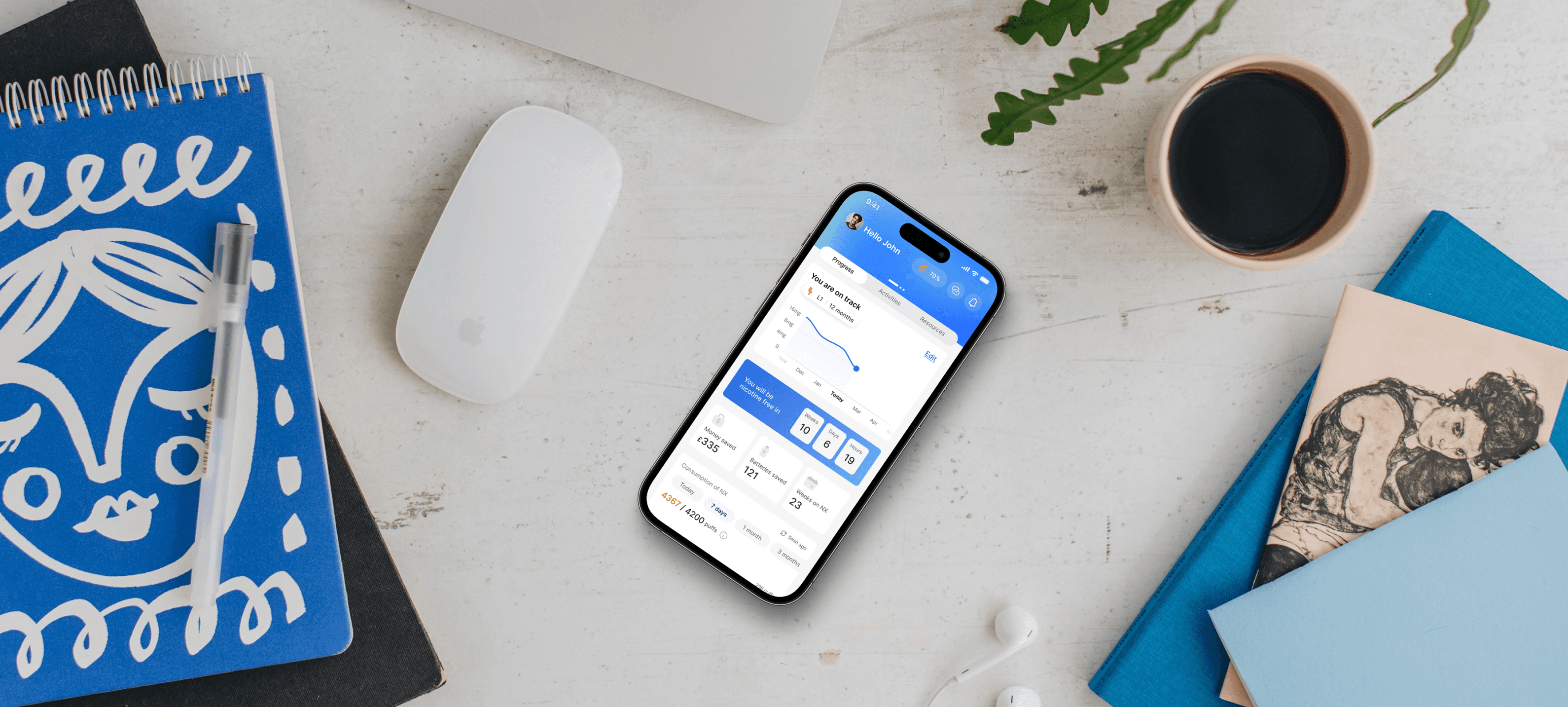
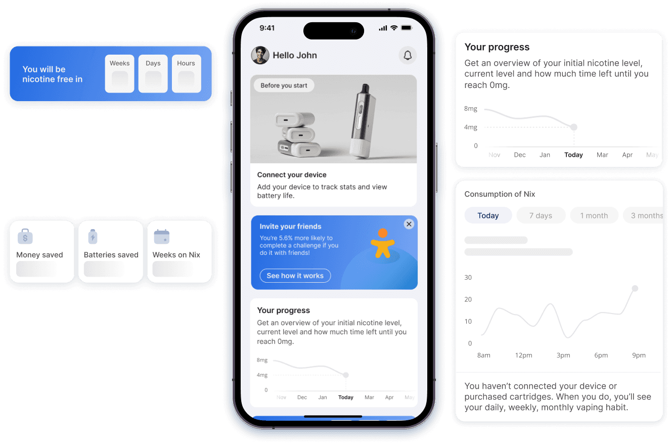
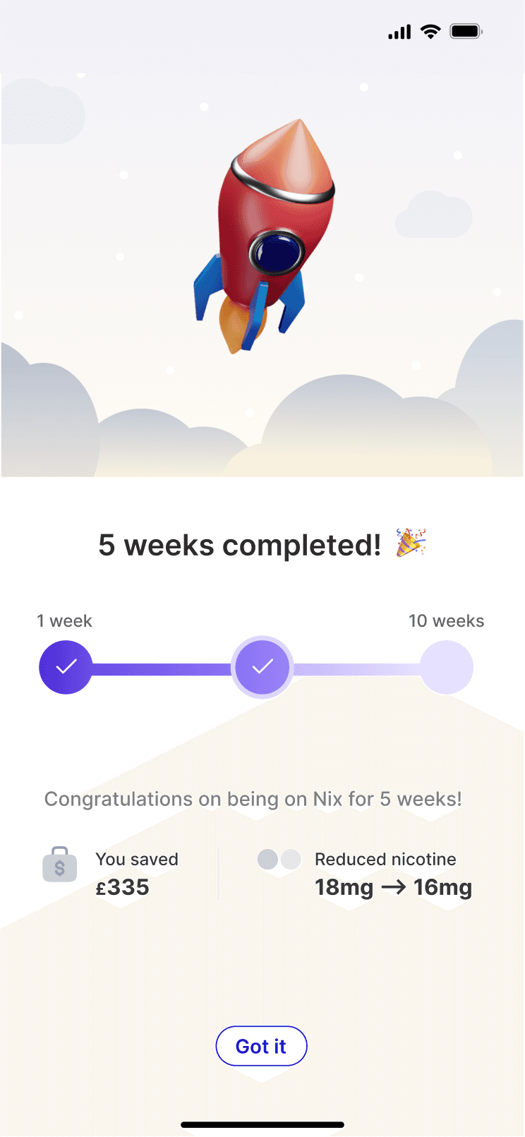
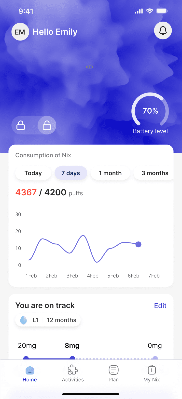
4.5 Data visualizations
Users who are on this journey of change need continuous feedback to remain motivated. However, this feedback must be clear, actionable, and encouraging. Users may not be familiar with the technical data (e.g., puffs, mg of nicotine) or may become overwhelmed by complex graphs. I experimented with different variations to find a way to represent this information so it’s easy to interpret at a glance.
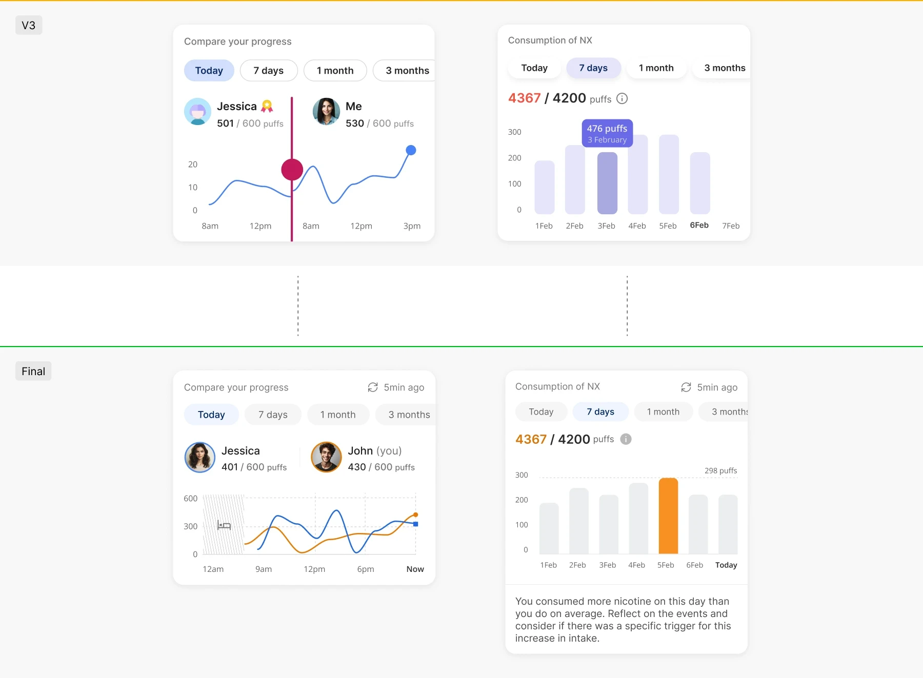
The comparison visualization went through 2 iterations. The first required sliding a control, which was less intuitive. I replaced it with a line chart showing both data sets and added a bed icon to mark the start of usage. The consumption bar chart also underwent 2 iterations. Initially, it had too many colors and a hard-to-read popup. I simplified it with one primary color and added text to explain the data and highlight usage spikes.
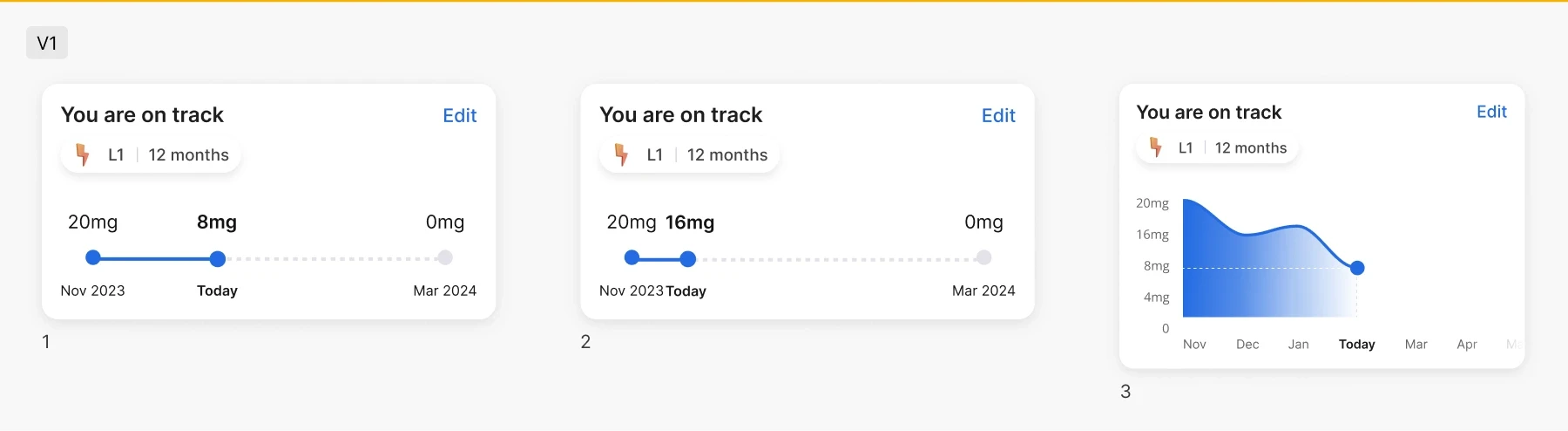
I aimed to represent measurable progress toward a goal (e.g., reducing from 20mg to 8mg over 12 months) using a progress bar. The issue arose when the spacing between data points looked good in cases where the mg levels were well distributed (pic 1). However, for users just starting, the marks would be too close together and might overlap (pic 2). I then tried a third version, switching to a line chart, but found the colours too harsh.
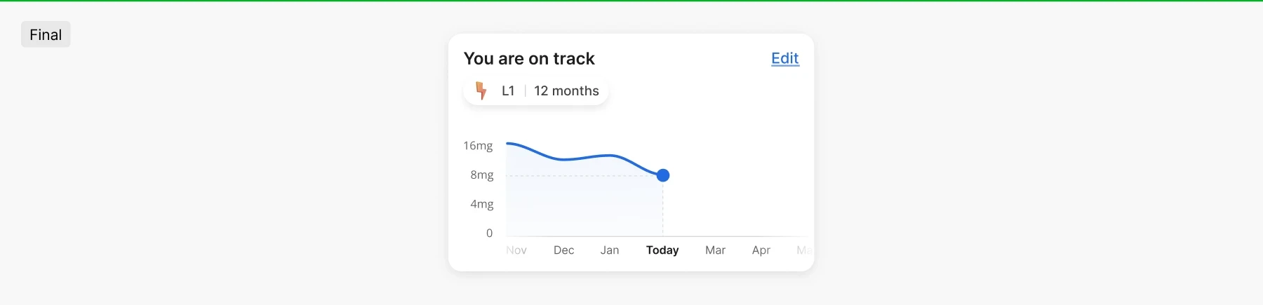
The final version features a line chart with a softer gradient to make it more welcoming. If all the months don’t fit within the bottom of the visualization, users can scroll left to view their progress so far or right to see how much progress remains.
4.6 Sketches
4.7 Iterations
I went through many iterations before reaching a final result I was satisfied with.


next steps
Present the MVP to investors to secure funding.
After obtaining funding, develop version 2 of the app, incorporating new features such as LED light customization, hit level tracking, haptic feedback, and more.
impact and reflections
Engaged in extensive research on nicotine cessation, a completely new field, which was both challenging and enlightening.
Discovered the high prevalence of vaping, which opened my eyes for the urgent need for effective cessation tools.
The need for a rapid presentation of designs in the pitch deck limited the depth of exploration.
Gained significant experience in data visualization, contributing to a deeper understanding of user behaviour.
The project emphasized the importance of innovative solutions for public health challenges and provided a solid foundation for future work.