
AMMCO (African Marine and Coastal Conservation Organisation) encountered challenges with their existing platform (both app and webapp), which was unintuitive and missing key features. Our task was to create a user-friendly app that allows fishermen to document unusual marine activities offline, ensuring they can capture and upload data quickly and accurately without disrupting their work. We also redesigned the webapp to enhance usability, accessibility, and data management, enabling researchers to efficiently analyse and validate the observations submitted by fishermen. National Geographic has, for the third time, pledged a generous $500,000 grant to support AMMCO in its critical mission to protect Africa's coastal marine ecosystems. Find out more.
Project timeline
Nov 2023 - May 2023 (11 months)
Role
Mobile application and webapp
Competitive analsysis
Heuristic evaluation
Redesign
Usability testing
Team
3 UX Designers
1 Project Lead
5 Engineers
1 Field Assistant
Tools
Figma
Miro
Gitlab
Slack
The challenge
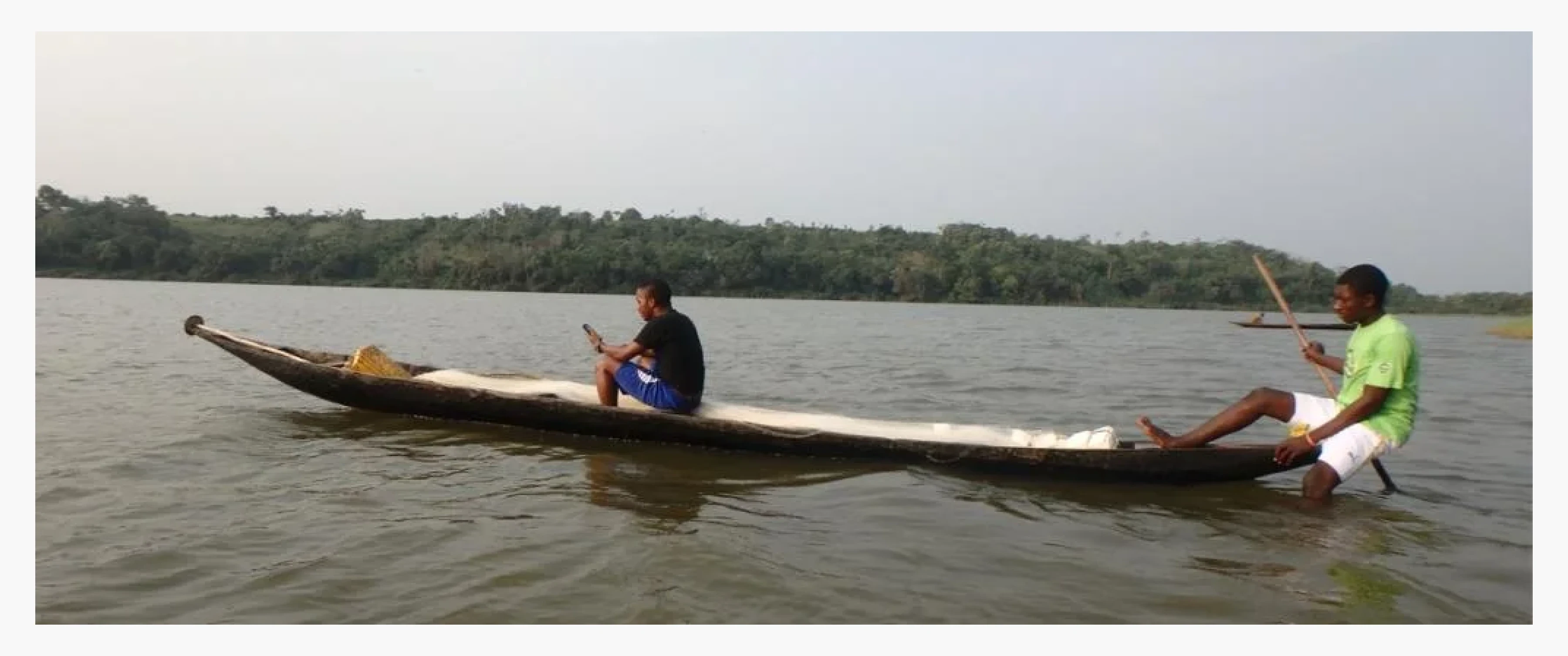
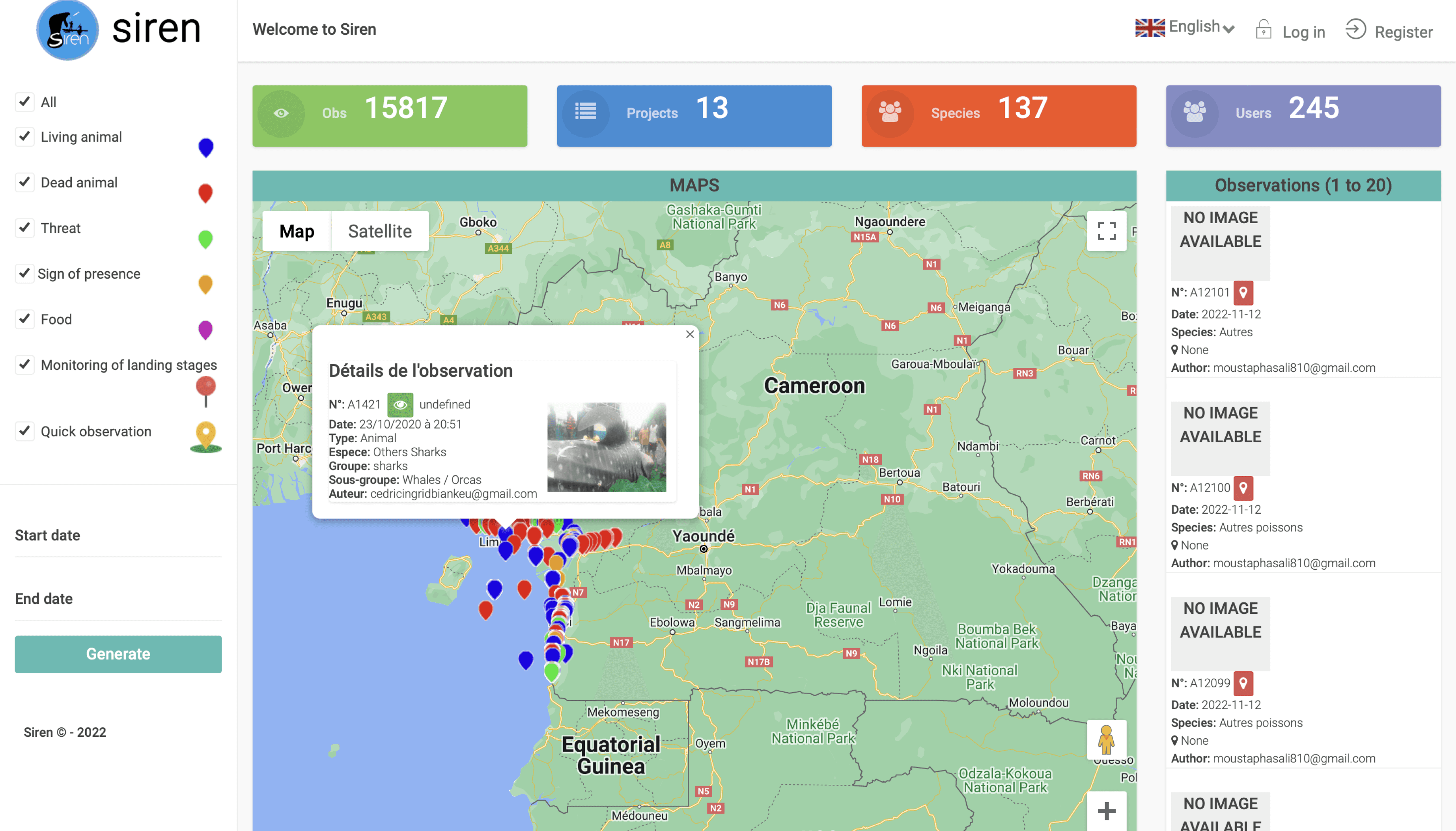
In Cameroon, megafauna like whales, dolphins, manatees, and sea turtles are poorly studied and at risk from poaching, accidental capture, and habitat degradation. To address these issues, a citizen science program was launched in 2015, engaging fishermen along the coast to report sightings and bycatch through the SIREN app. Over five years, the program collected 12,655 observations of 374 species, leading to the identification of critical threats to elasmobranchs, prompting a shift in conservation priorities.
SIREN citizen science project: involvement of fishermen in the conservation of aquatic biodiversity. Source
The solution
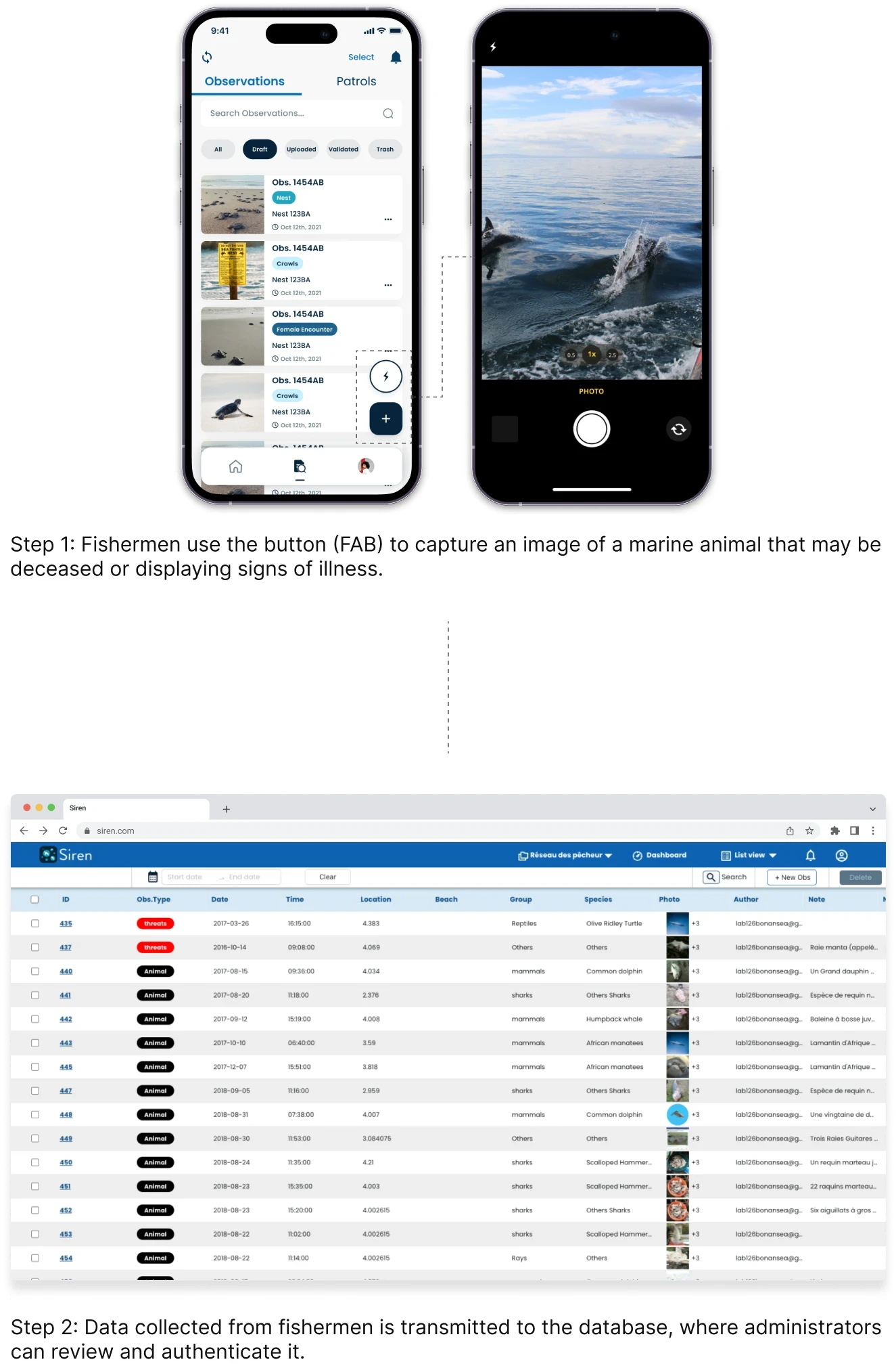
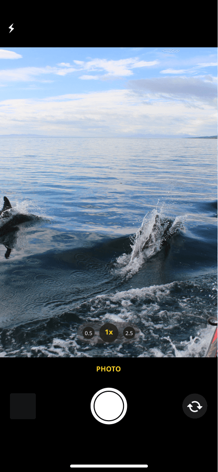
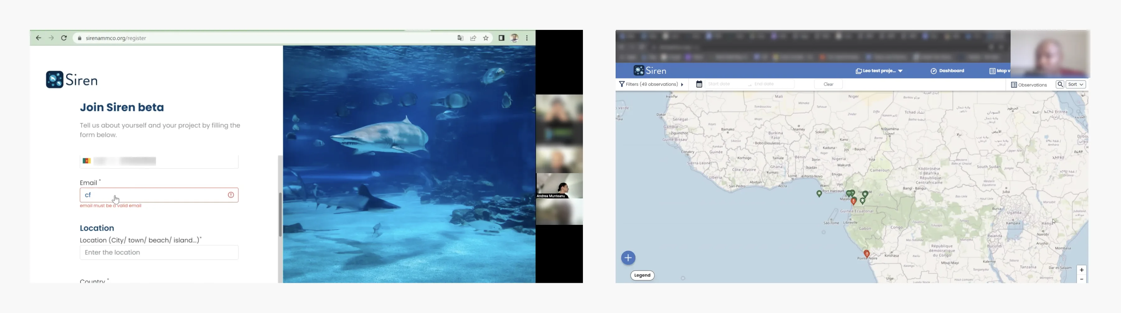
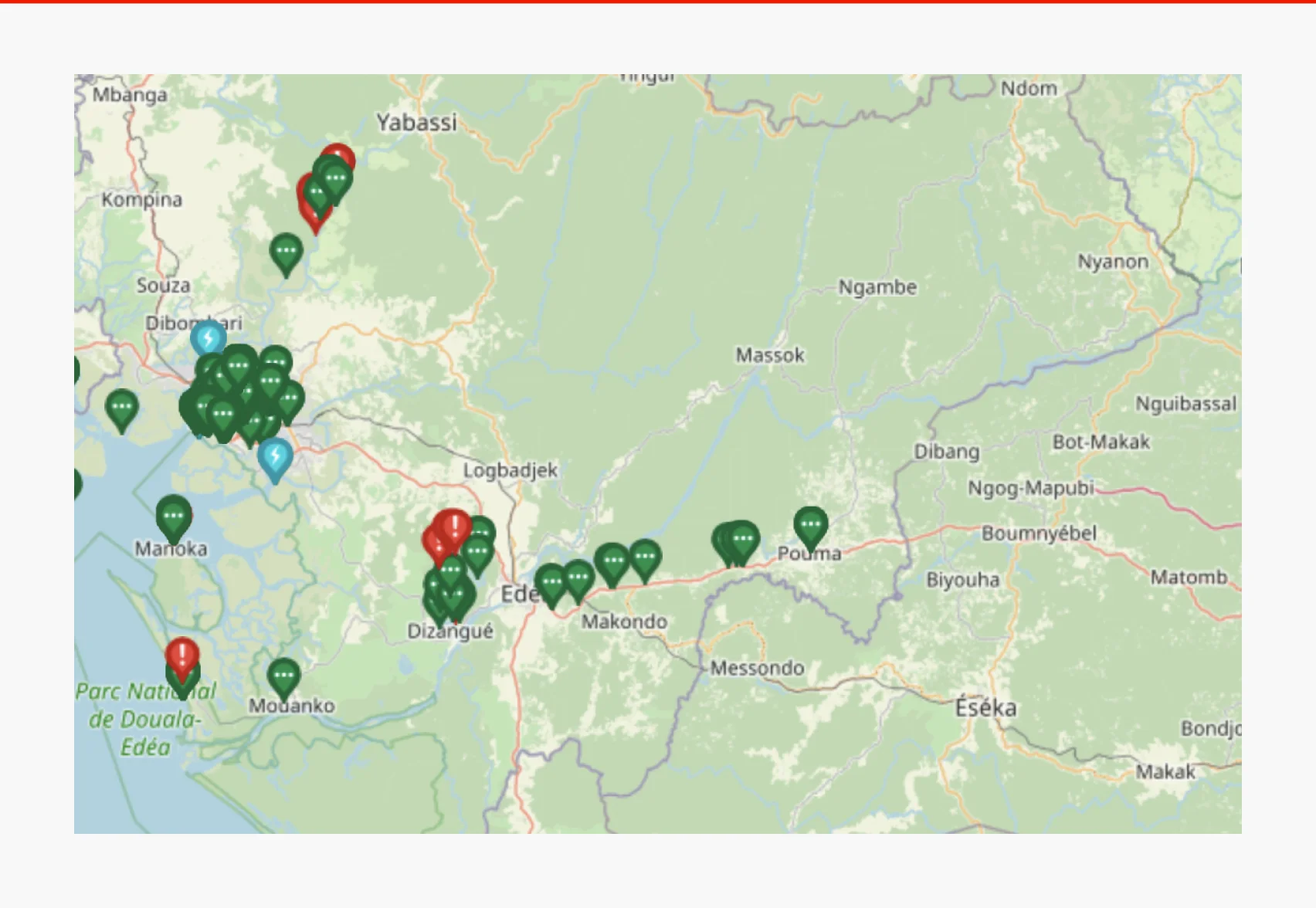
We developed an app for fishermen, who typically go out fishing in the morning, to capture photos of anything unusual, like multiple dead fish in one area. This data is then uploaded through the app and sent to the webapp for analysis by researchers.


Discovery
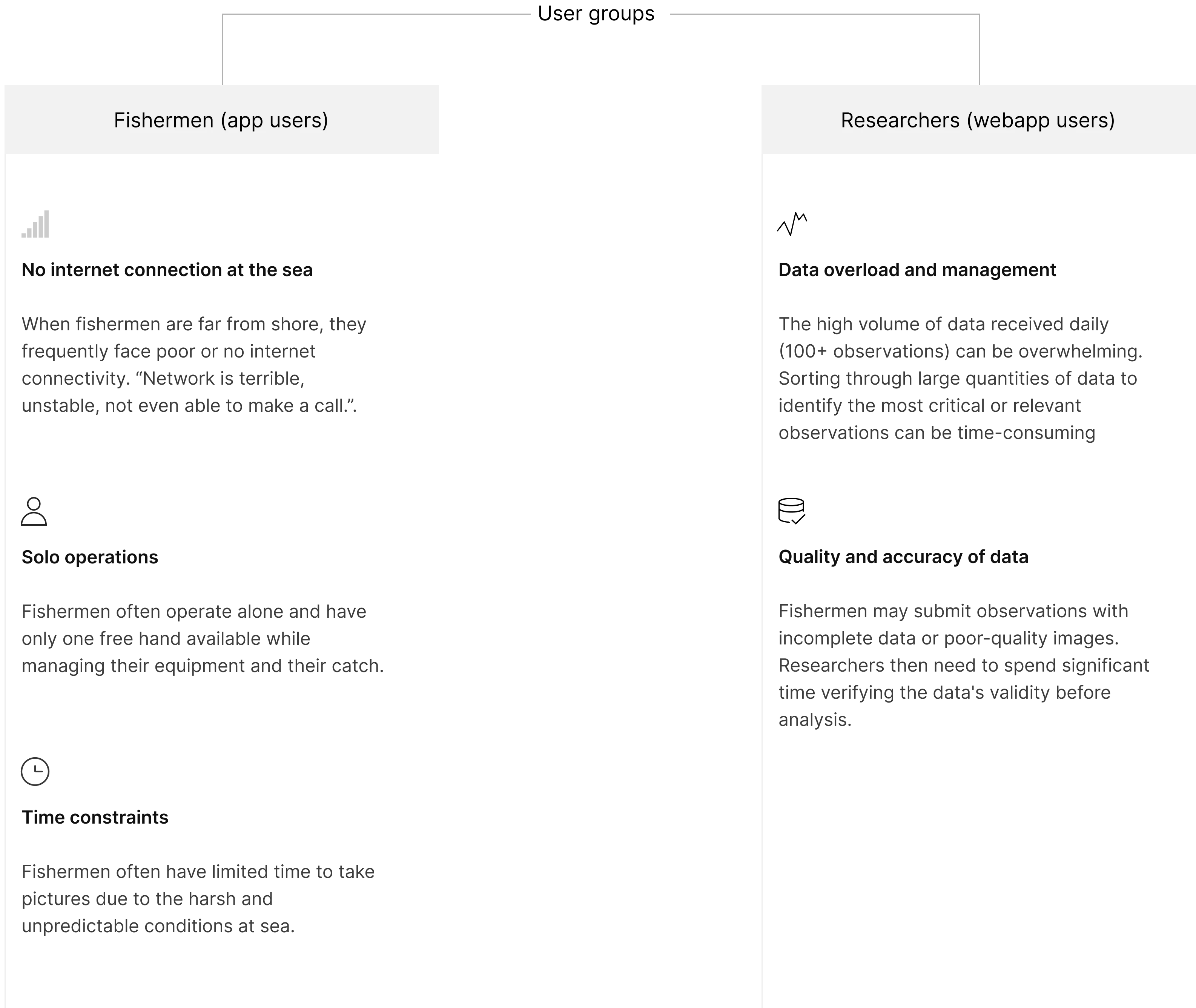
3.1 Conducting user interviews. We discovered 2 user groups: fishermen and researchers
I conducted primary research with three of our target users—fishermen with an average age of 40—and reviewed previous research of the interviews held with the our second target users—researchers. Here’s what I discovered:
3.2 Heuristic analysis of the current platform
I conducted a thorough evaluation of the design using Nielsen's 10 usability heuristics, identified areas for improvement, and prioritised issues based on severity using a 0-4 scale to reflect the importance of each issue.


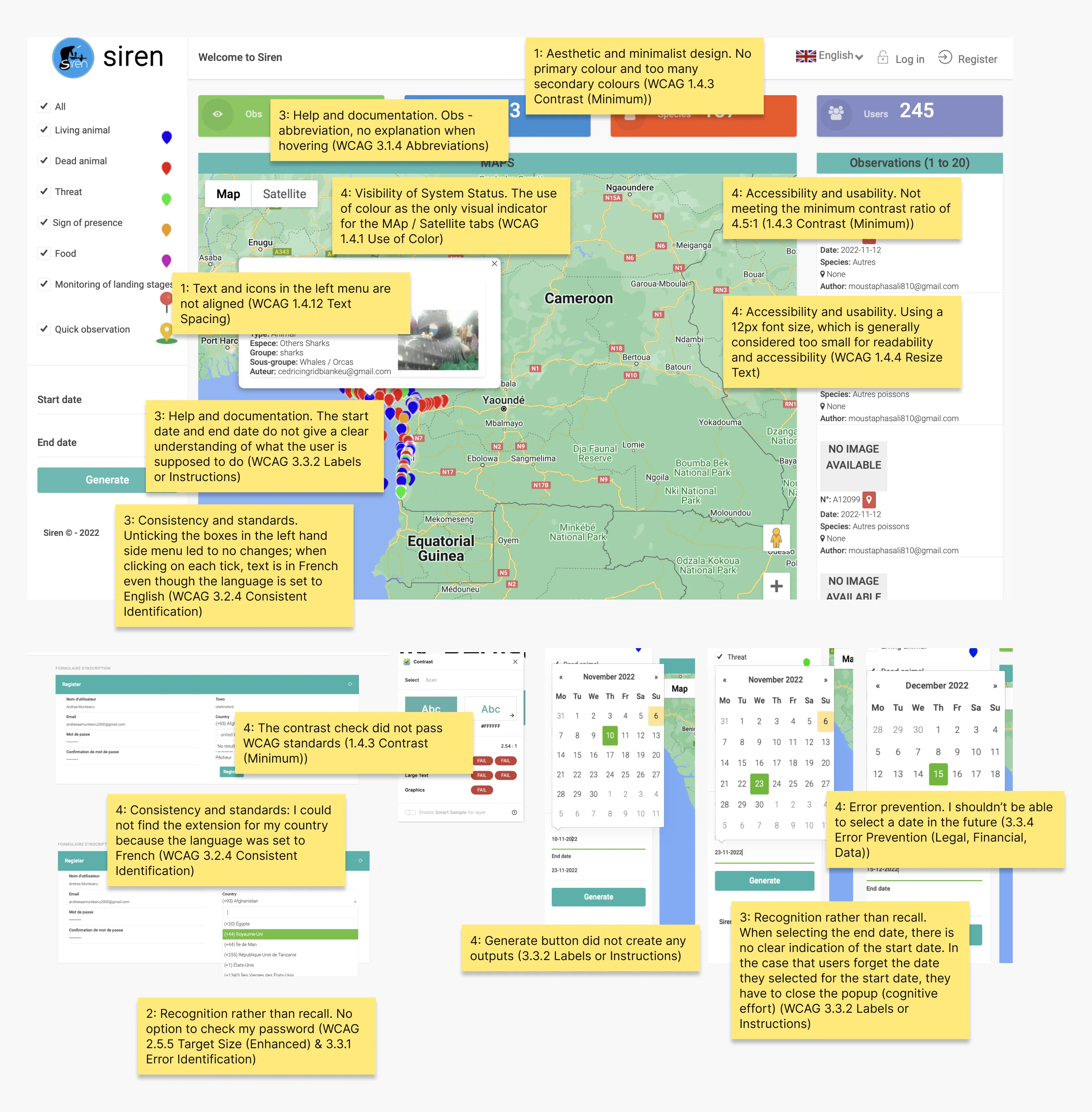
Heuristic analysis of the current platform using a rating scale between 0-4: 0: Not a usability problem; 1: Cosmetic problem; 2: Minor usability problem; 3: Major usability problem (important to fix); 4: Imperative usability problem (must fix)
3.3 Competitive analysis
This project was new territory for all of us as designers, making it challenging to find direct competitors—but we ultimately succeeded. We also analysed indirect competitors like Google Maps and Airbnb for relevant insights. I’ve only wrote notes for the navigation and table sections.
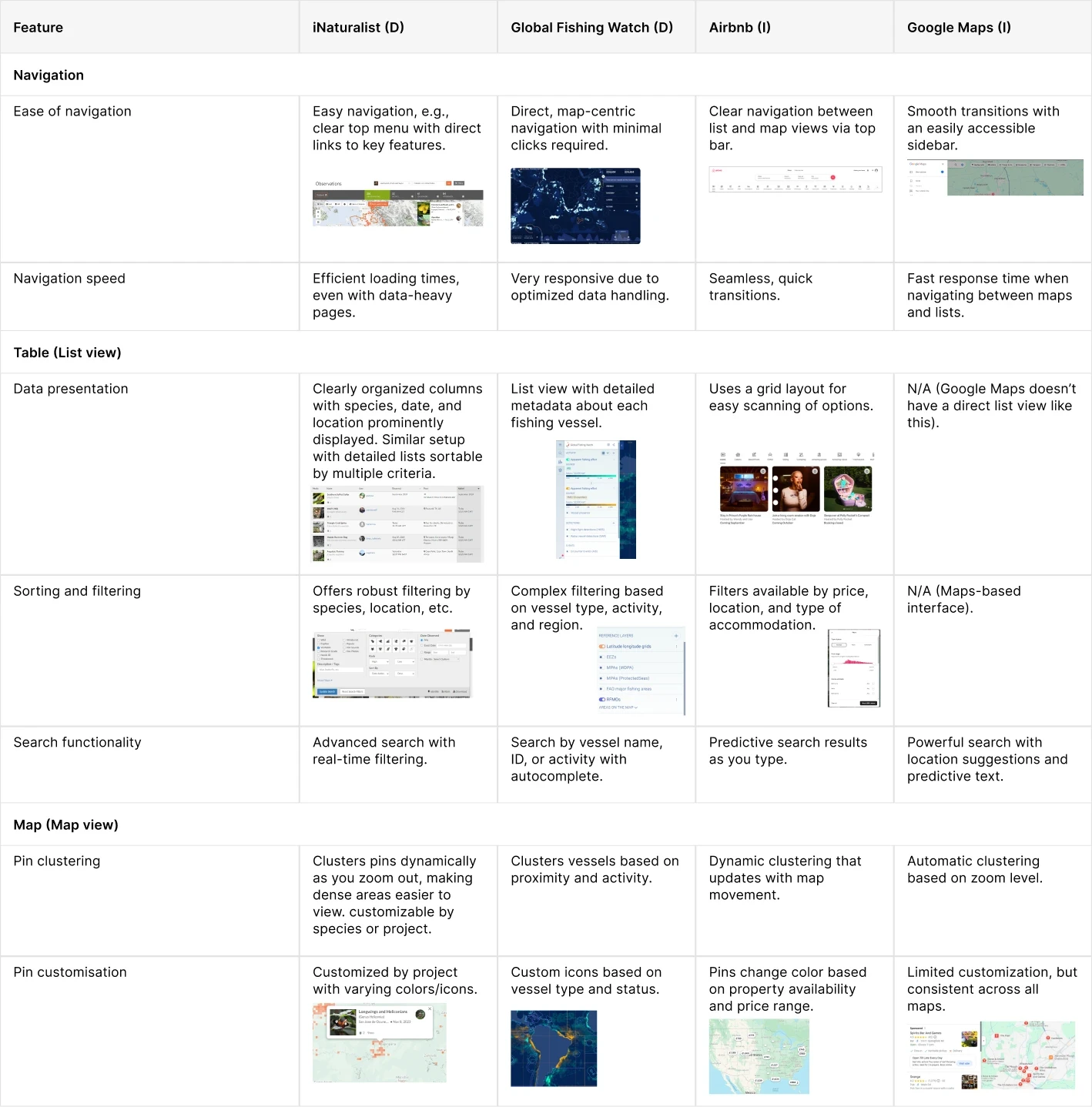
Competitive analysis table. Abbr.: D - direct competitors. I - indirect competitor.
Design: The App
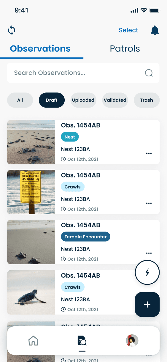
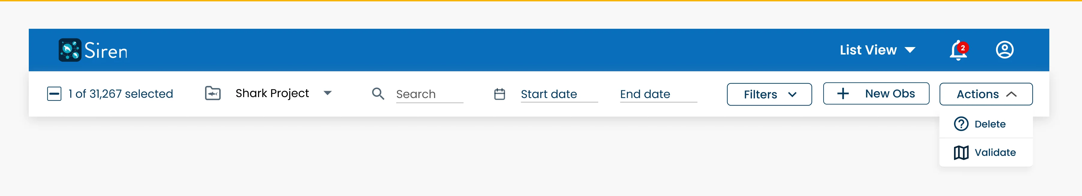
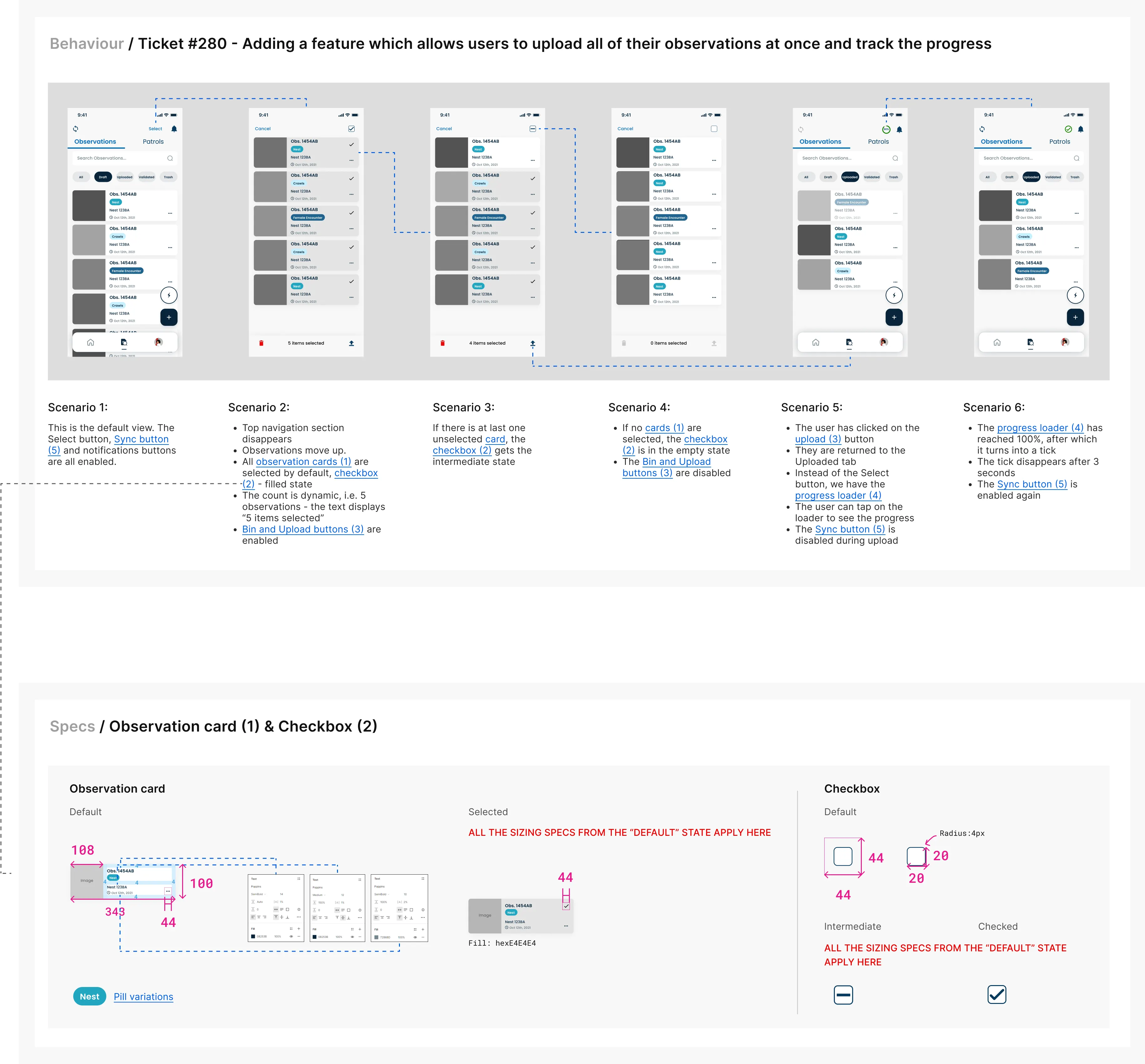
With all the necessary foundations, knowledge, and preparation in place, I began designing a feature to help fishermen quickly upload their observations to the webapp. Previously, users could only upload one observation at a time, which was cumbersome, especially when a fisherman needed to upload multiple observations. This new feature streamlines the process, allowing them to select and upload multiple observations at once.
4.1 App: quick select and tracking feature to quickly upload observations
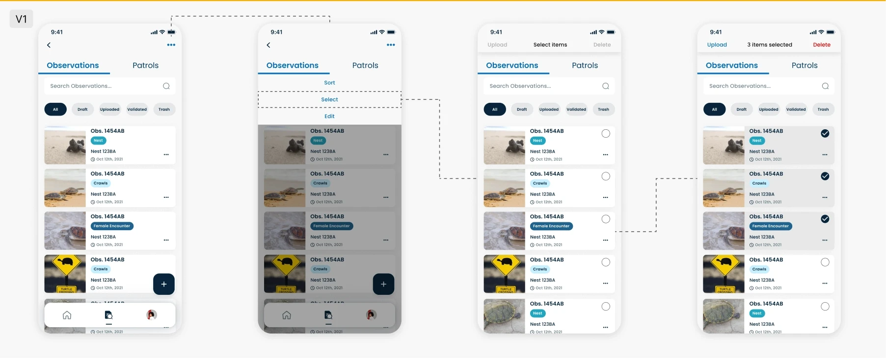
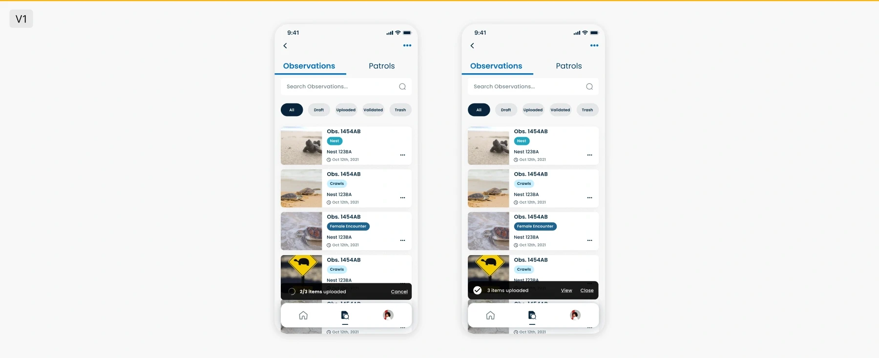
V1: Initial iteration included an ellipsis button which would open up to a dropdown menu with 3 select options. When clicking on "select", a top bar will appear and each card would have the option to be selected. Because most fishermen have difficulties reading or do not have the conditions necessary to read (windy sea), this iteration was not considered.
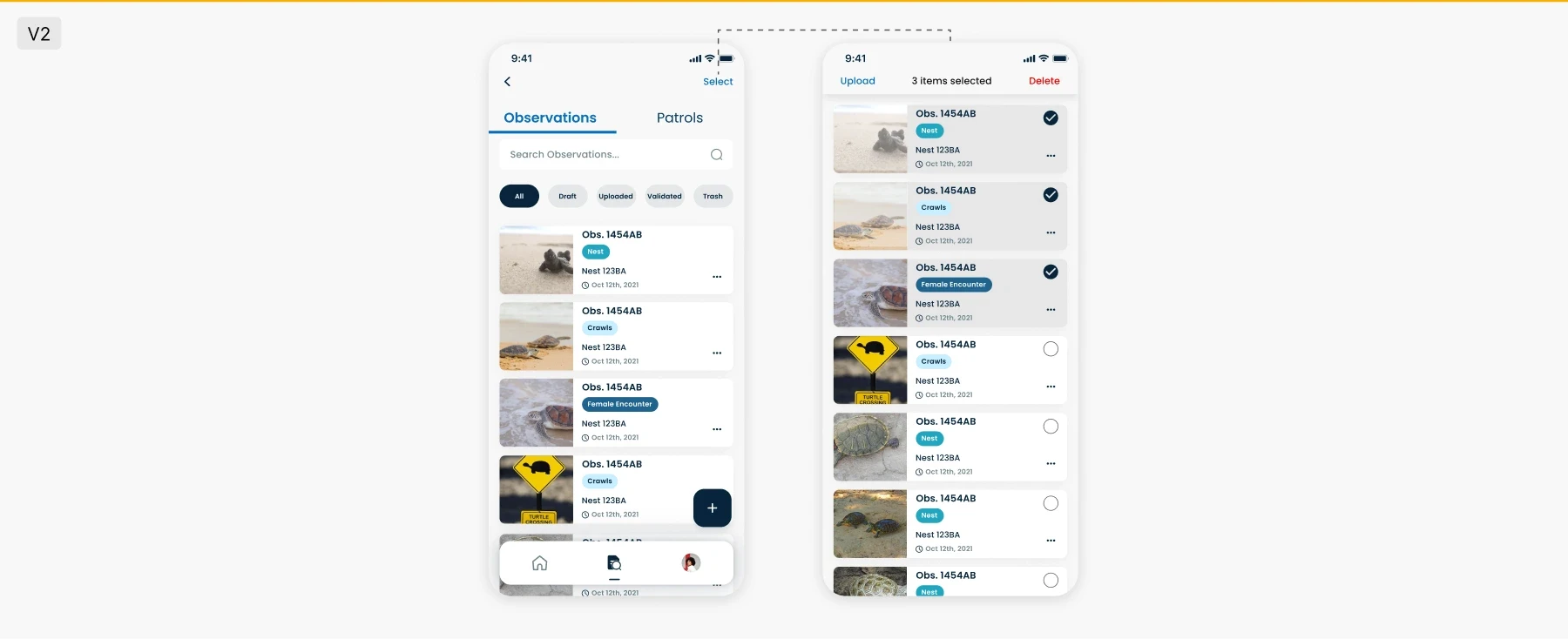
V2: The second iteration included a "Select" button. Once selected, the tabs and search box would disappear and all observations would move up and a top bar would emerge. This iteration needed improvement as it did not include a "cancel" option and to do so, some elements within the design had to be changed.
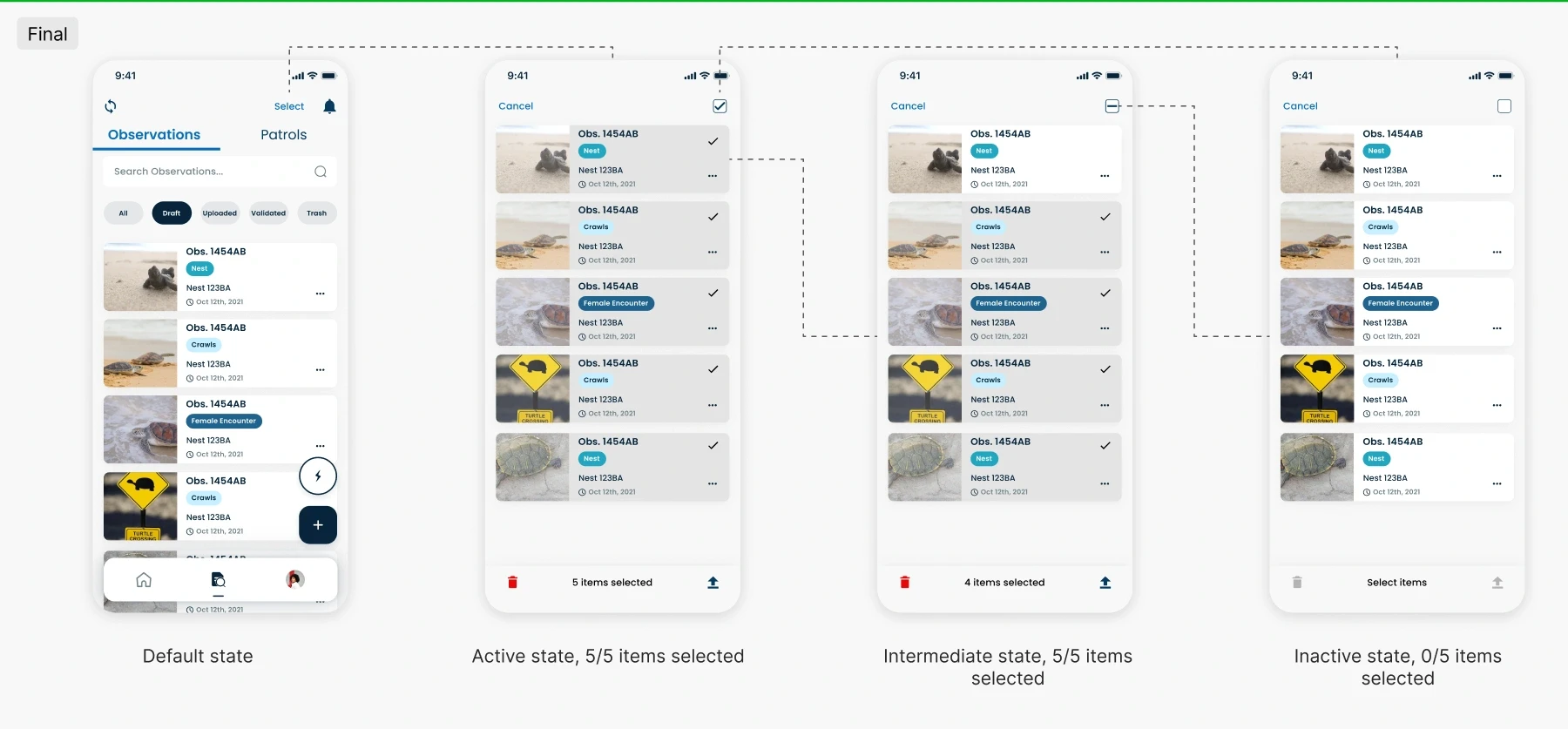
Final version: After discussing the iteration with the Dev and UX team, the final design included a "Cancel" option and a checkbox (which would be selected by default). The bottom bar text options were replaced with icons (more intuitive for users/easier to recognise).
4.2 Tracking progress
V1: The first idea for the "track progress" part of the feature included the addition of a toast notification at the bottom of the screen. This option came with issues such as the toast potentially going unnoticed and also interfering with other features within the app.
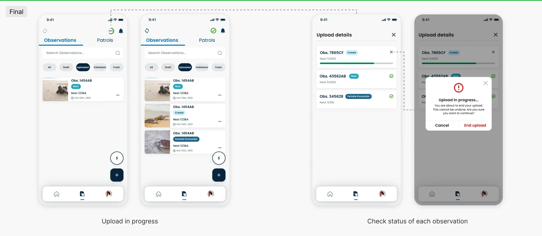
The final iteration allows users to have a live "ongoing" alert of the upload taking place (circular progress loader). The user will also be able to end an upload when an observation may be taking too long to upload or it has been mistakenly added.
Design: The WebAPP
5.1 Early ideation
We then moved on to designing the webapp, which was a highly collaborative effort among all three designers. My contributions focused primarily on the global top navigation, as well as key features within the table and observation modals.
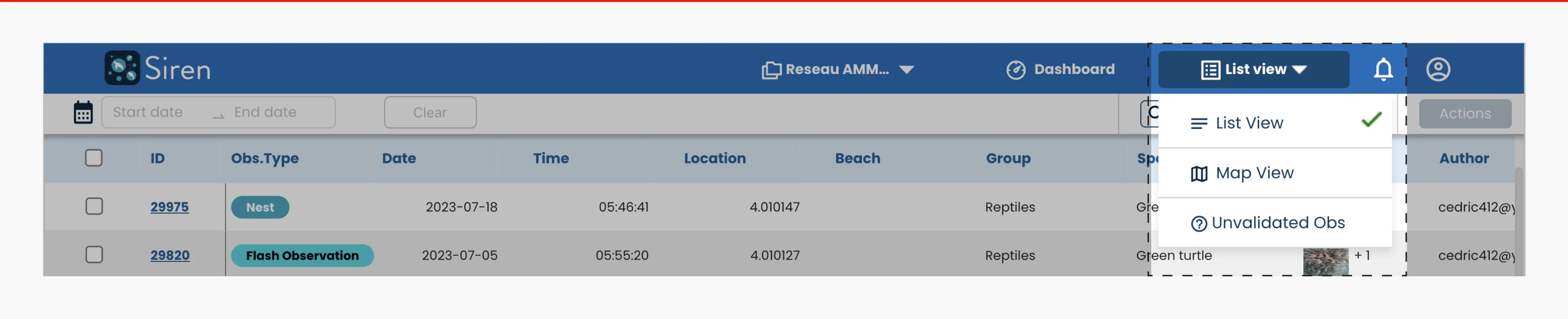
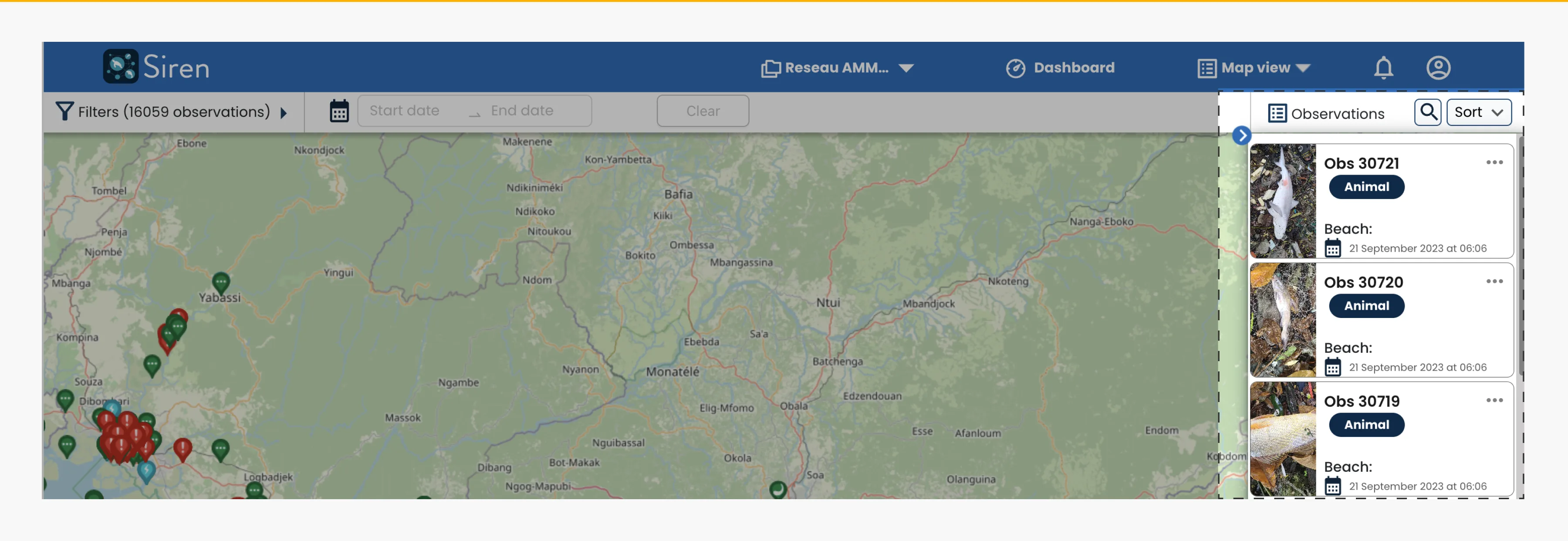
Designing the map and list view involved collaborative discussions, where we explored various options, provided reasoning for our choices, and ultimately reached a consensus.
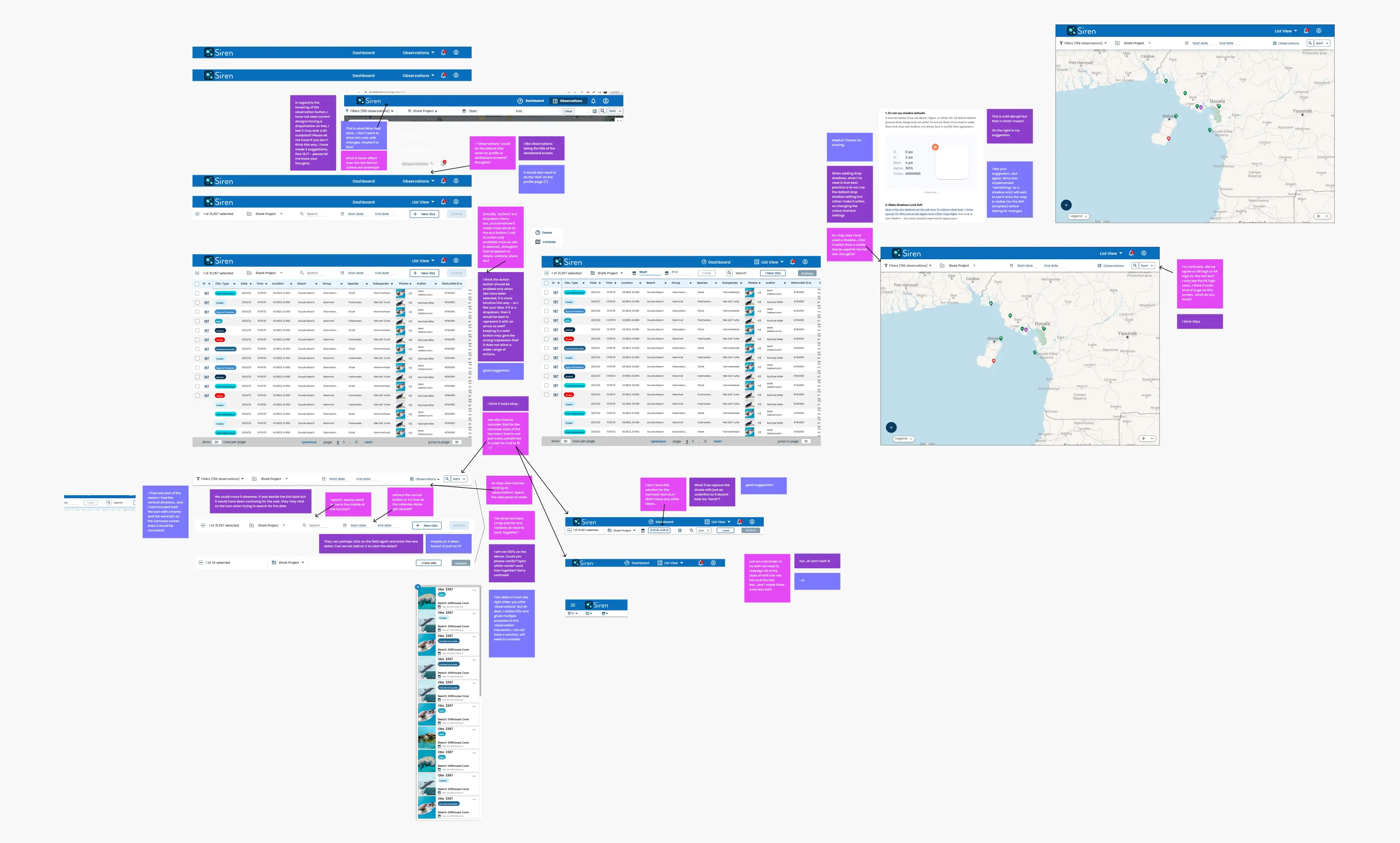
On the webapp, one of the most critical features we needed to develop was the top global navigation. We explored multiple variations, engaged in discussions with stakeholders, gathered all the necessary features for the navigation, and evaluated various design options.
In our first version, we included all the necessary features on the page. However, the navigation ended up looking cluttered, with important features like filters placed at the end of the bar.
In our second version, we rearranged some features and added important ones, such as placing filters slightly to the right and making the search function more intuitive. Despite these improvements, the navigation still appeared cluttered.
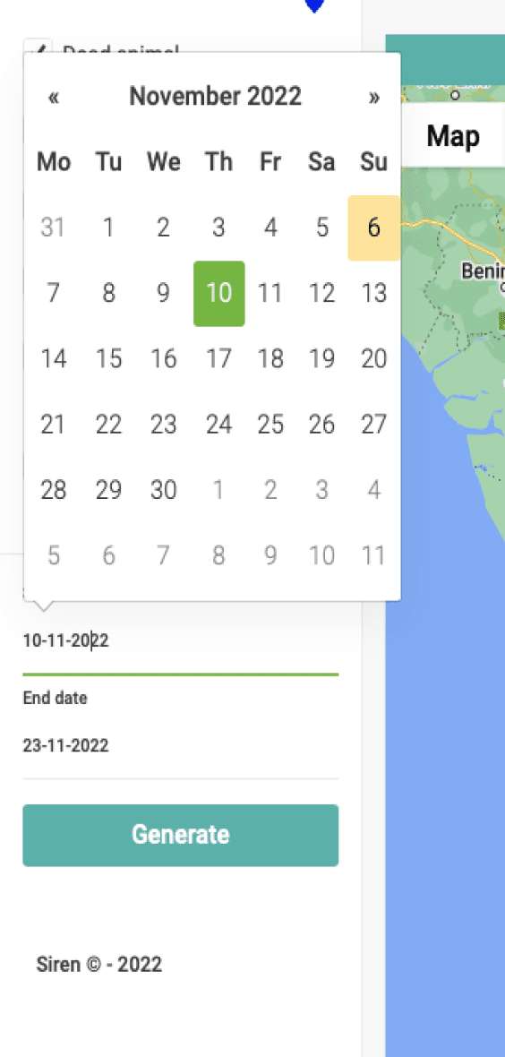
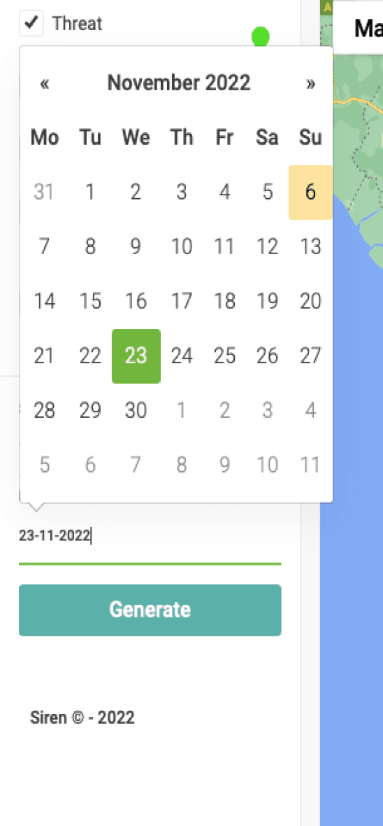
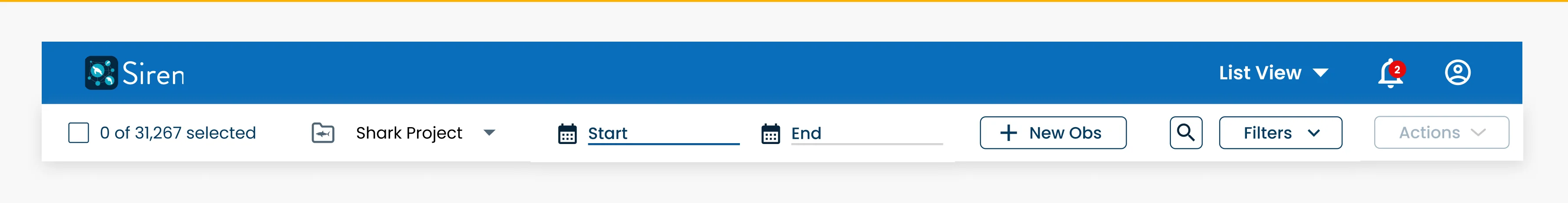
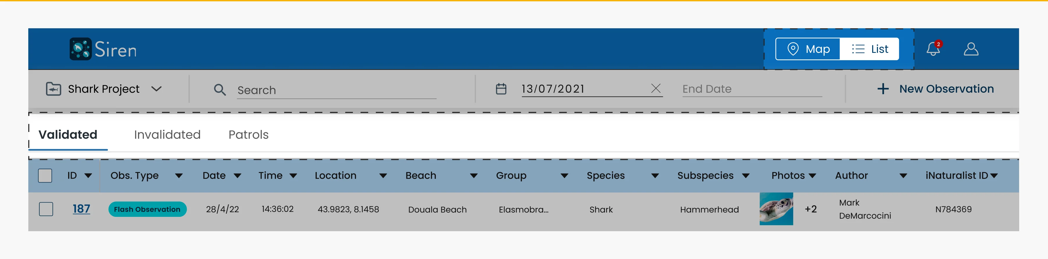
In our final version, we streamlined the design by removing some features, such as the indicator for the number of selected observations and the actions button, which was previously only enabled after selecting at least one observation. Instead, we decided to replace the top navigation features with the number of selected observations and the actions upon making a selection. This adjustment reduced the top navigation to just four features—filters, search, date, and new observation—resulting in a cleaner and more intuitive interface.
5.2 UX - engineer handoff: technical limitations
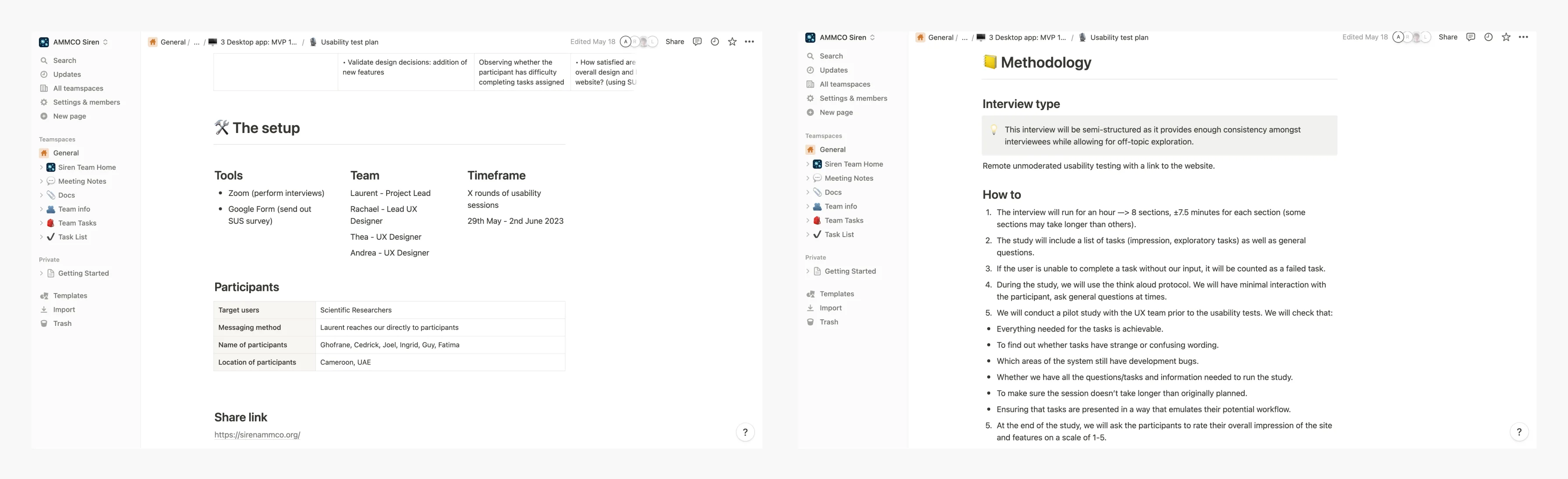
All our software engineers were based in Cameroon, which led to challenges due to poor internet connectivity. This meant we couldn't rely solely on Figma for behaviour and component specifications. Without the luxury of a dedicated business analyst, we also had to write the acceptance criteria ourselves. To address these issues, we decided to create comprehensive, detailed PDFs to describe the design behaviour and requirements.
6.2 Interviews
We conducted interviews with six participants located in Cameroon and the UAE via Zoom. The sessions were remotely moderated and recorded, with the UX team rotating roles as moderators, note-takers, and observers. Each one-hour session was divided into eight sections, with roughly 7.5 minutes allocated to each. Our approach included tracking and recording error rates, exploratory and impression tasks. We also employed the "think aloud" protocol, ensuring minimal interaction with participants to observe their natural behaviour.
Designing the map and list view involved collaborative discussions, where we explored various options, provided reasoning for our choices, and ultimately reached a consensus.
6.3 Analysing the insights
We collected all our interview insights as individual sticky notes in Miro
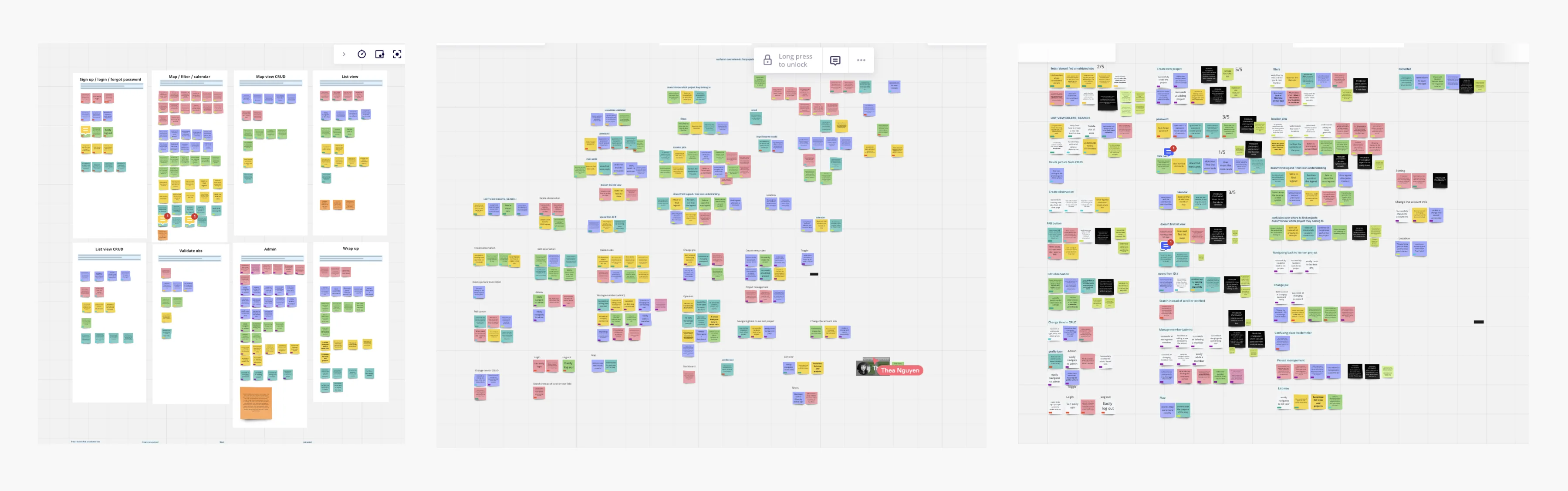
Picture 1: We categorised the sticky notes by section and documented each participant's experiences; Picture 2: Next, we rearranged the sticky notes, attempting to create different groups that were not section-specific. Picture 3: Beside each newly formed section, we included the problem statement in black, along with potential solutions. With all the problem statements prepared, each of us received three stars to allocate to what we considered the most significant issues.
6.4 Findings
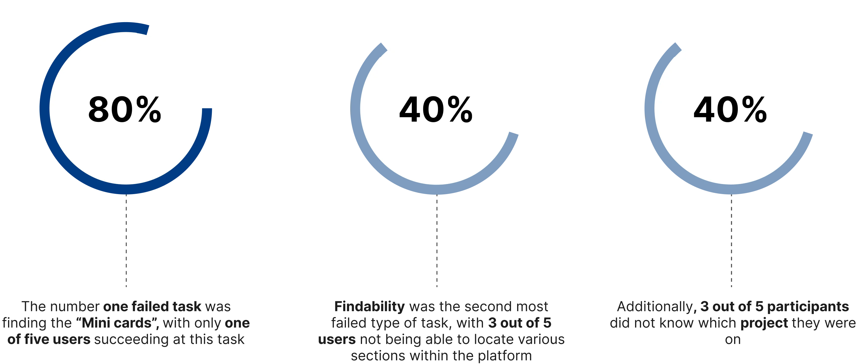
7.2 Users were unsure how to edit an observation
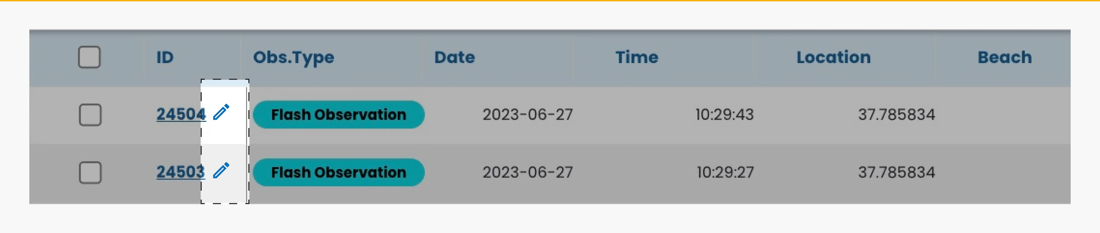
Initial suggestion: Users initially had difficulty editing observations despite the visible edit option with the observation ID being blue and underlined. We considered adding an edit icon upon hover but felt users would grasp the edit functionality after their first use of the app.
7.4 User manual
We initially aimed to avoid creating a user manual, relying on the web app's intuitiveness. However, we discovered that some users are not as tech-savvy and require instructions. Currently, this is a PDF guide, but in the future, we might transform it into an interactive onboarding experience.
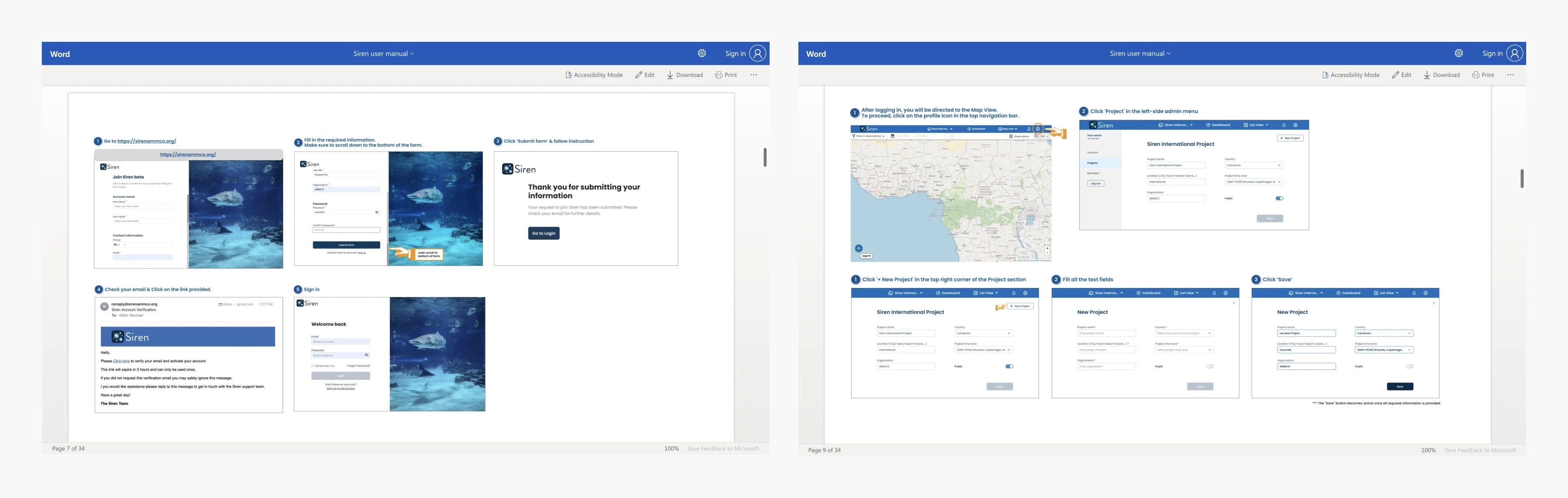
The Word document guide for new users on how to use the web app.
next steps
Design active onboarding to replace the user manual
Localisation. Addition of language options, French and English taking into consideration localisation best practices
Innovative technologies. Use AI to give immediate, approximate identifications of the species in the photos, which can then be verified by researchers.
Gamification. Introduce leader boards that highlight the most active contributors, with potential monthly challenges to encourage continuous engagement. Collaborate with National Geographic to create special badges or rewards for contributors that reflect their ongoing commitment to conservation.
impact and reflections
By designing an intuitive webapp interface for researchers, we enable them to efficiently analyse the data collected. This accelerates the process of identifying patterns, threats, and areas that need immediate attention, ultimately aiding in the preservation of marine megafauna.
This project was incredibly exciting. However, due to budget constraints as an NGO, we had limited resources, resulting in a small development team and a prolonged development process.
The language barrier between the UX team and developers hindered communication, and we primarily relied on the project link for collaboration, a practice we began to change towards the project's conclusion.
Unfortunately, we shipped the product to production without conducting usability tests beforehand. This decision had significant repercussions, as certain elements, such as the toolbar in the map and list view, require a complete redesign.