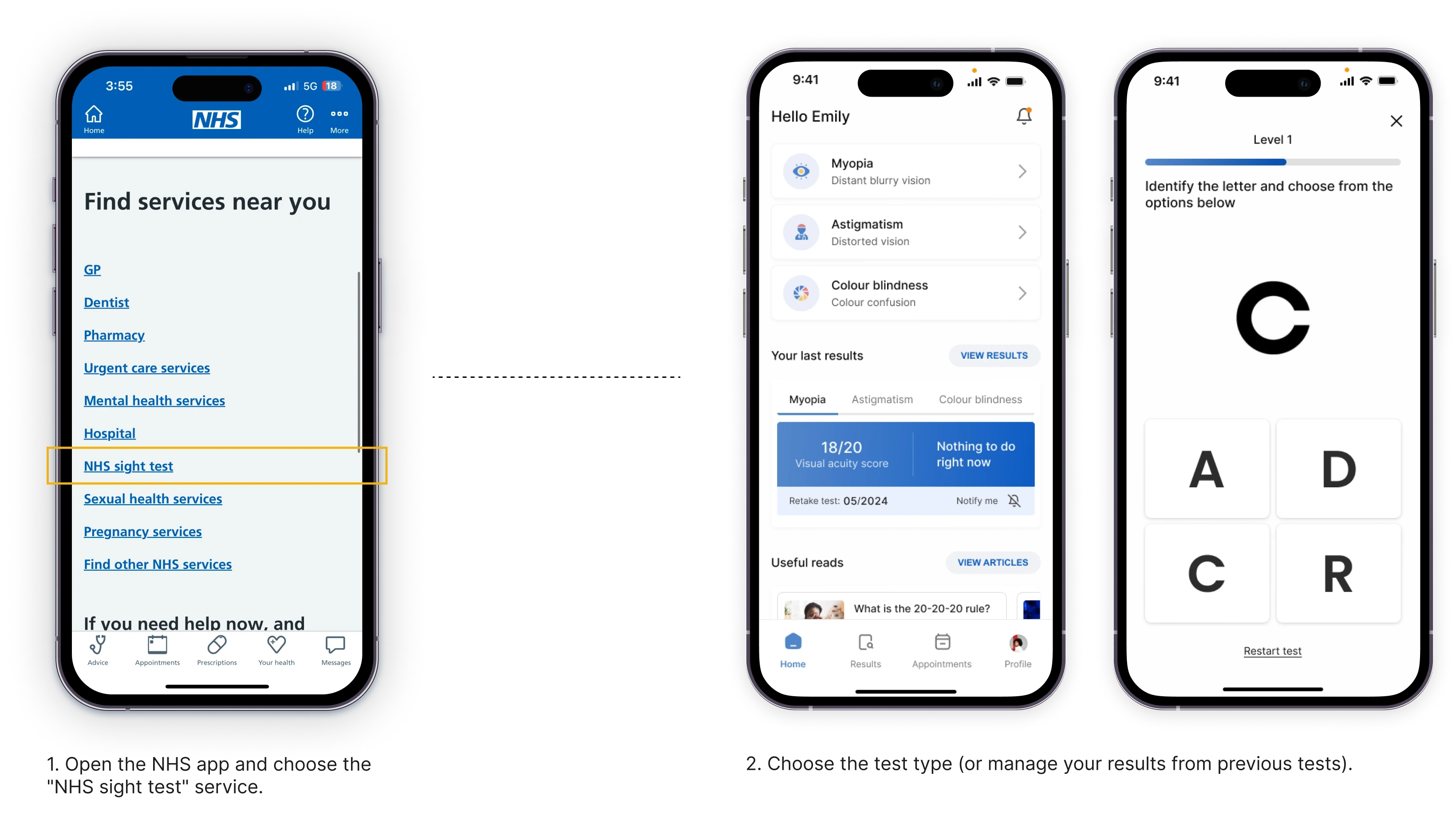
app · b2c / b2b · med-tech


This NHS-integrated app (or MACVision) is a convenient way to test for common visual impairments at home, however it does not replace professional diagnosis by optometrists. Testing at home is an affordable preliminary exam before consulting a doctor and it could save millions in healthcare expenses.
Project timeline
October 2022 - December 2022
Revisited December 2023
Role
User Research, prototyping, UI design
Team
2 UX Designers
Tools
Figma
Miro
the problem
Vision impairment poses an enormous global financial burden with the annual global costs of productivity losses associated with vision impairment. 2.2 million million people have a near or distance vision impairment in the UK. 3.0% % is the current prevalence of sight loss and blindness. This is projected to increase to 5.4% or approximately 4 million people by 2050. 43k cataract procedures in England in November 2021 - 21% higher than five years previously.
The most common causes of visual impairment globally are:
- cataracts (33%).
- glaucoma (2%).
- uncorrected refractive errors (43%). Refractive errors include near-sightedness (myopia), far-sightedness, presbyopia, and astigmatism.
Hurdles of routine vision tests: domino effect

the solution
Create an NHS-integrated app that would:
Be quick and easy to follow
The app provides real time instructions on how to conduct the test and easy to follow for any group of people, be it tech savvy or non-tech savvy.
Prevent disease worsening
With some conditions getting progressively worse due to various factors (career, age, genetics, etc.), being able to conduct regular precautionary tests is essential in preventing disease worsening.
Save on NHS expenditure
In 2020/21 the Department for Health and Social Care spent £192 billion with an average of £39.23 per GP consultation. By preventing no shows and paying the workforce only for essential hospital visits, this can considerably save on NHS expenditure.
research
Conducting user interviews with 3 people
All of them go to checkups on average once 1.5 - 2 years.
Because of increased appointment costs and insurance, one of the participant goes back from California to her home country Korea for appointments and prescription glasses.
One of them used to buy glasses off of non-licensed prescription glasses sellers which led to complications.
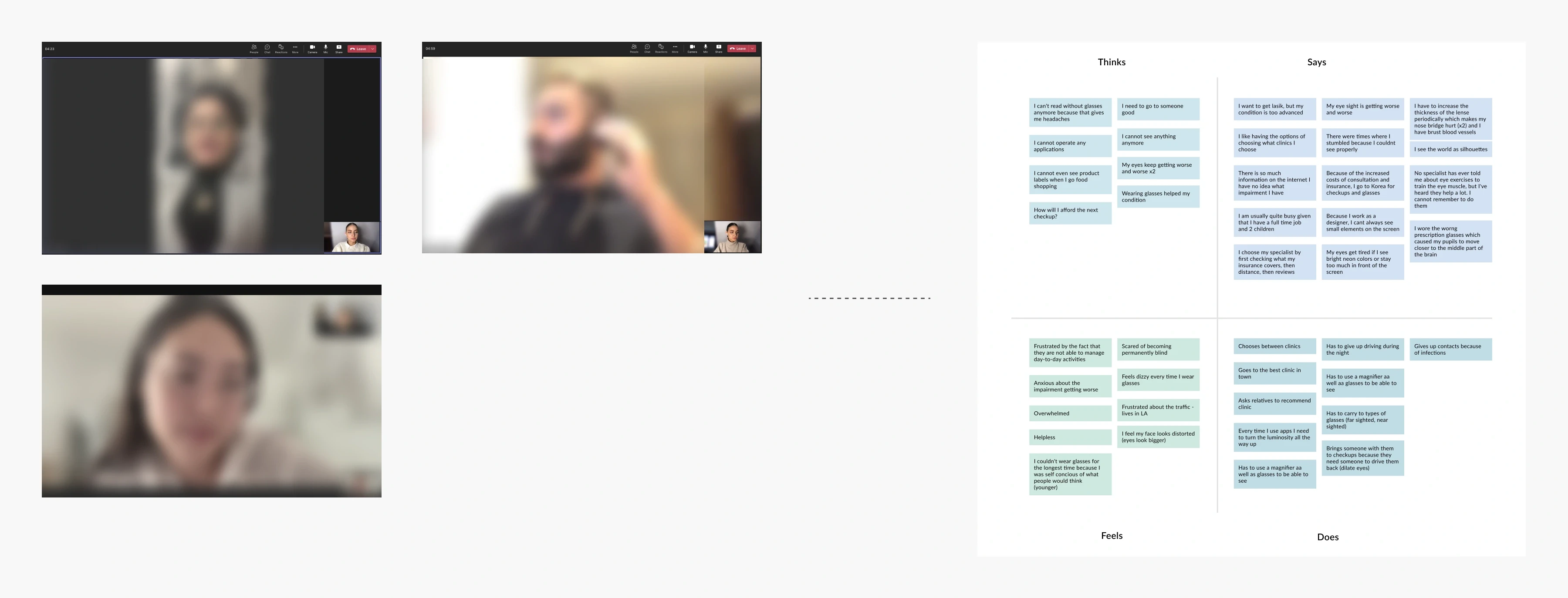
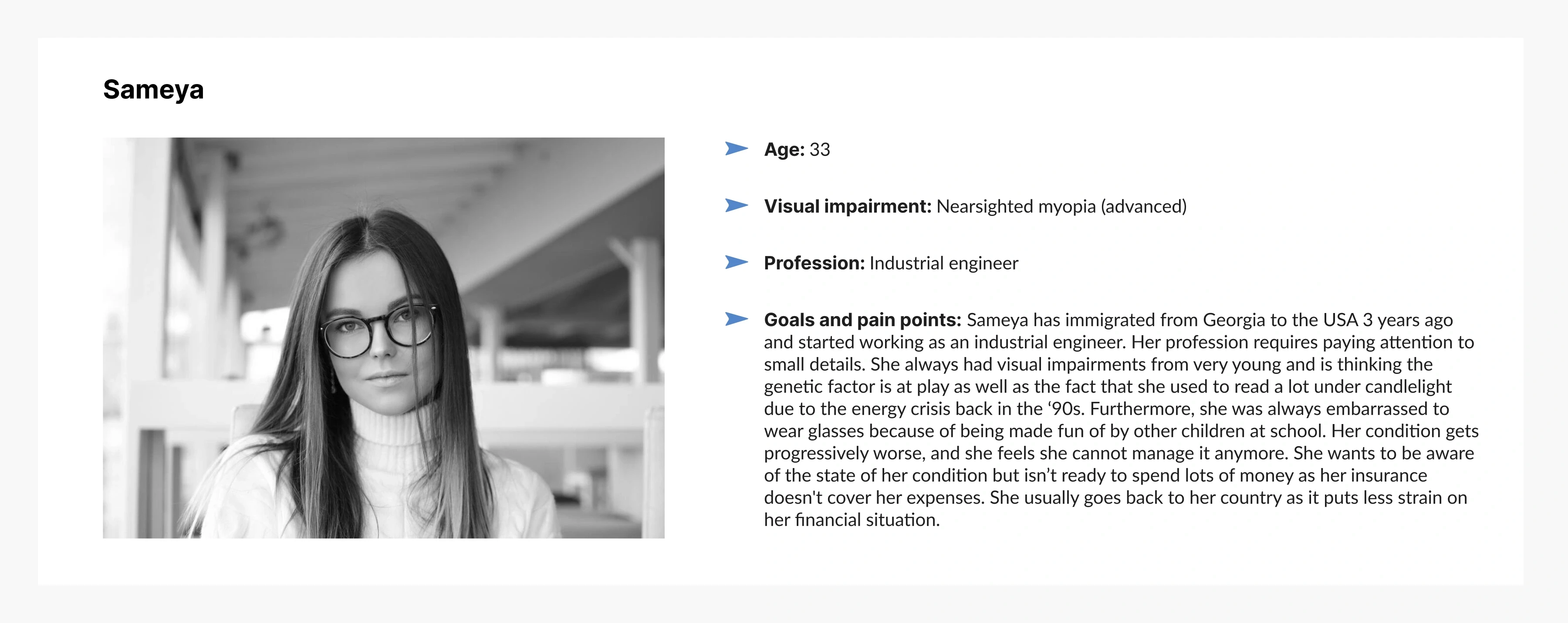
Persona developed based on insights gathered from affinity mapping conducted after user interviews.
Most competitor apps featured unclear instructions, required assistance, and lacked accuracy
After identifying the major challenges faced by people with visual impairments, I explored existing app solutions but found most had unclear instructions and required assistance.
design
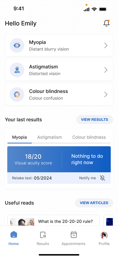
The homepage: Switching to bottom navigation for convenience and adjusting colours, layouts, and fonts for a polished look
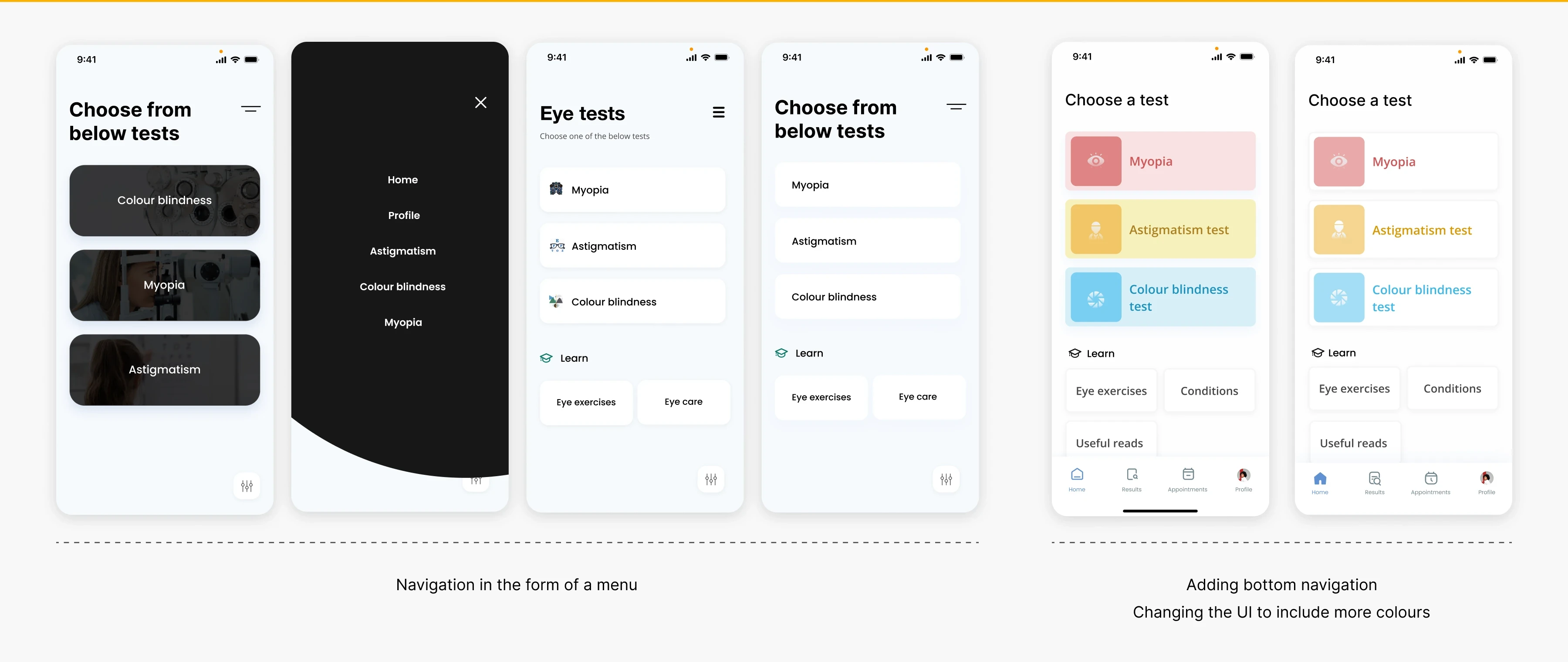
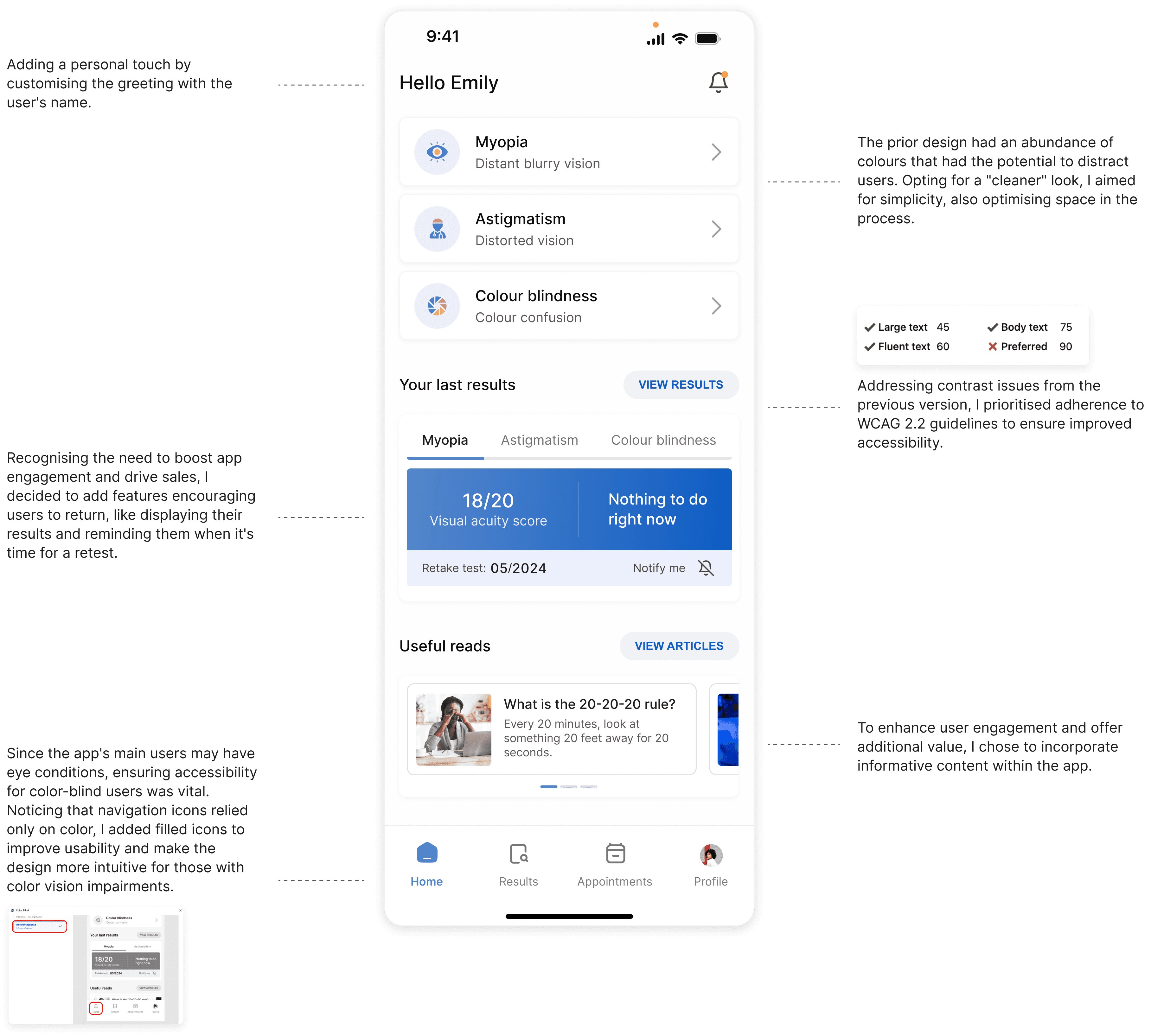
I went through several iterations to finalise the homepage design. Initially, I used a burger menu instead of bottom navigation, but I found the extra clicks inconvenient for users. So, I switched to bottom navigation for easier access. I also experimented with different colours, layouts, and font styles to refine the overall look and feel.
Final iteration
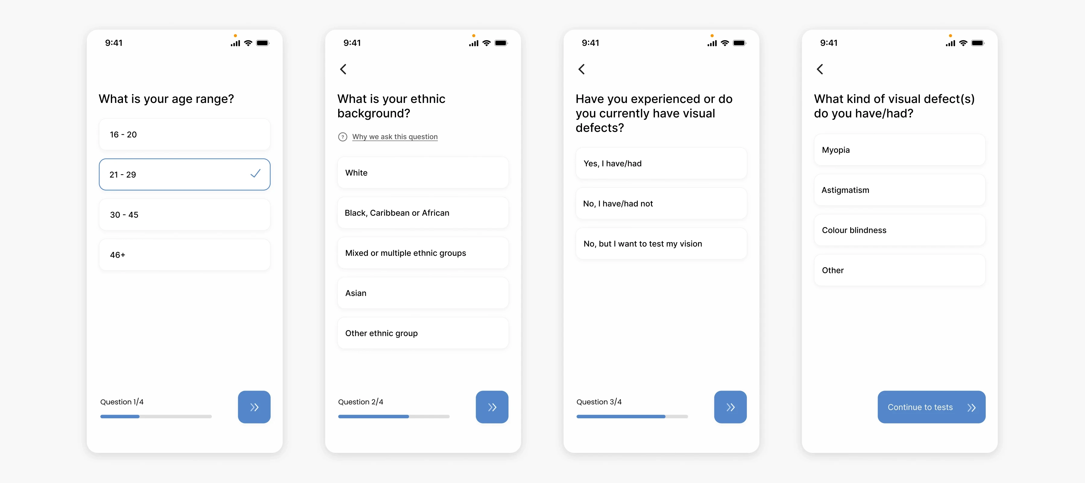
Onboarding: Helping the algorithm make better predictions
At the start of the test, users are required to answer a couple of questions to allow for better results. Age, ethnic background, and previous/current visual defects are valuable information when trying to make more accurate predictions.
Using face detection to assess the distance of the patient from the phone
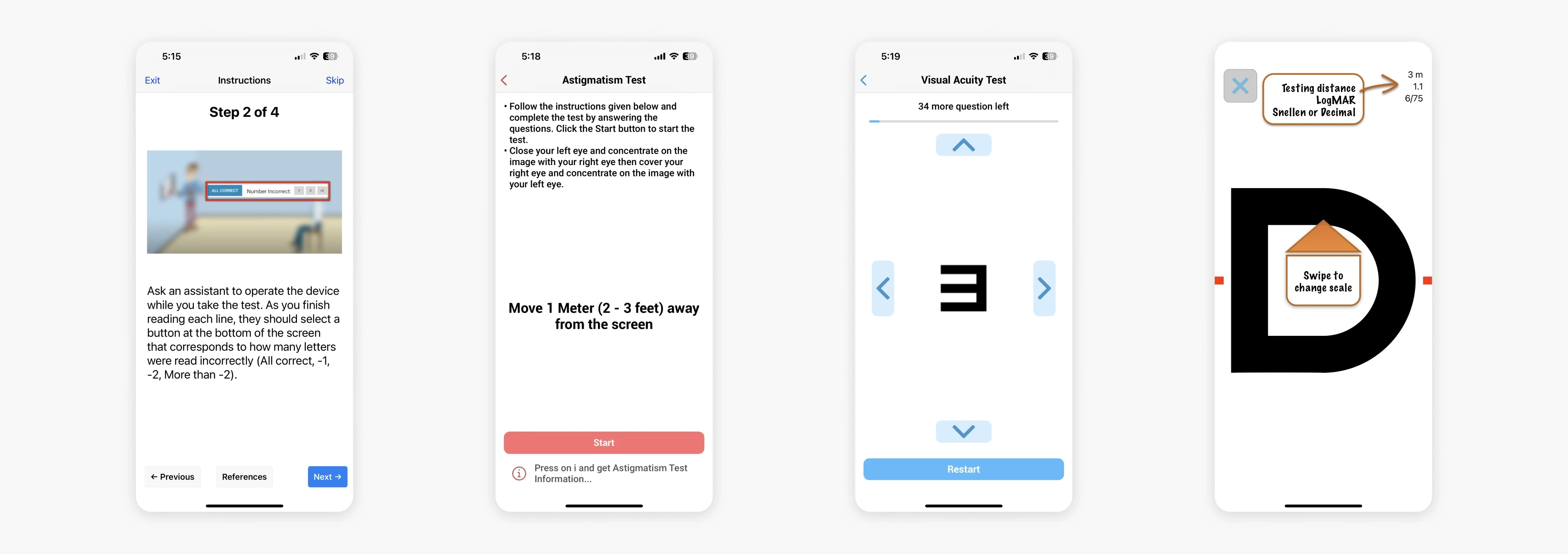
To increase distance and therefore test accuracy in rapport with the test instructions (e.g. place phone 35cm away from face), I decided to incorporate a similar approach used by smart banking apps. In order for the app to be able to detect how far away the object (patient) is, the user would have to place their face in the frame shown. The size of the frame would be in proportion to how far away the patient's eyes need to be, in this case around 35 cm away, or one arm's length away from the phone.
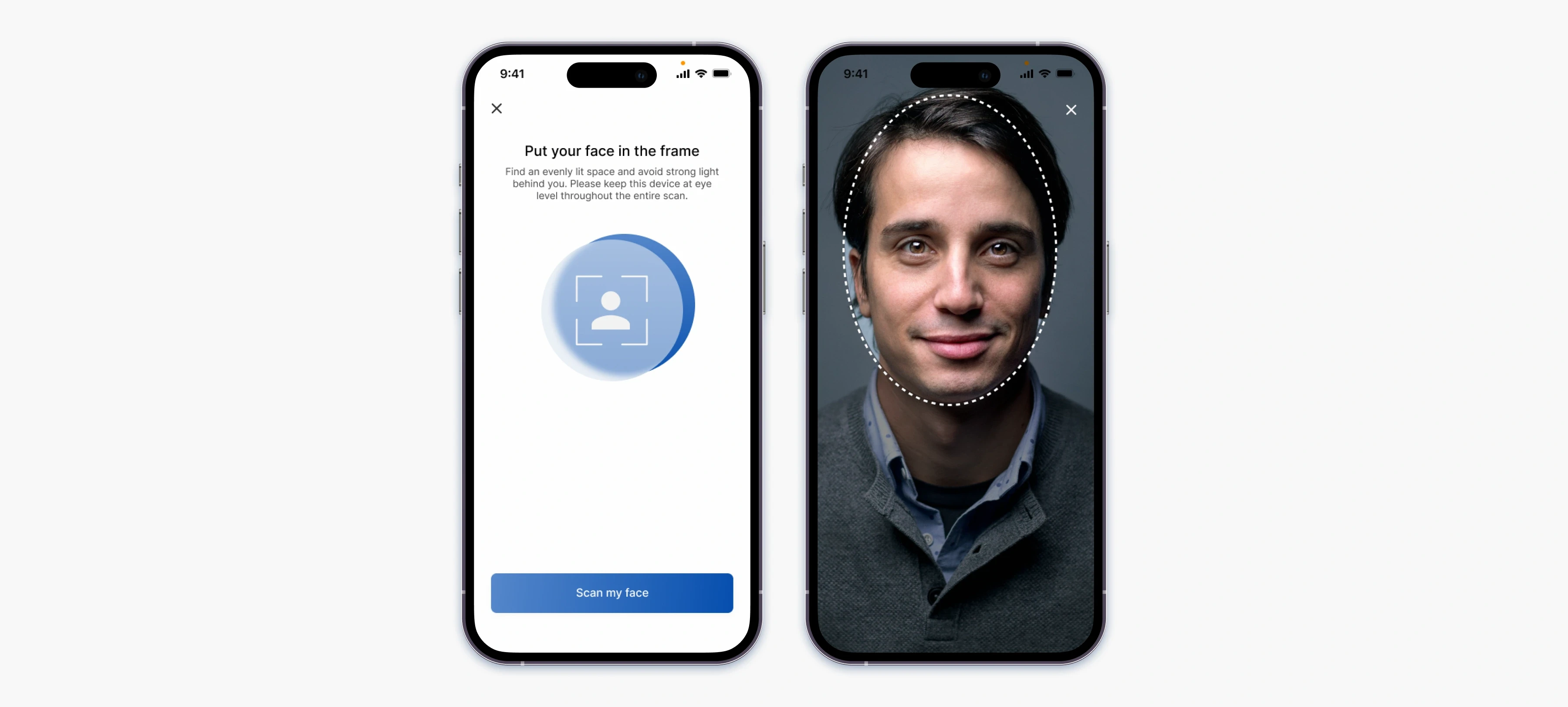
To improve test accuracy and ensure correct distance from the phone (35 cm or one arm's length), I implemented a face-framing approach similar to that used in smart banking apps.
Astigmatism test
There are 2 types of at-home astigmatism testing:

Because the dial test is a bit more complicated to implement on a small screen, I decided to stick with the line test. Following usability testing, I realised the touch target for the lines are too small for the user to accurately select so I decided to add the degrees on each of the lines and allow the user to select the degrees from a scrollable picker. The screens also informs the user at which level within the test they are by displaying the Level and a progress bar.
Myopia test
Many clinics in the UK are using Snellen charts to assess one's visual acuity despite there being major disadvantages. The disadvantages are that each line has a variable letter size, variable letters per line and lack of standardised progression between lines. For this app, I decided to use ETDRS charts, which are theoretically superior to Snellen charts because inter-patient differences are more accurately measured.
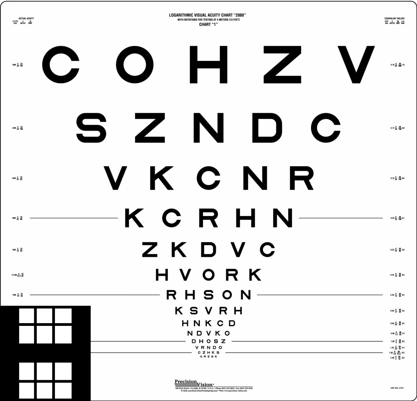
ETDRS charts (Early Treatment Diabetic Retinopathy Study charts) are standardized visual acuity charts that use uniformly sized letters and equal spacing between lines.
The letters used in the app are "Sloan letters", taken exactly from the chart without any modifications. The major drawback of taking this test alone, without an app is the difficulty in interpreting the results. However, with inputs being recorded and calculated automatically backstage, patients will only be required to enter the letter shown and wait for the results. This would pose advantages for ophthalmologists as well as they will have the results readily available.
How do we ensure letters are accurately displayed?
The myopia test requires the patient to identify letters on a distance chart, usually 20 feet (6m) away from the chart. This test measures visual acuity, which is written as a fraction, such as 20/40. The top number of the fraction is the standard distance at which testing is performed (20 feet). The bottom number is the smallest letter size read. A person with 20/40 visual acuity would have to get within 20 feet to identify a letter that could be seen clearly at 40 feet in a "normal" eye.
But how do we ensure that letters on a 64.8 cm wide and 62.2 cm high board are presented the same on phone with an average of 6 inch screens? There would be the need for an algorithm which would be able to convert the actual letter size on the board to the perceived letter size seen by the patient at a distance of 6m. With the help of PPI we can find out what would the perceived letter size would look like on a mobile phone screen.
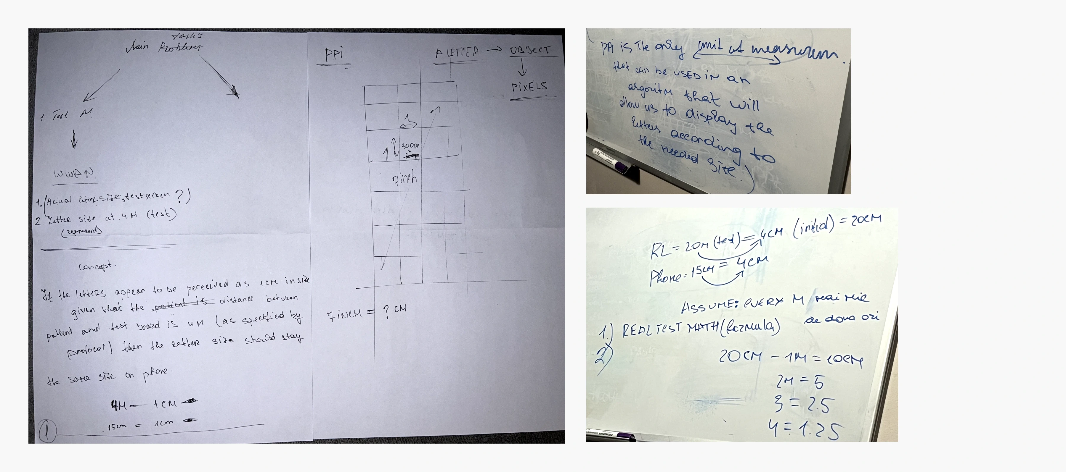
Some sketches of how I concluded the need for an algorithm to replicate the presentation of letters from a traditional eye exam chart on a phone screen.
Colour blindness test
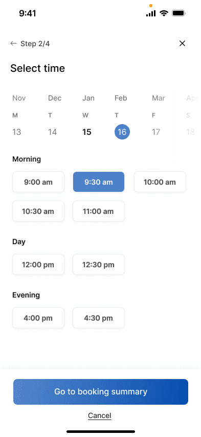
The colour blindness test was the easiest to recreate. The test mimics the commonly used Ishihara plates test which consists of 14 questions. The passing score is 12. The first and second iterations consist of having 4 different options to choose from, one of them being the correct one. However, this would have increased the chance of the user guessing the right answer and affecting the accuracy of the test. The final iteration would present the user with 6 different options, similar to a phone dial pad which would eliminate every chance of guessing the right answer. At the end of the test, based on the results, the user will be able to book an appointment with the specialist.
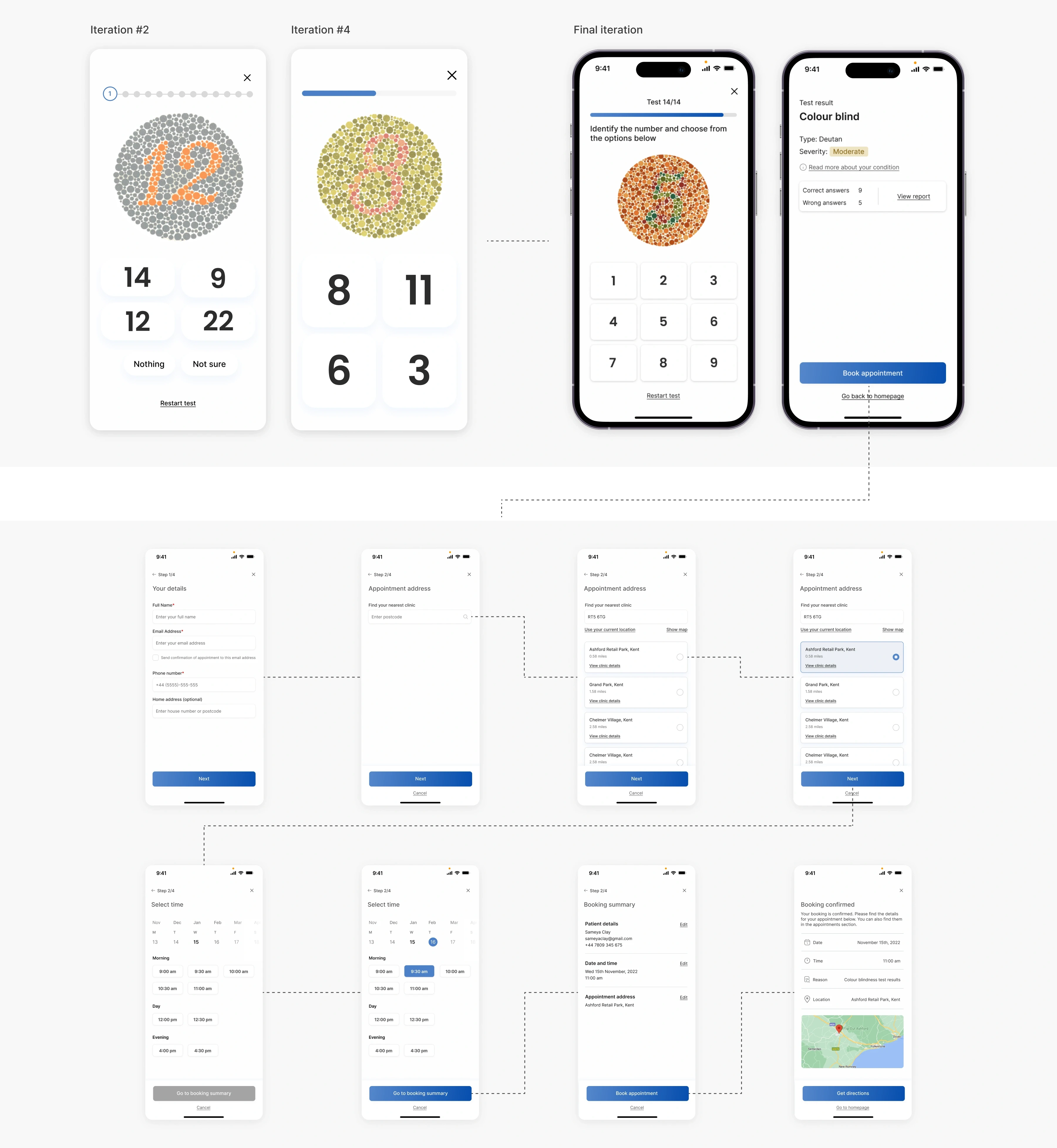
The user can book an appointment with a specialist directly within the app, without needing to leave the platform. By entering their estimated location, the app finds the nearest eye clinic and schedules the appointment for them.
usability testing
I tested the prototype with two of the interview participants who were able to navigate through the app with ease. Feedback from the second participant was in relation to the first screen (iteration #1), commenting on the fact that the results may bring negative emotions to users. The same participant found the myopia test (iteration #2) not intuitive enough by itself, therefore the added instructions will reduce users' cognitive load. The first participant had difficulties selecting the thicker line in the astigmatism test (iteration #3), issue remedied by adding degrees to each of the line as well as a scrolling picker.
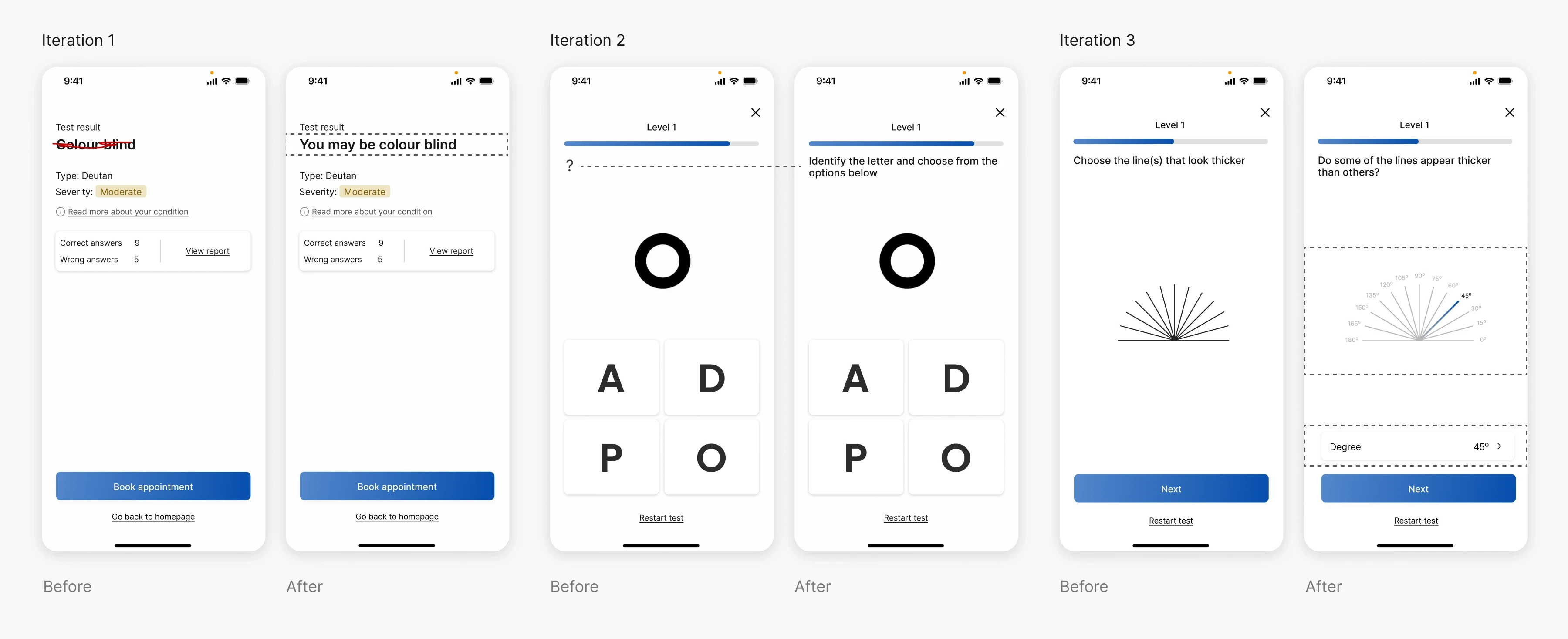
Design improvements following usability testing with 2 participants.
Having a platform where patients can have a pre-diagnosis prior to attending the clinic poses benefits for both the patient and the healthcare system, preventing frustration, waiting times, unnecessary clinic visits and healthcare expenses. The app would not replace professional diagnosis but it would serve as a good enough solution for a routine precautionary tests which would prevent disease worsening.
Although there may be scepticism in terms of accuracy of such applications, with so many technologies like AI, proximity sensors, face recognition, these apps would be a real solution for those struggling financially, people with motor disabilities, etc.
To further test the app's accuracy, an initial first step would be to get several opinions from specialists. The accuracy would further improve while the app is being used real-time, allowing me to understand where the app can be improved.
This idea can be further developed and can grow to allow for a wider range of tests such as hearing tests, condition which affects 1 in 6 of the UK adult population.